| Author | Thread |
Comments Made During the Challenge  |
|
|
07/07/2002 01:51:00 PM |
| Good combination on reflection and transparency. |
|
|
|
07/05/2002 09:37:00 PM |
| Nice concept. However, it needs more contrast and depth to give it "life." |
|
|
|
07/04/2002 04:02:00 PM |
| Very interesting photo. I like it! |
|
|
|
07/03/2002 05:18:00 PM |
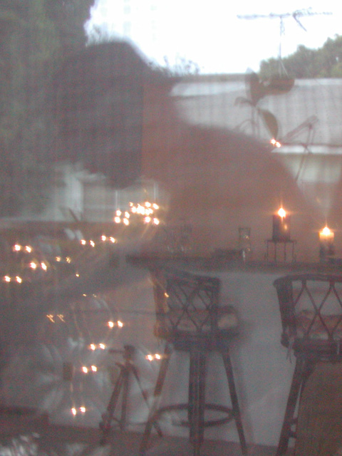
| The room is nicely distorted but I felt the reflection robbed this shot, A nice soft focused bar with candles (liked the tripod alot) was just murdered by the TV antenna on the reflected house. But that's just me :) |
|
|
|
07/02/2002 03:52:00 PM |
| A bit blurry, I'd prefer more detail and color. |
|
|
|
07/02/2002 03:42:00 PM |
| Reflection and transparency both, interesting. two things - the double glass fuzzes the reflection a bit too much and i see vertical rainbow lines that I can't explain, but mess with the shot, could be grain. Photo 5 Transparency 6 total 6 swash |
|
|
|
07/02/2002 09:43:00 AM |
| while i like the idea, i'd like to see something more in focus in this shot. also, the tripod doesn't quite fit the scene (although, mine is always standing around in the house like that, so i totally understand), and the street lights are a little too bright IMO. -- gr8photos (4) |
|
|
|
07/02/2002 07:27:00 AM |
| Quite interesting, but confusing. It's not clear enough to know what I'm looking at, but as an abstract it doesn't quite work. |
|
|
|
07/02/2002 01:44:00 AM |
|
|
|
07/01/2002 01:46:00 PM |
| creative 6 interesting 6 focus 3 framing 6 = 5 I like the photo, but needs more contrast. :) |
|
|
|
07/01/2002 01:45:00 PM |
| very unstructured. I cannot find a central theme. |
|
|
|
07/01/2002 01:27:00 PM |
| the tv antena at the top detracts from the over all composition. It should have been removed using rubber stamp. the ballence between reflection and transparency is really good. its implied that its the home of a photographer with the unused tripod inside. |
|
|
|
07/01/2002 02:30:00 AM |
| Fascinating subject! Looks like you're cooking out. Hope you had a good time and enjoyed it with someone you love. You are an inspiration to this viewer. This picture is 10 times better than "Black Hawk Down", although anything that makes you think is worthy of some praise. Have a great week. Yor great! |
|
|
|
07/01/2002 01:54:00 AM |
| Interesting photo.. I wish there was some way to add some mroe contrast to this one... = 5 - jmsetzler |
|
Home -
Challenges -
Community -
League -
Photos -
Cameras -
Lenses -
Learn -
Help -
Terms of Use -
Privacy -
Top ^
DPChallenge, and website content and design, Copyright © 2001-2025 Challenging Technologies, LLC.
All digital photo copyrights belong to the photographers and may not be used without permission.
Current Server Time: 03/13/2025 03:44:45 PM EDT.