The process of producing stuff for this place can be brain-stretching, even at its normal wekk-long timescale; no time to digest, no time to ponder, no time to absorb the idea of the challenge and let it mutate into an original approach. However, there is something to be said for the speed of it, for the mental rush it can induce, if one has any time at all to committ to it.
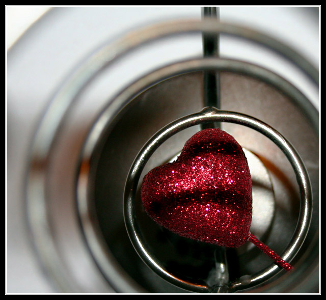
The results overall, it appears, have made plain that the voters expectations were for the most clever use of all the facility that Photoshop puts at our fingertips; I'm glad this shot is not one of those. There's a cerain level of abstraction here, and that too often provokes the simpketon's fascination with 'what is that?' and this detracts, I think, from a true consideration of the photograph. Complete abstraction is more effective - there's no possibility of knowing the source materiel, and thius one has to resort to a consideration of shape line and tone. Here, your rings serve I think simply as a frame for the decorative heart: there's an industrial quality there, but that isn't, for me, carried any further by the sparkly pink thing itself.
The apparently careful framing to place the heart itself on the thirds line is slightly let down by the near square crop, and a certain ;ack of definition in the shape itself - from your processing notes, I would say that the one element of that you need to dispose of is the auto-levels part. I think that's taken things to an extreme in the sparkly areas of the heart (the kind of fine detail that automated processes can never cope with), removing a lot of the detail, and over-blowing the highlights. |