| Author | Thread |
Comments Made During the Challenge  |
|
|
02/21/2006 08:30:45 AM |
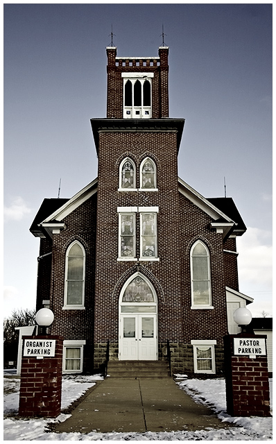
| I like this picture a lot, the one thing I can say is it looks a bit crooked and I would crop tighter on the left side to keep an even space from pillar to edge as on the right side. |
|
|
|
02/18/2006 09:17:21 PM |
| I don't see how a parking spot represents heavenly virtues. The photo looks a little washed out. |
|
|
|
02/18/2006 09:01:23 AM |
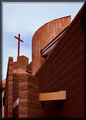
| For me, this is a nice photo of a church, but doesn't hold my interest as well as other entries in this challenge. The colors of the bricks themselves look odd to me, too dark, but that's just me. |
|
|
|
02/17/2006 08:34:41 PM |
| A nice clear shot - average for composition, color. |
|
|
|
02/17/2006 10:49:14 AM |
| simple, ok.. but a bit boring.. :S |
|
|
|
02/16/2006 04:44:19 PM |
nice lighting and colors.
the fun aspect adds alot ;P |
|
|
|
02/16/2006 11:49:08 AM |
|
|
|
02/15/2006 11:35:35 PM |
I'm having a hard time placing much Faith in man-made structures. Cliche and overused for this chellenge.
It's a nice structural shot, but falls short of this challenge. |
|
|
|
02/15/2006 02:29:26 PM |
| Great capture of this building. The 2 parking sites make it a bit funny. |
|
|
|
02/15/2006 10:57:47 AM |
| i think the color could be brought up a bit, nice tho |
|
Home -
Challenges -
Community -
League -
Photos -
Cameras -
Lenses -
Learn -
Help -
Terms of Use -
Privacy -
Top ^
DPChallenge, and website content and design, Copyright © 2001-2025 Challenging Technologies, LLC.
All digital photo copyrights belong to the photographers and may not be used without permission.
Current Server Time: 03/12/2025 06:43:02 PM EDT.