| Author | Thread |
|
|
03/01/2006 06:29:57 PM |
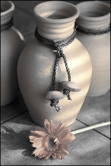
this was one of my top picks for this challenge even though it was not a true duetone but a desaturation (this may have accounted for the low votes)
I just love it anyway and have added it to my favs :) |
|
 Photographer found comment helpful. Photographer found comment helpful. |
|
|
03/01/2006 04:19:41 PM |
I gave this a 9. It was definitely one of my favourites in the challenge. Disappointing to see so many 1s, 2s and 3s.
|
|
| Photographer found comment helpful. |
|
|
03/01/2006 10:35:01 AM |
Hi Karen,
I didn't vote but I like this very much. The tones and the contrast are excellent. I think it should have scored much higher, not that 5.987 is a bad score. If your composition had not been so straight on it would have scored higher I believe, i.e. the main pot could be left or right of center and the flower diagonally opposite the pot. I think this would have been much stronger compositionally. Voters at DPC tend to be pretty anal about the rules of composition I find.
Cheers,
Owen |
|
| Photographer found comment helpful. |
Comments Made During the Challenge  |
|
|
02/26/2006 07:37:13 PM |
| I really love this. The tones are great. |
|
| Photographer found comment helpful. |
|
|
02/26/2006 05:33:50 PM |
| Maybe cropped a little to close at the top, but I love the color/lack of and it's simplicity. |
|
| Photographer found comment helpful. |
|
|
02/25/2006 10:48:15 PM |
| Great shot! Meets the challenge very well! |
|
| Photographer found comment helpful. |
|
|
02/25/2006 05:32:13 PM |
| Beautiful effect !! The shadows are just perfect. |
|
| Photographer found comment helpful. |
|
|
02/25/2006 03:00:01 PM |
| Very nice use of tone and colour as well as texture and lighting. |
|
| Photographer found comment helpful. |
|
|
02/24/2006 09:55:52 PM |
| Very nice. Suitable for wall hanging. Good light, composition and color choice. |
|
| Photographer found comment helpful. |
|
|
02/24/2006 07:49:27 AM |
| Nice image - not sure about it being "duotone" though. |
|
| Photographer found comment helpful. |
|
|
02/23/2006 09:03:14 AM |
| Out of all the floral or flower type of entries this is my favorite. Very delicate shading and toning. I think it matches perfectly with everything. I gave it an 8. I guess I am just not that much of a flower lover. |
|
| Photographer found comment helpful. |
|
|
02/23/2006 08:58:37 AM |
| great lighting beautiful composition well done |
|
| Photographer found comment helpful. |
|
|
02/23/2006 05:36:50 AM |
| This is a really nice, simple, well done, image..... |
|
| Photographer found comment helpful. |
|
|
02/23/2006 12:20:29 AM |
| I love the image, it's very soft and imotive. I'm just wondering though if there aren't more than two tones in this. Still I give it an 8. |
|
| Photographer found comment helpful. |
|
|
02/22/2006 10:09:09 PM |
| this doesn't look like a duotone but I really like the composition |
|
| Photographer found comment helpful. |
|
|
02/22/2006 07:26:32 PM |
| I think this is very nice. I like the mix of textures, dof and the color chosen. |
|
| Photographer found comment helpful. |
|
|
02/22/2006 11:05:54 AM |
| Nice pleasing composition. beautiful lighting and texture. Wonderful tones. |
|
| Photographer found comment helpful. |
Home -
Challenges -
Community -
League -
Photos -
Cameras -
Lenses -
Learn -
Help -
Terms of Use -
Privacy -
Top ^
DPChallenge, and website content and design, Copyright © 2001-2025 Challenging Technologies, LLC.
All digital photo copyrights belong to the photographers and may not be used without permission.
Current Server Time: 03/12/2025 09:50:05 AM EDT.