| Author | Thread |
|
|
03/01/2006 10:24:55 AM |
Originally posted by thegrandwazoo:
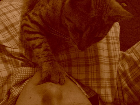
Nice play on words. No instead of Now. Could be sharper and the image needs to be bigger 640 by X. |
thanks for your comment. So, you now these words? I wrote "no" because i don't want to change ;) I know that it's normally "now" =) |
|
Comments Made During the Challenge  |
|
|
02/28/2006 04:37:30 PM |
| Nice play on words. No instead of Now. Could be sharper and the image needs to be bigger 640 by X. |
|
 Photographer found comment helpful. Photographer found comment helpful. |
|
|
02/28/2006 02:00:11 PM |
| This seems too dark and the toning doesn't do it any justice. |
|
|
|
02/28/2006 02:38:34 AM |
| The color looks forced, may have been better in a simple black and white |
|
|
|
02/27/2006 09:10:59 PM |
| Sweet moment. Lacks contrast though. |
|
|
|
02/25/2006 03:17:35 PM |
| I would have liked this better with more light/detail in the cat's face. |
|
|
|
02/24/2006 10:45:11 AM |
| Title give a nice interpretation of this picture. |
|
| Photographer found comment helpful. |
|
|
02/24/2006 12:05:22 AM |
| too lacking in contrast for mine. the cat's head seems to be in focus, but it's hard to find any features without looking hard. |
|
| Photographer found comment helpful. |
|
|
02/23/2006 06:32:53 PM |
| Nice colours, however the image is too blurred and use aren't using the full wide that you can, try to use the 640 max width as you will make a bigger impact with your photo |
|
| Photographer found comment helpful. |
|
|
02/23/2006 01:08:38 PM |
| I find this very poor. Nothing has been done to control the range of exposure, all the tones are compressed into a very narrow range indeed, with the result that it feels hopelessly amateur. The sepia toning is also very heavy, and hasn't helped. I'd have a damn good go at it with the levels tool, at the very least. However, I suspect that the composition of the shot isn't interesting enough for even that to put it into contention. |
|
| Photographer found comment helpful. |
|
|
02/22/2006 06:56:22 PM |
| Very dark photo, hard to see the detail... |
|
| Photographer found comment helpful. |
|
|
02/22/2006 11:29:18 AM |
| The color is very 1970's. Angle is akward, as are shadows. Had to strain my eyes because of the shadows. |
|
| Photographer found comment helpful. |
Home -
Challenges -
Community -
League -
Photos -
Cameras -
Lenses -
Learn -
Help -
Terms of Use -
Privacy -
Top ^
DPChallenge, and website content and design, Copyright © 2001-2025 Challenging Technologies, LLC.
All digital photo copyrights belong to the photographers and may not be used without permission.
Current Server Time: 03/12/2025 02:29:51 PM EDT.