| Author | Thread |
|
|
03/07/2006 07:02:49 PM |
Greetings from the Critique Club
by strangeghost
The first three parts of this critique are written based purely on examination of your photo. "Final thoughts" is written after reviewing your score, photographer's comments, and voter comments.
TECHNIQUE
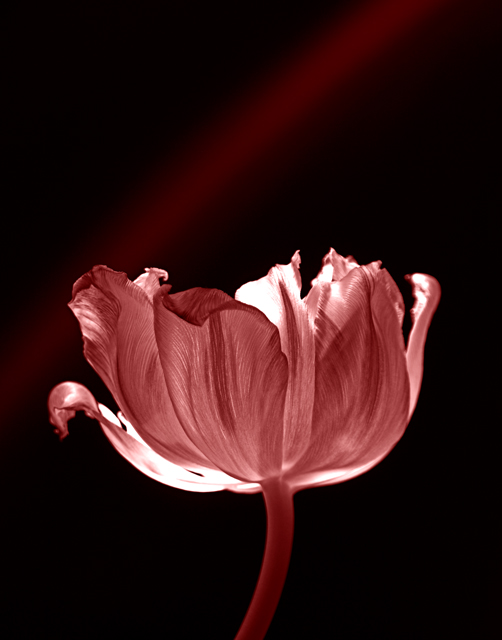
This image has such beautiful luminosity that it positively glows. It carries much more punch that the typical duotone. The focus is perfect on the near petal, and falls off gently toward the back of the flower, creating a nicely three dimensional feel. The lighting is wonderful, IMO, though a few small areas do appear to have blown out. I don't think this detracts, however. It leaves one with a sense of intense lighting that was well controlled. Your photo information indicates that it was a four second exposure at f5.6. Really? Must have been very dimly lit. The black background with the ray of light arching over the flower is exquisite. Much more effective than a flat black background. Whatever your technique, bravo on the result. I'm viewing (and critiquing) this image on a very bright iMac LCD. I just looked at your image on a traditional CRT and it's much darker and less vibrant on that monitor. I just can't express how beautiful it looks with the added brightness of the LCD screen. This gives me pause as I consider my own submissions, as well as my commenting on others' work. I bet you could have tweaked the brightness/exposure of this image up a bit and had it pop equally as well on CRTs.
COMPOSITION
Because it is an image that is so well done technically, the composition works. I don't know what is causing that arc of illumination over the flower, but I think it might have been even stronger had the flower been offset to the right, allowing the arc of light to frame it a bit. As shot, though, it's quite stunning.
EMOTIONAL IMPACT
Can you tell I like your shot?? It's beautifully simple and elegant, understated but strong. As a study, I can scarcely imagine how to make it stronger. It really works for me.
FINAL THOUGHTS
Your comments were generally very positive and people seemed to react to the beautiful lighting the same way I did. I'm a little disappointed that it only scored 5.77. Just based on the technical merit and over appeal, I would have guessed nearer to 6.0 and maybe even a smidge over. Still, it ranked at the 83rd%ile over all, not bad for a big challenge with lots of strong entries. Kudos to you. You made me pause and appreciate a wonderful work of art. |
|
 Photographer found comment helpful. Photographer found comment helpful. |
Comments Made During the Challenge  |
|
|
02/26/2006 11:51:44 PM |
| i really like the back lighting.... nice touch |
|
| Photographer found comment helpful. |
|
|
02/26/2006 01:16:53 PM |
| A very nice graceful subject. I would considered just a bit softer lighting. The color is pleasant. 6 |
|
| Photographer found comment helpful. |
|
|
02/25/2006 12:06:23 PM |
| How pretty! Wonderful lighting, and such crisp, clean focus. Great tones. And I love tulips! |
|
| Photographer found comment helpful. |
|
|
02/24/2006 10:15:14 AM |
| Love the delicate veining visible in the petals... |
|
| Photographer found comment helpful. |
|
|
02/24/2006 08:19:35 AM |
| Beautiful tones and textures. The lighting you used really mde the textures stand out. |
|
| Photographer found comment helpful. |
|
|
02/23/2006 08:00:06 PM |
| I'm not sure if the faded/blurred red line in the background was intentional, but for me, this would be more effective without it. I like your duotone choices. |
|
| Photographer found comment helpful. |
|
|
02/23/2006 09:16:53 AM |
| Lovely colors and tones. Nice placement. I find the red "streak" to work well with this. But could see where it would be a distraction for others. I would have likes to see just a bit more pop in the darker tones. I gave it a 7. |
|
| Photographer found comment helpful. |
|
|
02/23/2006 04:23:38 AM |
| I think that cropping off more of the top of the shot would be more effective. |
|
| Photographer found comment helpful. |
|
|
02/23/2006 12:23:49 AM |
| Like the luminosity very much. |
|
| Photographer found comment helpful. |
|
|
02/22/2006 01:16:19 PM |
| The backlighting in this shot is simply gorgeous.. excellent job :) |
|
| Photographer found comment helpful. |
|
|
02/22/2006 10:59:33 AM |
|
| Photographer found comment helpful. |
|
|
02/22/2006 10:05:23 AM |
| very well lit.. the fragile lines in the flower are perfect |
|
| Photographer found comment helpful. |
|
|
02/22/2006 09:56:19 AM |
| there are 2 things bugging me about this shot... the over exposed areas on the flower and the distracting diagonal line going accross the background |
|
| Photographer found comment helpful. |
|
|
02/22/2006 07:49:57 AM |
| The lighting really helps to make the soft textured petals stand out..... |
|
| Photographer found comment helpful. |
Home -
Challenges -
Community -
League -
Photos -
Cameras -
Lenses -
Learn -
Help -
Terms of Use -
Privacy -
Top ^
DPChallenge, and website content and design, Copyright © 2001-2025 Challenging Technologies, LLC.
All digital photo copyrights belong to the photographers and may not be used without permission.
Current Server Time: 03/10/2025 11:18:31 PM EDT.