| Author | Thread |
|
|
03/06/2006 01:39:27 PM |
Greetings from the Critique Club!
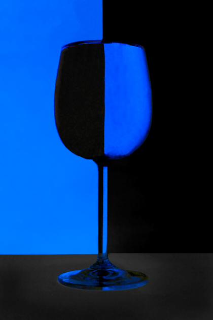
I've always liked this type of shot. And having tried it myself, I know how difficult it is to achieve. This is a very respectable take on it. I like the colors, although the blue seems to glow just a bit too much for my liking. The image is sharp and the centered composition works here because of the subject.
On the down side, I see three colors - blue, black, and dark grey. I suppose it could be argued that dark grey is just a tone of black, but in a specific duotone challenge, this may have hurt your score a bit. Also, the grey of the base makes the image seem just a little ... "off". The best photoshop is photoshop that can't be detected, and this particular part is a little too obvious, in my opinion.
Still, it's a very pleasing image. Well done.
milo |
|
 Photographer found comment helpful. Photographer found comment helpful. |
Comments Made During the Challenge  |
|
|
02/26/2006 05:37:21 PM |
| Yes it is at dpc but you appear to have taken a slightly different approach to othe examples I have seen. The base of the glass appears to be suspended in mid air. I am guessing you have inverted the photograph. Either way, I really like the effect & its so good to see a bit more colour than shades of B&W |
|
| Photographer found comment helpful. |
|
|
02/25/2006 10:32:05 PM |
| I like the crisp, clean lines and graphic arts look of this. Well lit. Nicely done. 7 |
|
| Photographer found comment helpful. |
|
|
02/25/2006 07:30:48 AM |
| ...but a well executed image 9 |
|
| Photographer found comment helpful. |
|
|
02/24/2006 01:26:51 PM |
| It is a cliche indeed :) someday I have to shoot one of those :) seriously now: there's a strange look about the glass base, the rest has nice contrast |
|
| Photographer found comment helpful. |
|
|
02/23/2006 07:13:51 PM |
Personal Contest Favorite.... Stunning!
10
Better find a spot to keep that blue ribbon ;) |
|
| Photographer found comment helpful. |
|
|
02/23/2006 07:01:03 PM |
| Yep it is a cliché, the edges seem a little too fuzzy to get that wow factor, still like these images though :) I know I'm going to surcome and give a go one of these days |
|
| Photographer found comment helpful. |
|
|
02/22/2006 10:31:28 AM |
| Simple and smooth. Bright colors. |
|
| Photographer found comment helpful. |
|
|
02/22/2006 03:14:25 AM |
| Good title and nice photo. |
|
| Photographer found comment helpful. |
|
|
02/22/2006 03:04:29 AM |
|
| Photographer found comment helpful. |
Home -
Challenges -
Community -
League -
Photos -
Cameras -
Lenses -
Learn -
Help -
Terms of Use -
Privacy -
Top ^
DPChallenge, and website content and design, Copyright © 2001-2025 Challenging Technologies, LLC.
All digital photo copyrights belong to the photographers and may not be used without permission.
Current Server Time: 03/12/2025 06:07:42 PM EDT.