| Author | Thread |
Comments Made During the Challenge  |
|
|
02/28/2006 11:40:13 PM |
| Love the originality of this one. great use of space. |
|
|
|
02/28/2006 11:01:29 PM |
| Love the simplicity, almost pure abstract, but still easily recognizable - 9 |
|
|
|
02/28/2006 06:27:31 PM |
|
|
|
02/28/2006 06:25:53 PM |
|
|
|
02/27/2006 04:46:22 PM |
| This is really interesting! Can't wait to see the original :) |
|
|
|
02/27/2006 12:43:09 AM |
| The lovely composition caught my eye. Well done. |
|
|
|
02/26/2006 11:59:03 PM |
| I'm not sure that it's a bullseye with respect to the theme, but otherwise, as a graphic image, I think this is just about perfect. I admire it tremendously -- great concept, design, and execution. |
|
|
|
02/26/2006 01:45:18 AM |
|
|
|
02/25/2006 07:06:43 PM |
| This photo caught my eye right away. There is something about it I like. It is simple and well executed. Good luck |
|
|
|
02/25/2006 04:05:14 PM |
| Very nice! Love to see the setup for this. |
|
|
|
02/25/2006 02:06:08 PM |
|
|
|
02/25/2006 08:28:30 AM |
|
|
|
02/25/2006 12:40:21 AM |
| Love this! I am eager to find out how you set this shot up. |
|
|
|
02/24/2006 10:40:22 PM |
| LOVE IT!!! The conciseness and simplicity is wonderful. Well positioned. Very fun. 10 |
|
|
|
02/24/2006 09:46:28 PM |
|
|
|
02/24/2006 07:03:45 PM |
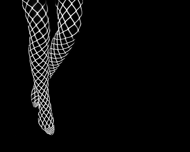
| I'm not really seeing this as a fashion shot. What fashion is being presented here? Even if it's an ad for hosiery, this is too abstract to properly show off the product. It is an interesting shot in terms of abstraction and art but it doesn't work for me as fashion. |
|
|
|
02/24/2006 04:16:02 PM |
This is a very interesting abstract image. For me, however, it has only a tenuous hold on the 'fashion' aspect of the challenge. Does it meet the challenge, IMO? Yes, barely. Do I like it? Yes. Does it say to me 'I'm a fashion photo'? No.
Also, there appears to be a slight amout of 'bleedover' between the white and black in some areas. |
|
|
|
02/24/2006 01:53:31 PM |
|
|
|
02/24/2006 07:16:52 AM |
| lovely :) like this very much.. 8 |
|
|
|
02/23/2006 07:59:54 PM |
| This is a very strong image, and I really like it..... |
|
|
|
02/23/2006 06:43:03 PM |
| ZZ Top - though I think I might have reversed portrait/landscape - just a little too much negative space. |
|
|
|
02/23/2006 06:26:32 PM |
|
|
|
02/23/2006 12:24:21 AM |
| Excellent! Lovely graphic image. Would look brilliant in a magazine. I smell a ribbon:))10 |
|
|
|
02/22/2006 11:09:36 PM |
| Good concept but wish I could see just a hint of the shoes. |
|
|
|
02/22/2006 10:08:59 PM |
| This is very clever. I can see it with writting to the right as a flyer or the buisness card for a manager for "exotic dancers." It is clean, simple and effective. It also is a great example of how our minds fill in the blanks. Well done. |
|
|
|
02/22/2006 06:50:40 PM |
| yay! Sexy!!! Now that's what I'm talking about... |
|
|
|
02/22/2006 04:56:43 PM |
| wow..this is very different...but good! 10 |
|
 Photographer found comment helpful. Photographer found comment helpful. |
|
|
02/22/2006 02:54:43 PM |
|
| Photographer found comment helpful. |
|
|
02/22/2006 09:51:43 AM |
| This is a nice shot. A very in-your-face and here-is-my-new-line-of-net-stockings photo. A bit too much empty space, but cropped better it would be in any high fashion magazine ad. Nicely done. |
|
| Photographer found comment helpful. |
|
|
02/22/2006 07:11:00 AM |
| now that's what I'm talking about 10++ |
|
| Photographer found comment helpful. |
Home -
Challenges -
Community -
League -
Photos -
Cameras -
Lenses -
Learn -
Help -
Terms of Use -
Privacy -
Top ^
DPChallenge, and website content and design, Copyright © 2001-2025 Challenging Technologies, LLC.
All digital photo copyrights belong to the photographers and may not be used without permission.
Current Server Time: 03/12/2025 08:24:44 PM EDT.