| Author | Thread |
|
|
03/08/2006 05:34:18 PM |
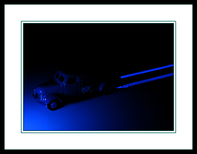
| CalliopeKel, thanks for the support.. Huh, check out the voting distribution, what a perfect gaussian curve... Now, just need to work on the next project to blue shift it more.. :) |
|
|
|
03/08/2006 01:13:11 AM |
| I gave this a 10 in the challenge. I thought it was an artful peice that is really classy. I loved the way you framed it too. Like for real. |
|
 Photographer found comment helpful. Photographer found comment helpful. |
|
|
03/08/2006 12:31:49 AM |
| yeah.. I guess the border IS UGLY... it hurts.. Well, this is what makes DPChallenge a great place to learn and grow. Thank everybody for the constructive suggestions |
|
Comments Made During the Challenge  |
|
|
03/07/2006 10:25:54 PM |
| Great pic, but I think you're going to get hammered for the border/frame - took up too much of the picture. |
|
|
|
03/07/2006 04:32:28 PM |
| A too large border if you ask me . . . |
|
|
|
03/07/2006 02:57:15 PM |
|
| Photographer found comment helpful. |
|
|
03/07/2006 08:02:56 AM |
|
|
|
03/06/2006 03:00:35 PM |
| The non stationary light source does not seem apparant here. |
|
|
|
03/06/2006 12:38:59 PM |
| Very original! How did you manage to highlight the tracks like that? |
|
|
|
03/05/2006 05:50:49 PM |
|
|
|
03/04/2006 01:09:47 PM |
| This is pretty cool..the blue is very nice and the tire trails are clever. I wish you would have left the border off of it, though...I think it would have been better without the frame and the photo itself larger, IMHO. |
|
| Photographer found comment helpful. |
|
|
03/03/2006 04:37:33 PM |
| The large border detracts from the over all image. Nicely done on the picture, its just swamped by that massive white border. |
|
| Photographer found comment helpful. |
|
|
03/03/2006 01:22:31 AM |
|
|
|
03/02/2006 08:01:53 PM |
|
|
|
03/02/2006 04:48:45 PM |
|
|
|
03/02/2006 01:53:54 PM |
|
| Photographer found comment helpful. |
|
|
03/02/2006 04:39:50 AM |
| Great picture, ugly frame. 9 |
|
|
|
03/01/2006 07:51:24 PM |
| dude, what's with the frame? neat idea... not quite sure that it looks painted with light, maybe if you had used the image limits for detail instead of frame I could see more detail. wee bit too dark. |
|
| Photographer found comment helpful. |
|
|
03/01/2006 02:05:33 PM |
| Border is a little heavy for the site, it reduces the photo even smaller than the already too small 640 px. The composition and blue tone look good, but I would like to be able to see more detail. |
|
| Photographer found comment helpful. |
|
|
03/01/2006 05:00:59 AM |
| I like big borders...but this is B-I-G!!! I would have like to have seen more of the photo, as it looks interesting. |
|
| Photographer found comment helpful. |
|
|
03/01/2006 02:16:42 AM |
| good shot .. but I find the border a little distracting |
|
| Photographer found comment helpful. |
|
|
03/01/2006 12:40:28 AM |
| well, don't get tired of hearing comments about the frame...I like the shot though. The tracks are cool. |
|
| Photographer found comment helpful. |
Home -
Challenges -
Community -
League -
Photos -
Cameras -
Lenses -
Learn -
Help -
Terms of Use -
Privacy -
Top ^
DPChallenge, and website content and design, Copyright © 2001-2025 Challenging Technologies, LLC.
All digital photo copyrights belong to the photographers and may not be used without permission.
Current Server Time: 04/27/2025 06:32:40 AM EDT.