| Author | Thread |
|
|
03/15/2006 12:25:19 PM |
Hi! Here̢۪s a comment from the Critique Club.
First Impression:
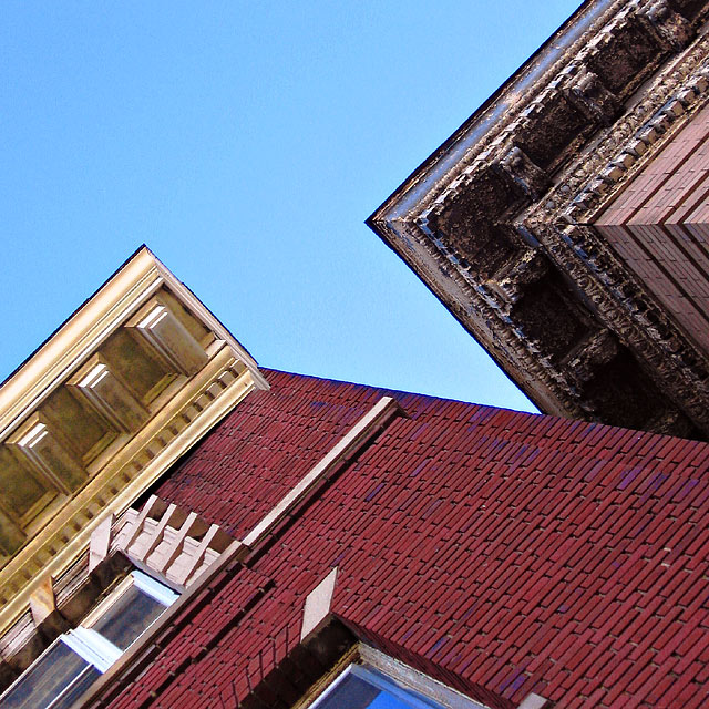
My eyes went to the dark corner, down to the red bricks, then up to the cream coloured corner. Funny black lines at the sky interface. Looks like the sky was “cut from paperâ€
Composition:
Good eye. Lots of colour and texture. I like the way you broke up the square with the 45 degree angle for the top building. A 30 degree angle may have been more pleasing, not as much vertigo!
Subject:
Met challenge well.
Technical:
Excellent lighting and colours. Good DOF. Picture seems a little grainy, may have been to much USM
Summary:
Good capture, less angle may have been more pleasing.
|
|
 Photographer found comment helpful. Photographer found comment helpful. |
Comments Made During the Challenge  |
|
|
03/12/2006 12:37:32 PM |
| WOW! I love it, great color and angel. Good job. |
|
| Photographer found comment helpful. |
|
|
03/10/2006 09:51:44 PM |
| angle is to strange..hurts my head to look at it |
|
| Photographer found comment helpful. |
|
|
03/10/2006 07:03:47 PM |
| interesting, rather vertigo inducing. nice angles |
|
| Photographer found comment helpful. |
|
|
03/09/2006 09:03:43 AM |
| The tilted perspective doesn't do any thing for me. |
|
| Photographer found comment helpful. |
|
|
03/09/2006 07:47:35 AM |
| vertigo inducing, really. this shotshould come with a referal to a vestibular disorders clinic. But, its got great shapes and "negative" sky space. |
|
| Photographer found comment helpful. |
|
|
03/09/2006 12:08:52 AM |
| This is an interesting picture, but really not a comfortable one to look at. |
|
| Photographer found comment helpful. |
|
|
03/08/2006 10:13:12 PM |
| The diagonals are daring for an architectural photograph. I dig this one though ;) The color contrasts are great. I bet someone commented that this might be me eh? Great job! |
|
| Photographer found comment helpful. |
|
|
03/08/2006 07:13:30 PM |
|
| Photographer found comment helpful. |
|
|
03/07/2006 07:26:25 PM |
| Nice perspective and colors |
|
| Photographer found comment helpful. |
|
|
03/07/2006 12:11:04 AM |
| Good take on the challenge - I especially like the "arrow" formed by the sky and the textures of the buildings. |
|
| Photographer found comment helpful. |
|
|
03/06/2006 07:35:02 PM |
| this tilt makes me dizzy, maybe too much |
|
| Photographer found comment helpful. |
|
|
03/06/2006 05:58:59 PM |
| I think you might usefully have used a monochrome conversion of this: that would have emphasised the graphic nature of the shot more strongly, and it's those intersections of lines that make this shot, of course. I don't find much colour here that would really not finction better as tonality in a black and white composition. However, it's one of few shots so far that actually uses the compositional advantages of the square crop effectively, so you must be praised for that. Good, strong work. |
|
| Photographer found comment helpful. |
|
|
03/06/2006 12:02:46 PM |
| This is different. Good picture |
|
| Photographer found comment helpful. |
|
|
03/06/2006 09:14:33 AM |
| I really like the angle of this. There's a lot of noise/grain in the sky, though. Maybe neat image would help. |
|
| Photographer found comment helpful. |
|
|
03/06/2006 01:11:27 AM |
| great colours and perspective |
|
| Photographer found comment helpful. |