| Author | Thread |
Comments Made During the Challenge  |
|
|
07/14/2002 12:16:00 PM |
|
|
|
07/13/2002 08:55:00 PM |
| creative 8 interesting 8 focus 7 framing 5 = 7 |
|
|
|
07/13/2002 08:35:00 PM |
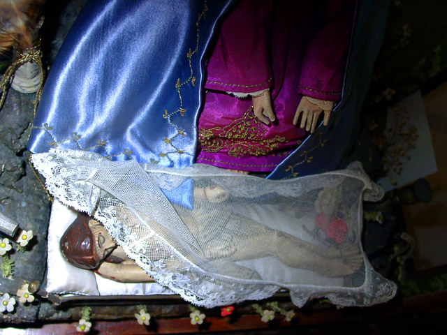
i thought about it while but i don't get the "fear" part. does the photo wants to express jesus who has fear of being crucified? well... ok.
a bit dark on the top and on the right side but maybe that was intended by you to make up some "divine light" on jesus' head?
|
|
|
|
07/13/2002 02:53:00 PM |
| nice color and texture contrasts-imagery interesting and open to interpretation - has a Spanish influence or perhaps New orleans? Lighting too harsh - more subtle might have worked better |
|
|
|
07/13/2002 05:42:00 AM |
even though i think this gives off a feeling more of melancholy than fear, i still like the sideways look at the subject, and the obvious thought that went into the shot.
nice work. |
|
|
|
07/12/2002 11:09:00 AM |
|
|
|
07/11/2002 11:29:00 PM |
| I'm confused. What is the fear here? |
|
|
|
07/10/2002 03:08:00 PM |
| I don't see any fear here. |
|
|
|
07/09/2002 10:37:00 PM |
|
|
|
07/09/2002 09:56:00 PM |
| hmm.. i just have no real comment on this image.. = 6 - jmsetzler |
|
|
|
07/09/2002 08:47:00 PM |
were you in a museum? is this a diorama?
|
|
|
|
07/09/2002 04:56:00 PM |
Took me a minute, but I think I understand what you may have been trying to do here. Thought-provoking.
i like the colors, but the light is a little harsh on the lower left. Maybe you could bounce/reflect it to get a more even lighting situation. |
|
|
|
07/09/2002 01:53:00 PM |
|
|
|
07/08/2002 06:18:00 PM |
| Well executed shot, but fear to limited audience. 6 Swash |
|
|
|
07/08/2002 05:20:00 PM |
| Interesting but I don't get it. I would soften the flash to get a better glow as opposed to that "Hey look, it's Jesus eating at Arby's" look. |
|
|
|
07/08/2002 04:23:00 PM |
| More-so weird than fearful. The lighting isn't too hot either -- too much on the left and none on the right. |
|
Home -
Challenges -
Community -
League -
Photos -
Cameras -
Lenses -
Learn -
Help -
Terms of Use -
Privacy -
Top ^
DPChallenge, and website content and design, Copyright © 2001-2025 Challenging Technologies, LLC.
All digital photo copyrights belong to the photographers and may not be used without permission.
Current Server Time: 03/12/2025 02:48:47 AM EDT.