| Author | Thread |
|
|
07/15/2002 09:26:00 AM |
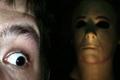
| Rough score - this was easily my favourite this time around... Good placing though. |
|
Comments Made During the Challenge  |
|
|
07/14/2002 07:55:00 PM |
| Great sillohuette, color/composition. |
|
|
|
07/14/2002 06:30:00 PM |
|
|
|
07/14/2002 05:37:00 PM |
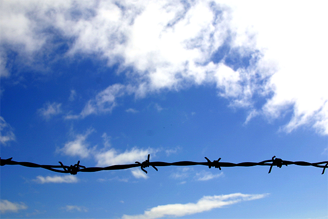
| Very simple and very effective. I have a similar shot, but it used a strange pinwheeling metal wall emplacement to keep people out of a backyard (and probably pigeons off the wall). You've got some problems with the clouds -- those on the right are blown out while those on the left are gray and kind of murky. I think I would have tried to keep more texture in the ones on the right. I'd suggest (even tho I like the color) seeing what this one looks like in B&W as well. Make it a little more stark. Good work. |
|
|
|
07/14/2002 12:05:00 PM |
| I really like this shot, though the darkness on the left side bothers me a little. |
|
|
|
07/14/2002 01:26:00 AM |
| very pretty blue sky, one of my favorites this week |
|
|
|
07/13/2002 02:48:00 PM |
| What a great ad this would be for Amnesty International. I love it. |
|
|
|
07/13/2002 02:46:00 PM |
| Interesting concept - needs more "meat" - nice shot of sky. Good color. Might have used multiple shots of the wire in a more effective design |
|
|
|
07/13/2002 02:23:00 PM |
| great shot, just dont see fear |
|
|
|
07/13/2002 05:34:00 AM |
|
|
|
07/13/2002 03:40:00 AM |
| nice and simple--i like this. 8-amitchell |
|
|
|
07/12/2002 06:05:00 PM |
|
|
|
07/12/2002 02:41:00 PM |
| simple, yet fits the challenge. Fear of imprisonment. Good thinking. |
|
|
|
07/11/2002 10:32:00 AM |
| good image. well shot. clean. i took an image similar to this : ) .. no real suggestions for improvement. i think this could make a poster for amnesty international : ) .. mag 99. |
|
|
|
07/10/2002 11:19:00 PM |
| very nice shot.. simplicity always works for me. The single strand of barbed wire silhouetted against the sky offers a nice contrast, not only in the image, but a contrast between freedom and captivity :) = 8 - jmsetzler |
|
|
|
07/10/2002 11:11:00 PM |
| pretty damned awesome photo, but it doesn't exactly represent fear. |
|
|
|
07/10/2002 07:28:00 PM |
| Very simple, yet it speaks so much. The sky looks incredible. Great work. |
|
|
|
07/10/2002 04:38:00 PM |
| Nice, simple execution, it's a good idea, but needs the title to "rescue it". 7 Swash |
|
|
|
07/10/2002 04:21:00 PM |
| beautiful picture but i dont see fear |
|
|
|
07/10/2002 08:31:00 AM |
| Nice, simple composition. I was actually looking for barbed wire for my shot, but couldn't find any...so of course I like your idea. |
|
|
|
07/10/2002 01:04:00 AM |
|
|
|
07/09/2002 04:33:00 PM |
| too much cloud top right but otherwise nice idea |
|
|
|
07/09/2002 11:42:00 AM |
| classic composition, good theme, love the 'free' sky background - excellent. |
|
|
|
07/09/2002 11:42:00 AM |
| Not sure how strongly it says "Fear", but it's a great pic |
|
|
|
07/09/2002 10:42:00 AM |
| beautiful image...wow. seems like more barbed wire would have conveyed the 'captivity' better. 9 because I love it anyway. Lisa |
|
|
|
07/09/2002 09:16:00 AM |
| I really like this shot. It is very simple and the dark twisted barb wire against the beautiful sky backdrop is an excellent contrast and gives the picture an ominous feel. |
|
|
|
07/08/2002 10:36:00 PM |
|
|
|
07/08/2002 10:12:00 PM |
| At first, I thought the wire needed to be further up the picture, but then I decided that it may be more effective where it is because the viewer has a sense of freedom by the wide open blue sky, then it abruptly ends with the single strand of barbed wire. (Just a note: if a horse wants to be out of "captivity" a strand of barbed wire won't stop him. :-)) I like the contrast provided. karmat |
|
|
|
07/08/2002 07:19:00 PM |
| You're probably getting beat up by the voters, but I think it's a nice composition and excellent, creative idea. 7 |
|
|
|
07/08/2002 05:38:00 PM |
| I love this but it seems a bit too overexposed. I still love it!! |
|
|
|
07/08/2002 04:54:00 PM |
| Nice, simple shot. But it looks like there's dust on your lens. |
|
|
|
07/08/2002 01:33:00 PM |
| Good picture, i think a deeper darker blue sky would work better. |
|
|
|
07/08/2002 12:50:00 PM |
|
|
|
07/08/2002 11:37:00 AM |
| cool! : ) very... just not enough fear... |
|
|
|
07/08/2002 10:21:00 AM |
|
|
|
07/08/2002 08:55:00 AM |
|
|
|
07/08/2002 06:25:00 AM |
|
|
|
07/08/2002 12:46:00 AM |
| Overall, I like this pic a lot. There is a tat too much sky so maybe a different crop. The thing that I'm having issues with is....the title saves it. Without the title I would see no fear. |
|
Home -
Challenges -
Community -
League -
Photos -
Cameras -
Lenses -
Learn -
Help -
Terms of Use -
Privacy -
Top ^
DPChallenge, and website content and design, Copyright © 2001-2025 Challenging Technologies, LLC.
All digital photo copyrights belong to the photographers and may not be used without permission.
Current Server Time: 03/13/2025 12:25:30 AM EDT.