| Author | Thread |
|
|
09/20/2007 02:23:31 AM |
| Its cool idea. And its underrated photo. |
|
 Photographer found comment helpful. Photographer found comment helpful. |
|
|
03/31/2006 12:37:43 AM |
| Oh how neat! I like this one a lot. It seems the top left could use just a bit more light, and as was pointed out, the wet paint (or so it seems) on the yellow is a bit distracting, but other wise, a very nice, fun photo! |
|
| Photographer found comment helpful. |
Comments Made During the Challenge  |
|
|
03/28/2006 06:23:47 PM |
| Very creative and obviously took more time and planning to execute. Good shadow detail and tonal range. |
|
| Photographer found comment helpful. |
|
|
03/27/2006 01:16:07 AM |
| Excellent idea and well excuted.....messy but very good..... |
|
| Photographer found comment helpful. |
|
|
03/26/2006 09:33:26 PM |
| Beautiful colors and composition |
|
| Photographer found comment helpful. |
|
|
03/25/2006 07:58:22 AM |
|
| Photographer found comment helpful. |
|
|
03/25/2006 01:09:35 AM |
| Would have liked to see the tip of that thumb in the frame great colour, idea. |
|
| Photographer found comment helpful. |
|
|
03/24/2006 02:14:16 PM |
| Nice colors and arrangement. More clarity and sharpness would help. |
|
| Photographer found comment helpful. |
|
|
03/22/2006 10:44:48 PM |
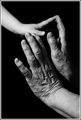
| nice idea with this. a qualm i have with it though is that it's pretty apparent the paint wasn't dry, at least on the yellow hand, especially around the thumb where a lot of light is being reflected and creating a distraction that draws attention. my last point is obviously personal opinion, and i'm sure people would disagree with me here, but i think more thought could have been given to the placement of th ehands. maybe if they were aligned each 120 degrees to one another to form spokes of a wheel, although i admit that's probably a bit cliche. the issue for me is that the blue hand kind of disappears behind the other colors, which could be helped either with my first suggestion, using a white background to increase contrast between the background and blue hand, OR move the blue hand towards the top because the yellow hand is bright enough to stand out against the black background. just some thoughts. -6- |
|
| Photographer found comment helpful. |
|
|
03/22/2006 08:10:40 PM |
| I really like this one! Great colors |
|
| Photographer found comment helpful. |
|
|
03/22/2006 07:16:41 PM |
| Love the use of primary colors and the intertwining of the hands - no distractions except the paint thickness on the yellow thumb. Great composition idea! |
|
| Photographer found comment helpful. |
|
|
03/22/2006 03:12:23 PM |
| Love the colors & I'm sure that was fun cleaning up. =) |
|
| Photographer found comment helpful. |
|
|
03/22/2006 03:08:44 PM |
| Fun idea. In my opinion slightly too noisy (as in grain or colour noise), but still a good picture. |
|
| Photographer found comment helpful. |
|
|
03/22/2006 01:59:40 PM |
| Good idea, it comes over well. Just wish the yellow thumb were completely covered with paint too though. |
|
| Photographer found comment helpful. |
|
|
03/22/2006 07:00:23 AM |
|
| Photographer found comment helpful. |
|
|
03/22/2006 05:01:56 AM |
|
| Photographer found comment helpful. |
Home -
Challenges -
Community -
League -
Photos -
Cameras -
Lenses -
Learn -
Help -
Terms of Use -
Privacy -
Top ^
DPChallenge, and website content and design, Copyright © 2001-2025 Challenging Technologies, LLC.
All digital photo copyrights belong to the photographers and may not be used without permission.
Current Server Time: 03/13/2025 04:18:03 PM EDT.