| Author | Thread |
Comments Made During the Challenge  |
|
|
03/28/2006 07:26:40 PM |
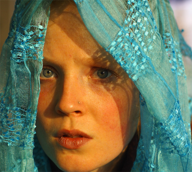
very nice. IMO a little more shadow on her LH side(viewers rh) would be good.
Edit: Again, very nice portrait. I think the light just needs softened just a touch. 8 |
|
|
|
03/27/2006 10:44:09 PM |
I think a little Neat Image would've got you the skin tone he achieves.
Great photo!
:) |
|
|
|
03/27/2006 07:51:11 AM |
| Not very much like the original but certainly strong enough to stand on its own as a great portrait. -8- |
|
|
|
03/27/2006 07:23:54 AM |
| The eyes do not stand out - the left one is in the (rather harsh) shade and he whites could have been dodged a bit to increase the effect. Otherwise nice expression on the model. |
|
|
|
03/26/2006 03:10:36 PM |
|
|
|
03/25/2006 11:01:02 PM |
| Beautiful image, and a great tribute as well..... |
|
|
|
03/24/2006 06:33:26 PM |
| A little closer view of the eyes would have been perfect! Good photo. |
|
|
|
03/24/2006 01:13:33 PM |
| stunning. Love the colors. She looks very worried. |
|
|
|
03/24/2006 04:40:31 AM |
| Sorry, not trying to offend you but this doesn´t even come close to the original, the only thing I see similar is a girl and a cloth around her head. The composition, post processing, expression on the girl and especially the lighting are MUCH better in his shot. This is hardly bad though, you just picked a really hard shot to imitate and I think I am being overly hard on you for that reason. I ended up giving this a 5. |
|
|
|
03/24/2006 02:12:27 AM |
| that's a nice shot...i might have cropped a bit off the top to draw more attention to the eyes, also the shadow on the right eye covers it up a bit..good attempt 7 |
|
|
|
03/24/2006 12:13:48 AM |
| I commented on this in the regular entries. Did you upload it to your portfolio too. YIKES - not supposed to do that. |
|
Home -
Challenges -
Community -
League -
Photos -
Cameras -
Lenses -
Learn -
Help -
Terms of Use -
Privacy -
Top ^
DPChallenge, and website content and design, Copyright © 2001-2025 Challenging Technologies, LLC.
All digital photo copyrights belong to the photographers and may not be used without permission.
Current Server Time: 12/14/2025 07:28:10 PM EST.