| Author | Thread |
|
|
09/11/2006 08:47:50 AM |
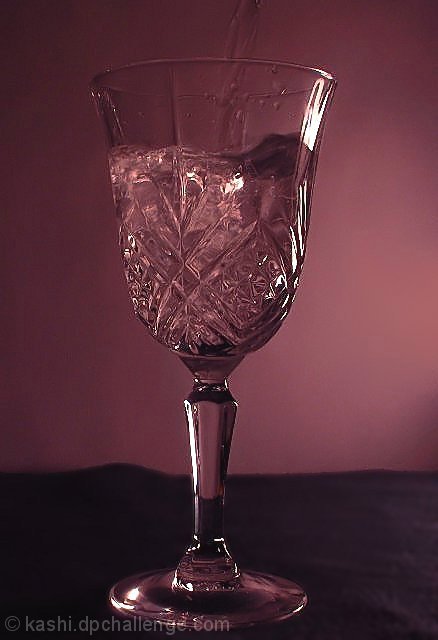
| I am oinclined to agree it is very hard to see the water in the glass. I think the purple colors are just to strong, and maybe in black & white, one may have been able to see the water. In saying that I happen to really like the purplish color tones as an effect. |
|
 Photographer found comment helpful. Photographer found comment helpful. |
Comments Made During the Challenge  |
|
|
04/02/2006 05:43:14 PM |
| The water is sort of lost with the cut crystal of the glass and the duotone chosen. And the horizon line would look better if straight. |
|
| Photographer found comment helpful. |
|
|
03/30/2006 06:48:09 PM |
| Adequate for the challenge, but not enough detail to hold interest. Noticeable jpeg artefacting around the edges of the glass detracts from the whole. |
|
| Photographer found comment helpful. |
|
|
03/30/2006 02:56:50 PM |
|
| Photographer found comment helpful. |
|
|
03/30/2006 06:25:15 AM |
| To me, this shot is too dark and too purple to be rated higher than average. |
|
| Photographer found comment helpful. |
|
|
03/28/2006 10:14:16 AM |
I'm not too keen on the colors of this.
I think a straight black and white would be more impactful. |
|
| Photographer found comment helpful. |
Home -
Challenges -
Community -
League -
Photos -
Cameras -
Lenses -
Learn -
Help -
Terms of Use -
Privacy -
Top ^
DPChallenge, and website content and design, Copyright © 2001-2025 Challenging Technologies, LLC.
All digital photo copyrights belong to the photographers and may not be used without permission.
Current Server Time: 03/17/2025 10:44:19 PM EDT.