| Author | Thread |
Comments Made During the Challenge  |
|
|
04/03/2006 02:28:03 PM |
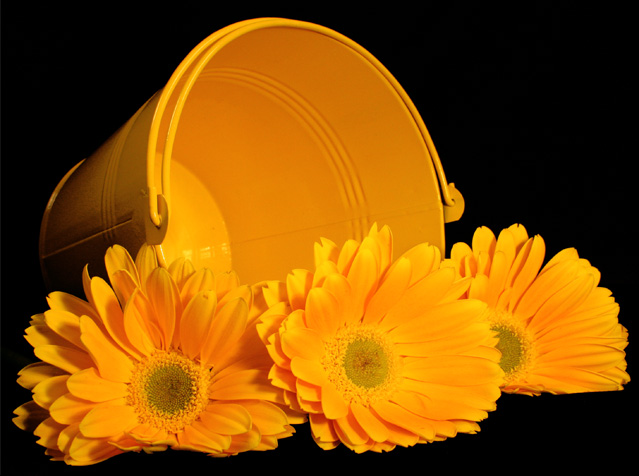
| The black background really makes the colors of the pail and the daisies pop visually. Composition of elements is good. My critiques are on some composition and some technical elements that need some improvement. First, some of the flowers in the forefront are a tad soft in detail - the edges of the petals on the flower on the far right appear in sharper focus than the one in the middle and far left - perhaps a smaller aperature would increase the depth of field and sharpness of details. Next, the hue in the daisies and the hue of the pail are very close in color so much so that they blend in together a little too well. I would have liked them to be more distict and individual in the hues. Lastly, the hues of the flowers trend more to the orange-yellow hues rather than the yellow-yellow hues most would be expecting. But by and large the reason why this falls in just the good category rather than extraordinary is that the hues of both objects are too close to each other such that the individual beauty of each does not stand out. Hmmm- maybe the addition of some green folliage (leafy foliage that would make it look more like a bouquet spilled out) would break up those same color hues. |
|
 Photographer found comment helpful. Photographer found comment helpful. |
|
|
04/03/2006 08:24:10 AM |
| Strong image with strong yellows..... |
|
| Photographer found comment helpful. |
|
|
04/03/2006 03:06:03 AM |
| Love this one.. the simple colors on black really make it stand out. Gorgeous. :) |
|
| Photographer found comment helpful. |
Home -
Challenges -
Community -
League -
Photos -
Cameras -
Lenses -
Learn -
Help -
Terms of Use -
Privacy -
Top ^
DPChallenge, and website content and design, Copyright © 2001-2025 Challenging Technologies, LLC.
All digital photo copyrights belong to the photographers and may not be used without permission.
Current Server Time: 03/14/2025 11:52:28 AM EDT.