| Author | Thread |
|
|
04/20/2006 09:58:15 PM |
Greetings from the Critique Club!
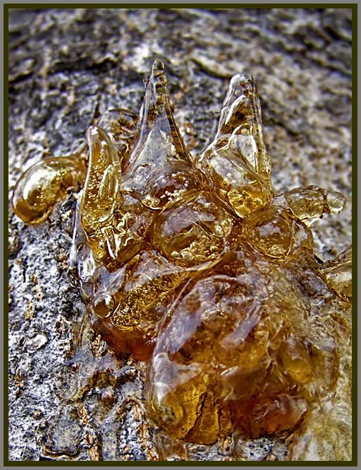
This is an interesting shot - I like the warm colors in front of the cool, monochromatic background.
The image does not really stand out or pop very much though. I think part of this is the lack of significant texture in the bottom part of the amber. I am not sure if this image could have benefitted from a deeper depth of field, or maybe simply a tighter crop on the upper part of the amber. With your particular camera, I am not sure if you could have done that. But what I see is a lot of the texture of the amber being lost in the bottom section, which is a bit of a shame since the texture is the overall theme. I hope this helps, and that I did not sound too critical - overall I do like the shot.
-Rich |
|
 Photographer found comment helpful. Photographer found comment helpful. |
Comments Made During the Challenge  |
|
|
04/12/2006 08:33:21 PM |
|
| Photographer found comment helpful. |
|
|
04/12/2006 05:00:55 AM |
| Great capture! Maybe more dof would work better. |
|
| Photographer found comment helpful. |
|
|
04/10/2006 09:07:09 PM |
| 6 - Nice. Good concept. Colors are good. Different angle perhaps, the OOF area dominates this too much within the composition in my opinion. Like the detail and clarity on the other areas though. Not sure on the frame. |
|
| Photographer found comment helpful. |
|
|
04/08/2006 08:45:21 PM |
|
| Photographer found comment helpful. |
|
|
04/07/2006 10:35:55 AM |
| Nice contrast in textures, congratulations. |
|
| Photographer found comment helpful. |
Home -
Challenges -
Community -
League -
Photos -
Cameras -
Lenses -
Learn -
Help -
Terms of Use -
Privacy -
Top ^
DPChallenge, and website content and design, Copyright © 2001-2025 Challenging Technologies, LLC.
All digital photo copyrights belong to the photographers and may not be used without permission.
Current Server Time: 03/14/2025 09:26:40 AM EDT.