| Author | Thread |
Comments Made During the Challenge  |
|
|
08/12/2003 01:27:47 AM |
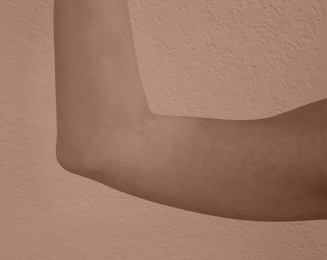
| Good idea. I feel like the contrast isn't it's best in this picture, I almost missed the arm completely. The tinting doesn't help much and I think you could have used brighter lighting. Good effort! |
|
 Photographer found comment helpful. Photographer found comment helpful. |
|
|
08/11/2003 04:55:18 AM |
| Like to see a little more contrast. I like that you could see some texture of the walls. Great title. |
|
| Photographer found comment helpful. |
|
|
08/09/2003 11:49:04 AM |
| The models arm is too pale for the background you chose |
|
| Photographer found comment helpful. |
|
|
08/09/2003 05:14:28 AM |
| I would have liked a little more contrast or better focus on the arm, to make it stand out from the wall. As it is, the photo looks a bit flat. And with the title, I would have liked to see the hand - its sort of intrinsic to the gesture of taking an oath. Nice idea for the challenge. |
|
| Photographer found comment helpful. |
|
|
08/08/2003 12:24:59 AM |
| I suppose it is close enough to a right angle. But it isn't very interesting. It would perhaps portray the intended subject better if the background was more suggestive of a courtroom than a living room (preferably showing a bench with a gavel, but at least wood paneling). And the attached hand should really be included. |
|
| Photographer found comment helpful. |
|
|
08/06/2003 11:10:32 PM |
| Don't understand the meaning of the pic's Title. The picture is not interesting and the lighting is terrible. The wall for a background isn't too good either. Other then that I really like it. :D |
|
| Photographer found comment helpful. |
|
|
08/06/2003 07:55:28 PM |
| A nice idea but just to washed out :( sorry 4 |
|
| Photographer found comment helpful. |
|
|
08/06/2003 01:53:50 PM |
|
| Photographer found comment helpful. |
|
|
08/06/2003 03:27:03 AM |
| blackish background I Tthink would have worked much better for this |
|
| Photographer found comment helpful. |
|
|
08/06/2003 02:18:50 AM |
| poor lighting, poor composition. |
|
| Photographer found comment helpful. |
Home -
Challenges -
Community -
League -
Photos -
Cameras -
Lenses -
Learn -
Help -
Terms of Use -
Privacy -
Top ^
DPChallenge, and website content and design, Copyright © 2001-2025 Challenging Technologies, LLC.
All digital photo copyrights belong to the photographers and may not be used without permission.
Current Server Time: 03/15/2025 10:13:04 AM EDT.