| Author | Thread |
Comments Made During the Challenge  |
|
|
07/21/2002 07:08:00 PM |
| I like the way this picture is framed, and the basic composition is nice. It just seems a little flat to me. I think a brilliant blue sky (out of your control, unless a polarizer works), or a tighter focus on the building fartherest away might help. I like that you got it devoid of people. |
|
|
|
07/21/2002 05:37:00 PM |
| Seems a little flat. Maybe playing with the curves might add some more punch. Really great subject, though, and a nice crop. |
|
|
|
07/21/2002 10:42:00 AM |
| Very much a typical landscape photo. nice. |
|
|
|
07/21/2002 01:10:00 AM |
| I wish it was a bit brighter. |
|
|
|
07/20/2002 11:28:00 PM |
| Not very sharp ... try using a tripod or a faster shutter speed. |
|
|
|
07/20/2002 09:14:00 PM |
| nice compostion and reflections |
|
|
|
07/19/2002 04:46:00 PM |
| This looks almost like a painting. My main complaint is that your subject is too centered. Also this photo is quote overcompressed at 58K. You may wish to adjust your settings to use more of the 150K file size limit. 5-ClubJuggle. |
|
|
|
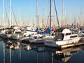
07/19/2002 03:14:00 PM |
| Really nice image, but the boats don't look very distinct/clear. Nice color. 7 Swash |
|
|
|
07/19/2002 02:03:00 PM |
| I wouldn't quite center the tower... 5 sjgleah |
|
|
|
07/19/2002 06:44:00 AM |
| Could be crisper, and needs the colours brought out better. |
|
|
|
07/19/2002 04:37:00 AM |
| Interesting colors of the buildings have not reached their full potential because of poor light. |
|
|
|
07/18/2002 04:52:00 PM |
| I'd have cropped this to 640x427 taking off most of the sky. Or, if editing for print, I'd create a mask for the sky and either colorize it or drop in another sky image. As it is I think having that bright swath draws the eye there and away from the main subject. |
|
|
|
07/17/2002 01:28:00 PM |
| really nice composition. Good lighting for this subject. |
|
|
|
07/17/2002 08:31:00 AM |
| composition divided in middle splits the imagery; photoshop to bring out color |
|
|
|
07/17/2002 03:20:00 AM |
|
|
|
07/16/2002 11:36:00 PM |
| This is horribly blurred, and the lighting is uninteresting. Was the lack of sharpness on purpose? This is just not good. The composition is ok. |
|
|
|
07/16/2002 09:37:00 PM |
| Wonderful photo! It looks like a postcard. |
|
|
|
07/15/2002 10:51:00 PM |
| I love the scene in this image, but the colors lack punch... These colorful buildings don't stand out as nicely as I would like... It appears that the weather wasn't working with you on this image :( = 6 - jmsetzler |
|
|
|
07/15/2002 08:16:00 PM |
| Is it blurry or too compressed? |
|
|
|
07/15/2002 07:37:00 PM |
| this would make a pretty puzzle |
|
|
|
07/15/2002 07:31:00 PM |
| Pity the colouring is so dull. Perhaps it should have been taken at a different time of day or in different weather. Always assuming you had a chance to come back at a different time...? |
|
|
|
07/15/2002 03:59:00 PM |
| Nice shot good composition but the focus is soft. Kee |
|
|
|
07/15/2002 10:15:00 AM |
| This is nice but seems too out of focus and for me lacks something 'special' to look at. 6 Lisa |
|
|
|
07/15/2002 09:57:00 AM |
|
|
|
07/15/2002 07:45:00 AM |
| I like the colors and the "look" of this photo - it is a lovely location, but it does not convey any particular "feeling" or "impact" to me. |
|
|
|
07/15/2002 03:29:00 AM |
| Looks like a very pretty town. I think if you had used a different angle, maybe closer some buildings, and focused more on the boats instead of the whole pond, you'd have a stronger image. |
|
|
|
07/15/2002 01:53:00 AM |
| Needs a little sharpening. |
|
Home -
Challenges -
Community -
League -
Photos -
Cameras -
Lenses -
Learn -
Help -
Terms of Use -
Privacy -
Top ^
DPChallenge, and website content and design, Copyright © 2001-2025 Challenging Technologies, LLC.
All digital photo copyrights belong to the photographers and may not be used without permission.
Current Server Time: 03/12/2025 11:58:01 AM EDT.