| Author | Thread |
|
|
07/22/2002 09:20:00 AM |
i think this is awesome but i think that oyu could have improved it by increasing the tonal range in your favorite image editor.
|
|
|
|
07/22/2002 02:48:00 AM |
What kind of flower is that?
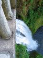
- These aren't flowers, they're actually Taro leaves.
About the color...I would've submitted a color version, but it really didn't look good at all. |
|
Comments Made During the Challenge  |
|
|
07/21/2002 11:59:00 PM |
|
|
|
07/21/2002 11:48:00 PM |
| Really awesome image, but as sick as you may be of hearing it, I'd much rather see this in color -- everything is very middle-gray in the shot, and I think that takes the excitement out. |
|
|
|
07/21/2002 09:10:00 PM |
| What kind of flower is that? |
|
|
|
07/21/2002 12:18:00 PM |
| Excellent work, the water drops look almost rendered. 9-ClubJuggle |
|
|
|
07/21/2002 09:09:00 AM |
|
|
|
07/20/2002 08:04:00 PM |
| great grayscale and very pleasing to the eye |
|
|
|
07/20/2002 12:17:00 AM |
|
|
|
07/19/2002 10:19:00 PM |
| beautiful. I like the contrast. |
|
|
|
07/19/2002 08:11:00 AM |
| I bet this looks nice in color |
|
|
|
07/19/2002 06:48:00 AM |
|
|
|
07/19/2002 03:33:00 AM |
| it might have looked better in color instead?? |
|
|
|
07/19/2002 12:30:00 AM |
| I missed color in this theme |
|
|
|
07/18/2002 11:05:00 PM |
| I hate to say this, cause I'm sure you had a reason for shooting it in B&W, but I really would have liked to see this one in color :-) 6 |
|
|
|
07/18/2002 02:44:00 AM |
|
|
|
07/17/2002 07:39:00 PM |
We've seen a lot of water drops here but yours are special. Superb contrast and clarity. I agree a good picture don't need a stinkin title. Composition9,
Technical Aspects9,
Meets Challenge9,
Originality9,
Average Score9,
Autool.
|
|
|
|
07/17/2002 07:16:00 PM |
| Great shot, the color version with its deep greens and the water would've made it a bit more lively. Nice affect though. |
|
|
|
07/17/2002 06:01:00 PM |
| excelent. maybe a bit more contrast/saturation |
|
|
|
07/17/2002 05:51:00 PM |
Very very interesting. - really cool - I'm going out on a limb and suggesting more contrast/white - a little too grey for me--or just a little more zing. Otherwise really excellent work!
Ruthann |
|
|
|
07/17/2002 05:47:00 PM |
| Rain or did you place the water. I think I would like color. |
|
|
|
07/17/2002 04:32:00 PM |
| i love it except for the grey 4 |
|
|
|
07/17/2002 03:07:00 PM |
| this might have looked better in color. |
|
|
|
07/16/2002 11:23:00 PM |
| I would have loved to see the water drop in the front leaf. Still a very nice pic. |
|
|
|
07/16/2002 04:26:00 PM |
| I like b/w shots but this just dosen't work for me. |
|
|
|
07/16/2002 02:36:00 PM |
| This is an interesting shot, but it seems to be begging for color. the black and white seems to flatten out the contrast quite a bit... = 6 - jmsetzler |
|
|
|
07/16/2002 10:51:00 AM |
| I really think this would have been better in color.Maybe if you punch up the contrast. |
|
|
|
07/16/2002 09:16:00 AM |
| not sure the B&W helps on this - the contrast is quite soft. Perhaps not enough light on the area that's been focused on. Could be interesting to isolate just one leaf/ water and have that as the only thing in the frame ? |
|
|
|
07/16/2002 12:51:00 AM |
| we have some of those plan |
|
|
|
07/15/2002 09:28:00 PM |
| Very nice! How do you get your water to shine? I tried this on a shot and it didn't bead up OR shine like this. karen_v |
|
|
|
07/15/2002 08:42:00 PM |
| The water looks silver in this photo! I like this. I just wish the leaf in the foreground wasn't so prominent. I keep wanting to push it out of my way! ;0) |
|
|
|
07/15/2002 05:02:00 PM |
| Interesting why you chose to remove the color from this photo. It seems to me that it would have worked much better in color. |
|
|
|
07/15/2002 04:09:00 PM |
| Very delicately photographed and processed. I love the tonality you've achieved with the B/W conversion. |
|
|
|
07/15/2002 02:13:00 PM |
| Nice. I'd also like to see this in color. |
|
|
|
07/15/2002 02:01:00 PM |
| How could you not title this photo, Its a great photo!! |
|
|
|
07/15/2002 01:51:00 PM |
| This is sooo nice. I love these water cupped shots. I would have been tempted to center on one leaf, but this is a really nice view. Color looked bad? (I really like color...) 8 Swash |
|
|
|
07/15/2002 12:51:00 PM |
|
|
|
07/15/2002 11:20:00 AM |
| I would have liked to have seen this in colour rather than B/W. |
|
|
|
07/15/2002 04:41:00 AM |
| Pretty nice shot. I do think the composition could of been improved. The leaf in the front is the least interesting. Your tones are okay I just would of liked them a bit lighter or with more contrast. Over all I like this shot. Kee |
|
|
|
07/15/2002 01:39:00 AM |
| Out of all the cliche'd flower pics, this one I think is my favorite. |
|
Home -
Challenges -
Community -
League -
Photos -
Cameras -
Lenses -
Learn -
Help -
Terms of Use -
Privacy -
Top ^
DPChallenge, and website content and design, Copyright © 2001-2025 Challenging Technologies, LLC.
All digital photo copyrights belong to the photographers and may not be used without permission.
Current Server Time: 03/13/2025 07:59:10 PM EDT.