| Author | Thread |
|
|
04/29/2006 03:54:43 PM |
::: Greetings from Critique Club :::
Hi, as requested, here is an indepth critique of your submission.
First Impression - the most important one:
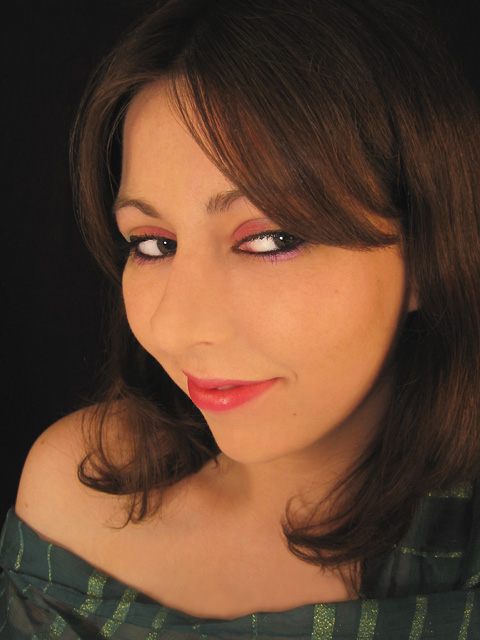
If I had such a lovely model standing in my mirror, I'd never use anyone else ;-)
Seriously, I thought it was a very good portrait. Loved the eyes. I only wish you had applied a bit more USM after resize.
Composition:
Works well. It's tight, but not so tight it makes me feel closterphobic. I think it is bold and "in-your-face". It deifinitely brings attention to your lovely eyes. (ok, I will "try" to quit flirting) :-)
Subject:
Usually, in a portrait, the subject is the person posing. I think you've gone as far as perhaps making your eyes the subject of the image. That's what I'm getting, anyway. The framing of the hair has really brought attention to them.
Technical (Color, focus, and light):
Color looks good to me. But may be just a little flat. Might want to be a bit more agressive with the curves.
Focus: A tiny bit soft, but perhaps just needed a bit more USM in post.DoF might have been just a bit too shallow also.
Lighting: Also, just a bit flat, but with the more agressive curve would have popped a bit more.
To grow its vote?:
A few technicals perhaps held you down. You beat me and portrait photography is what I do.
Summary:
[flirt on] Stunning, beautiful self-portrait. You can't pay for much prettier models. Those eyes kill me.[/flirt off]
I'm with Yanko and eschalar, this was highly under-rated. But, a few technicals could have popped you up a point or two. I think you did a great job, using a P&S.
[firt on]Here's to hoping we see more self-portraits from you :-) [/firt off again].
oh BTW:
Originally posted by moniepenny:
Edit: Well I didn't get it. Oh well. I'm wondering how the face is distorted though, I just don't see it...also I have a p&s, so wide angle isn't really a choice. |
I believe the "distortion" is a bit of misunderstanding of your uniquie PoV. Some might not like the "in-your-face" short focal length, close camera PoV.
Generally, portraits are shot with a less-wide zoom than you have used.
Hope to see more from you soon,
Leroy
Edit: for typos.
Message edited by author 2006-04-29 16:00:43. |
|
 Photographer found comment helpful. Photographer found comment helpful. |
|
|
04/26/2006 08:46:23 PM |
| I agree with MadMan2k, very underrated. I don't know much about portraits but this one just stands out in it's own unique way. |
|
| Photographer found comment helpful. |
|
|
04/24/2006 08:57:12 AM |
Highly underrated. Your pose is fantastic. Makeup is very good, hair is gorgeous, the angle is great. The lighting is absolutely appropriate to the picture. She's extremely beautiful too... This is a VERY flattering angle for this picture.
The only thing I'm concerned by is a slight unnaturalness in your eyes. Tough to say for sure though. Did you whiten with visine or dodge?
There seems to be a bit of a softness to the picture though that makes me feel like there could have been a bit more sharpening or contrast... Your skin seems a bit in-between. Not really soft, and not really sharp. That does have the potential to look good, but I don't think it's a positive here. I am currently trying to understand how so I can make better pictures myself. I suspect that what other's have said about flat lighting may have been a contributing factor...
I think this pic would be very fun with a light touch of ethereal glow. You've got fabluous cheekbones for it.
Message edited by author 2006-04-24 09:02:48. |
|
| Photographer found comment helpful. |
|
|
04/24/2006 01:27:24 AM |
| This is underrated, IMO. I don't mind the wide angle perspective even if it's not typically used in portraits, it seems to put more emphasis on the shape of the face. The shot does have fairly low contrast, though, so processing a little more to increase it would help. Nice model though :p |
|
| Photographer found comment helpful. |
Comments Made During the Challenge  |
|
|
04/23/2006 09:55:50 PM |
| lighting is not bad, but the angle of the shot really distorts her face. looks odd. |
|
| Photographer found comment helpful. |
|
|
04/22/2006 08:49:22 PM |
| Great expression. Could probably do more with this - but originality gets a bump up. |
|
| Photographer found comment helpful. |
|
|
04/22/2006 08:29:55 PM |
| Nice composition, color and focus. |
|
| Photographer found comment helpful. |
|
|
04/20/2006 10:55:08 PM |
| I think a cooler light would have brought out the red in the lips and teh makeup in the eyes... it may have possibly created a more natural skin tone. |
|
| Photographer found comment helpful. |
|
|
04/19/2006 07:30:57 AM |
| This is a perfect example why a wide lens is normally not used in portrait photography, it makes the things closest to the camera seem much bigger than the rest and isn´t flattering to most subjects. Try backing off next time and using a longer lens and I´ll bet you´ll like the results much better... |
|
| Photographer found comment helpful. |
|
|
04/19/2006 05:23:21 AM |
this is a terrific prespective/angle
Good work. |
|
| Photographer found comment helpful. |
|
|
04/18/2006 08:07:49 PM |
|
| Photographer found comment helpful. |
|
|
04/18/2006 04:35:19 PM |
| Very flat lighting makes the face almost featureless. More contrast would be better. |
|
| Photographer found comment helpful. |
|
|
04/18/2006 01:27:06 PM |
| Nice colors and pose. I like her eyes. Lacks contrasts in the face. |
|
| Photographer found comment helpful. |
|
|
04/17/2006 07:49:14 AM |
| cheeky! nice perspective, gorgeous face. Well done, hope you do well with this... |
|
| Photographer found comment helpful. |
|
|
04/17/2006 01:20:25 AM |
| The nose lacks profile. Maybe burn the shadows along the edge? Also, could use a luminance boost? Otherwise nice. 6 |
|
| Photographer found comment helpful. |
Home -
Challenges -
Community -
League -
Photos -
Cameras -
Lenses -
Learn -
Help -
Terms of Use -
Privacy -
Top ^
DPChallenge, and website content and design, Copyright © 2001-2025 Challenging Technologies, LLC.
All digital photo copyrights belong to the photographers and may not be used without permission.
Current Server Time: 04/28/2025 07:02:14 AM EDT.