| Author | Thread |
Comments Made During the Challenge  |
|
|
08/12/2003 01:11:23 AM |
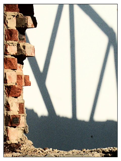
| This is an interesting shot. It was a good concept, but the aren't a whole lot of right angles in the shadow, which happens to be the main focus. Speaking of focus, I'm sure you know by now that this picture is a little out of focus. Oddly enough it's a little grainy too. |
|
 Photographer found comment helpful. Photographer found comment helpful. |
|
|
08/07/2003 03:31:59 PM |
| I like the use of the shadow and the brick "framing". |
|
| Photographer found comment helpful. |
|
|
08/07/2003 12:30:22 PM |
| interesting composition, but wish the brick was in focus! |
|
| Photographer found comment helpful. |
|
|
08/07/2003 09:43:01 AM |
| nearly abstract, if not for the reality of the bricks. Poetic qualities to this image emphasized by the title. Very good shot and interesting point of view. |
|
| Photographer found comment helpful. |
|
|
08/07/2003 08:15:52 AM |
| pixelated and unsharp. composition is not bad, it's just not apealing enough to look at. |
|
| Photographer found comment helpful. |
|
|
08/07/2003 05:59:45 AM |
| Needs focusing. Composition is nice. The shadow in the background is great. Just wish the photo had better focusing. |
|
| Photographer found comment helpful. |
|
|
08/07/2003 01:18:29 AM |
| this is a interesting shot.I feel that the focus is a bit rough and the eye finds it hard land On any part of the subject. 5 |
|
| Photographer found comment helpful. |
|
|
08/06/2003 06:50:45 PM |
| the bricks seem to washed out and the shadow looks as if this is 2 photos merged |
|
| Photographer found comment helpful. |
|
|
08/06/2003 03:50:39 AM |
| good idea, but too noisy and blurry |
|
| Photographer found comment helpful. |
|
|
08/06/2003 12:19:02 AM |
| The idea is great and I like the composition, but the bricks on the left could do with a little more sharpness, the black spot is a little distracting, and there is quite a bit of noise in the image. Although not technically perfect, the composition and interest is good. |
|
| Photographer found comment helpful. |
Home -
Challenges -
Community -
League -
Photos -
Cameras -
Lenses -
Learn -
Help -
Terms of Use -
Privacy -
Top ^
DPChallenge, and website content and design, Copyright © 2001-2025 Challenging Technologies, LLC.
All digital photo copyrights belong to the photographers and may not be used without permission.
Current Server Time: 03/12/2025 02:36:39 PM EDT.