| Photograph Information |
Photographer's Comments |
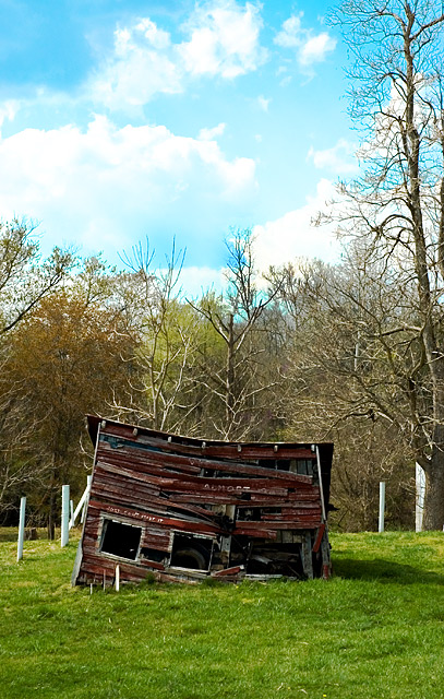
Challenge: Something Old II (Advanced Editing IV*)
Camera: Nikon D70
Lens: Nikon AF-S DX Zoom-Nikkor 18-70mm f/3.5-4.5G IF-ED
Location: Culpeper, VA
Date: Apr 13, 2006
Aperture: f/4.5
ISO: 200
Shutter: 1/250
Galleries: Landscape
Date Uploaded: Apr 14, 2006
|
This delapidated building sits on a small farm just inside the town limits. They have all kinds of signs up in their yard with pithy sayings and a "Population Count" (People: 7, Cats: A Bunch, Dog: Ran Away). A really ... unique ... place.
Taken with a polarizer on the lens to beef up the sky to begin with. From the camera this shot was spit through the "Direct Positive" filter of Adobe Lightroom, which was responsible for the incredible color contrast. Then to Photoshop! Minor crop to take out the edge of another building on the left side. One adjustment layer using a mask of the grass with a slight saturation boost and hue tweak, and another adjustment layer on the sky with a moderate saturation boost. Then a curves adjustment layer on the whole thing, to bring out some more definition in the cloud highlights and the building shadows. Finally, all that tweaking, especially the highlights end of the curves adjustment made the tops of the trees look like they were radioactive, so I used a simple burn tool on the tree tops and forest to "calm" them down a little.
Resize, Sharpen, Save for Web.
This was a fun shot to take, and I'm really glad this was an advanced challenge. The LightRoom filter probably would have been legal in basic, but I've been working on my PS skills using a couple textbooks, and I really had fun putting some of my learnings about selections, masks, and especially the curves tool. I think this is the most effective Post Processing I've done to a shot yet. |
| Author | Thread |
|
|
04/26/2006 05:58:19 PM |
A few things, although I like the picture and idea overall.
1) The composition is so centered. Boring. You know better than that.
2) The building is awesome, but is just a bit dark. We lose the great detail of all the wood planks.
3) I think you did a good job on the sky, but to be honest, the tone in the middle is my least favorite color of sky. It looks like faded slides to me. That's just a nitpick though. I think you did well with the sky.
It's mainly the centered composition which got you here, I think. |
|
 Photographer found comment helpful. Photographer found comment helpful. |
Comments Made During the Challenge  |
|
|
04/25/2006 11:28:48 AM |
too straight forward. no depth. no feel. and the sky colors are way off.
nice subject though. keep trying. |
|
| Photographer found comment helpful. |
|
|
04/25/2006 09:51:23 AM |
| Your WB is off here... too much of a blue tint. Oterwise a nice composition. |
|
| Photographer found comment helpful. |
|
|
04/22/2006 09:36:00 AM |
| Great sky.....nice image as well..... |
|
| Photographer found comment helpful. |
|
|
04/22/2006 12:57:05 AM |
| Wow, great colors and good subject! Nice |
|
| Photographer found comment helpful. |
|
|
04/21/2006 06:11:55 PM |
| Curious about what the writing says.... |
|
| Photographer found comment helpful. |
|
|
04/20/2006 12:34:05 AM |
|
| Photographer found comment helpful. |
Home -
Challenges -
Community -
League -
Photos -
Cameras -
Lenses -
Learn -
Help -
Terms of Use -
Privacy -
Top ^
DPChallenge, and website content and design, Copyright © 2001-2025 Challenging Technologies, LLC.
All digital photo copyrights belong to the photographers and may not be used without permission.
Current Server Time: 03/18/2025 04:55:57 AM EDT.