| Author | Thread |
|
|
02/25/2008 02:19:36 PM |
| I haven't seen this before - its lovely! |
|
 Photographer found comment helpful. Photographer found comment helpful. |
|
|
10/31/2007 10:34:05 AM |
| Excellent and touching portrait. Horribly underscored IMO. |
|
| Photographer found comment helpful. |
|
|
03/03/2007 08:08:25 AM |
| That's a sweet shot, Kashi! :) You should find an appropriate challenge and reshoot using the advice you got about composition, noise, and the blown highlights. You'd break 6 for sure! |
|
| Photographer found comment helpful. |
|
|
02/20/2007 11:19:49 AM |
| beautiful portrait, very nice light. |
|
| Photographer found comment helpful. |
|
|
01/27/2007 02:04:45 PM |
| very nce lighting , Great shot |
|
| Photographer found comment helpful. |
|
|
01/04/2007 03:15:37 PM |
| I had to add this to my "favorites", I love the lighting and his "contemplative" gaze. I do have to ask, how many shots did you have to take to get this perfect look? |
|
| Photographer found comment helpful. |
|
|
01/04/2007 02:34:40 PM |
Very Vermeer....and I like it.
Message edited by author 2007-01-04 14:35:02. |
|
| Photographer found comment helpful. |
|
|
12/30/2006 09:22:41 AM |
| This is absolutely beautiful. |
|
| Photographer found comment helpful. |
|
|
12/27/2006 07:03:21 PM |
| Well done, nice lighting.. |
|
| Photographer found comment helpful. |
|
|
12/22/2006 06:17:28 PM |
| Really like the way you have done this shot, love the black background! Adding to fav's! |
|
| Photographer found comment helpful. |
|
|
12/20/2006 11:22:26 AM |
| blurry a little and maybe too much noise but lightning is great! Keep up the good work! |
|
| Photographer found comment helpful. |
|
|
09/17/2006 10:03:41 PM |
| this is sweet...you have wonderful highlights making this work... |
|
| Photographer found comment helpful. |
|
|
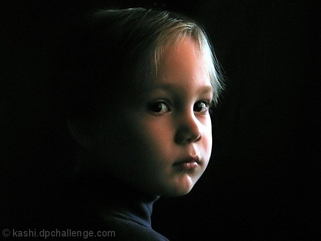
04/30/2006 01:45:02 PM |
::: Greetings from Critique Club :::
Hi, as requested, here is an indepth critique of your submission.
First Impression - the most important one:
Nice low-light portrait. You have a bit of noise (due to low light with a P&S) but overall a good quality portait.
Composition:
Composition is a bit irrelevant to discuss in portraits. As I see it, it either works or it does. Yours does, but I think it'd be a bit stronger if you had moved your subject to the left side of the frame.
Subject:
Clear, in-focus and well isolated from the background. And your lighting has wonderfully isolated the face.
Technical (Color, focus, and light):
Color: color is going a bit green in the shadows. I suspect that is due to the response curve of your camera in low light.
Focus is sharp.
Light: love it! Worked well for you. Only issue I have is the blown highlights in the hair at the right side of the image.
To grow its vote?:
Not actually sure. A bit stronger composition probably would have gotten you over the 6 mark as would the blown highlight area. But overall, there was some tough competition in the upper-ranks with a lot of expensive equipment.
Summary:
Well done portrait. Definitely a keeper.
To answer your question about banding: It is usually an artifact of having a large gradiant of colors. Banding is when the gradient does move smoothly from one shade to another and starts to visually seperate. I can't agree with crayon, I don't see it happening in your image. I think what he is seeing is difference in lighting that he assumes is banding. I say that because I don't see any distinct lines between shades of colors.
To see what I'm talking about try putting a posterization adjustment layer over the image and notice how the colors start to seperate.
Hope that helps and hope to see more from you soon,
Leroy |
|
| Photographer found comment helpful. |
|
|
04/25/2006 06:49:37 AM |
| Great job Kashi. See, everyone told you to keep shooting and keep shooting...the natural juices will eventually syart to flow! |
|
| Photographer found comment helpful. |
|
|
04/24/2006 05:34:54 AM |
Originally posted by crayon:
seems to be some banding (whatever they call it) on the child's face.
Could have been removed with softening. But if grain is what you are after, there isn't enough in the photo to make it obvious - the one on this photo looks more accidental than purpose. cheers. 8 |
What is banding ? |
|
Comments Made During the Challenge  |
|
|
04/23/2006 10:13:07 PM |
| I really like the shot and the set up, just seems like the light is a touch on bright side. |
|
| Photographer found comment helpful. |
|
|
04/22/2006 01:32:36 PM |
| Beautiful shot. Perfect lighting. Some details seem to have burnt out and there seems to be some noice but still a wondrful capture.8. |
|
| Photographer found comment helpful. |
|
|
04/21/2006 07:50:10 PM |
| I like the lighting...a beautiful portrait |
|
| Photographer found comment helpful. |
|
|
04/21/2006 06:42:04 PM |
| Great image, nice lighting. The grainess gives it a canvas like feel, although that may actually be hurting you in the voting (as DPC'ers hate noise). Nice capture. |
|
| Photographer found comment helpful. |
|
|
04/20/2006 11:14:10 PM |
| This image has a lot of noise in it. Shooting at a lower ISO could have helped with this. |
|
| Photographer found comment helpful. |
|
|
04/19/2006 04:35:24 AM |
seems to be some banding (whatever they call it) on the child's face.
Could have been removed with softening. But if grain is what you are after, there isn't enough in the photo to make it obvious - the one on this photo looks more accidental than purpose. cheers. 8 |
|
| Photographer found comment helpful. |
|
|
04/18/2006 10:47:14 PM |
| Great lighting and great expression. Very nice capture. |
|
| Photographer found comment helpful. |
|
|
04/18/2006 07:38:55 PM |
the lighting here is splendid and the kid's position is very unique.
great work. |
|
| Photographer found comment helpful. |
|
|
04/18/2006 04:12:18 PM |
|
| Photographer found comment helpful. |
|
|
04/18/2006 01:54:15 AM |
|
| Photographer found comment helpful. |
|
|
04/17/2006 10:11:29 PM |
| very nice! light is a little bit hard but still a great picture! 8 |
|
| Photographer found comment helpful. |
|
|
04/17/2006 03:30:10 PM |
| I love the dramatic lighting. It creates a perfect mood for his expression. Well done getting a catchlight into his left eye. I think the highlights are too hot, though. 7 from me. |
|
| Photographer found comment helpful. |
|
|
04/17/2006 02:01:23 PM |
| Maybe cropped in a little tight from the top, but I like everything else. |
|
| Photographer found comment helpful. |
|
|
04/17/2006 11:35:05 AM |
| Nice image with lovely soft lighting, but the noise in the photo really detracts for me. I also think strong focus or selective sharpening on the eyes would have been great, and a portrait orientation of the image overall would have been most effective. |
|
| Photographer found comment helpful. |
|
|
04/17/2006 10:38:59 AM |
| nice lighting... I'm not sure about the centered on approach though. |
|
| Photographer found comment helpful. |
|
|
04/17/2006 08:52:19 AM |
| Very effective! Looks a little grainy - you may have been going for that. Great shot. |
|
| Photographer found comment helpful. |
|
|
04/17/2006 07:56:28 AM |
| This is beautiful. The lighting just blows me away. 10 |
|
| Photographer found comment helpful. |
|
|
04/17/2006 07:25:54 AM |
| Nice shot...composition isn't great though...would have used the rule of thirds on this... |
|
| Photographer found comment helpful. |
|
|
04/17/2006 06:08:26 AM |
| Wow that's good. If you get the chance to try it, move the subject left onto the thirds line and print it. I'd be interested in how it looks |
|
| Photographer found comment helpful. |
|
|
04/17/2006 04:45:08 AM |
| I think this would be so much better if the left side was cropped more. Great lighting and expression. |
|
| Photographer found comment helpful. |
|
|
04/17/2006 01:43:31 AM |
|
| Photographer found comment helpful. |
Home -
Challenges -
Community -
League -
Photos -
Cameras -
Lenses -
Learn -
Help -
Terms of Use -
Privacy -
Top ^
DPChallenge, and website content and design, Copyright © 2001-2025 Challenging Technologies, LLC.
All digital photo copyrights belong to the photographers and may not be used without permission.
Current Server Time: 03/13/2025 11:08:56 AM EDT.