| Author | Thread |
Comments Made During the Challenge  |
|
|
04/23/2006 04:30:10 AM |
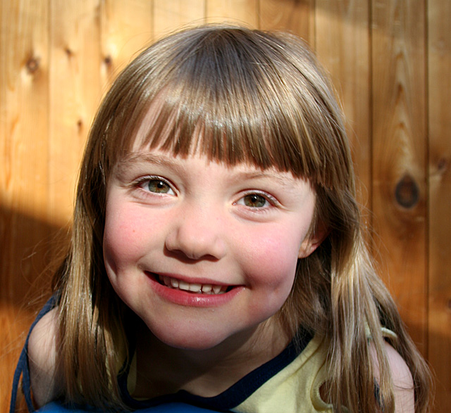
| Very cute however I don't like the background. Even though it's not in focus the wood background still has a lot of detail that draws attention back there. |
|
 Photographer found comment helpful. Photographer found comment helpful. |
|
|
04/21/2006 07:54:13 PM |
| So beautiful like the way you captured the sun across her face. |
|
| Photographer found comment helpful. |
|
|
04/20/2006 07:05:27 PM |
| a nice pic of a lovely girl. but... the focus is a little weak, and the shadow on her lower cheeks and chin is a bit distracting. |
|
| Photographer found comment helpful. |
|
|
04/19/2006 04:28:58 PM |
| Sweet looking little girl. I think a different colored background would have helped it to look more "portrait-ish." |
|
| Photographer found comment helpful. |
|
|
04/19/2006 05:19:23 AM |
| what a sweet smile. be careful with the handshakes though - focus looks a bit off unintentionally. |
|
| Photographer found comment helpful. |
|
|
04/18/2006 09:20:27 AM |
|
| Photographer found comment helpful. |
|
|
04/17/2006 11:37:56 PM |
| Lighting is uneven and focus is poor (eyes should be sharp) |
|
| Photographer found comment helpful. |
|
|
04/17/2006 10:02:20 PM |
| I will vote this low because the challenge specified a "studio" shot and this is obviously done outside in the backyard. Cute picture but it doesn't meet the challenge criteria. ;~( |
|
| Photographer found comment helpful. |
|
|
04/17/2006 11:40:49 AM |
| Just a tad blurry, and the shadow on her lower face is a bit strange. |
|
| Photographer found comment helpful. |
|
|
04/17/2006 10:30:39 AM |
| cute she looks like a young cameron dias with that smile. back ground is a little distracting though |
|
| Photographer found comment helpful. |
|
|
04/17/2006 10:03:23 AM |
| focus on the eyes is out. Also some strange light patterns... |
|
| Photographer found comment helpful. |
|
|
04/17/2006 06:22:42 AM |
| Does not look like a studio shot. |
|
| Photographer found comment helpful. |
|
|
04/17/2006 03:54:26 AM |
Beautiful girl , what a lovely smile , what lovely eyes !
I don't like the background because of the shadows.You should have tryed to use a different lighting or at least have placed a white board to avoid shadows in the chin zone. |
|
| Photographer found comment helpful. |
|
|
04/17/2006 01:14:53 AM |
| Not sure why, but the top of her face is a lot brighter than the bottom - like maybe the flash or strop was pointed at a slight upwards angle to the subject. |
|
| Photographer found comment helpful. |
Home -
Challenges -
Community -
League -
Photos -
Cameras -
Lenses -
Learn -
Help -
Terms of Use -
Privacy -
Top ^
DPChallenge, and website content and design, Copyright © 2001-2025 Challenging Technologies, LLC.
All digital photo copyrights belong to the photographers and may not be used without permission.
Current Server Time: 03/13/2025 09:04:23 AM EDT.