| Author | Thread |
|
|
04/30/2006 04:06:38 AM |
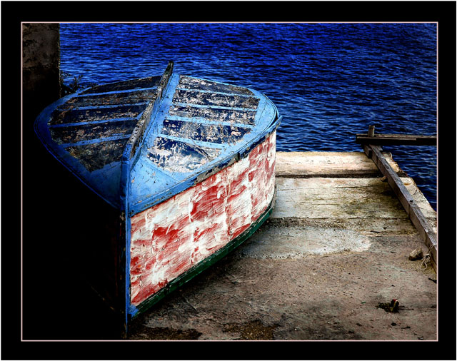
This is really very nicely seen, and it well deserves its high finish. I do have a couple of issues with the processing of it, but they don't take away from the quality of the essential work.
First and foremost, the frame seems way too heavy and restrictive for this image. Secondly, the burning-in of the water upper right is not very smoothly done, and it looks very artifical. If you did this by hand, you might want to know about how to do this kind of thing with gradient overlays. Feel free to PM me for an explanation of how, if you wish.
Finally, I wish there were a trace of separation between the boat and the wall/pier in the lower left. Not much, just a hint, to have that area come alive.
VERY nice work! |
|
|
|
04/29/2006 01:03:48 PM |
| the colors and textures in this one are magnificent. love the saturations. |
|
|
|
04/29/2006 06:04:06 AM |
| nice capture! Congrats on top 20 |
|
|
|
04/26/2006 10:17:25 AM |
| Nice finish. I really like this image. Congrats. |
|
Comments Made During the Challenge  |
|
|
04/25/2006 05:51:28 PM |
| I love the colors. The frame is too much thick for me. |
|
|
|
04/25/2006 12:12:01 PM |
| should have maybe not done so much burning. the water looks too blue and i can see your burn markings. |
|
|
|
04/24/2006 04:19:06 PM |
| Nice colours and contrast |
|
|
|
04/23/2006 07:39:19 PM |
| A litle bit to much blue and I´m not sure about the frame, but some how I still like this one 8 |
|
|
|
04/21/2006 06:22:09 PM |
| What wonderful colors you produced! |
|
|
|
04/21/2006 10:57:25 AM |
| Lotsa potential, but too much blue. |
|
|
|
04/20/2006 09:04:07 PM |
|
|
|
04/20/2006 07:17:28 PM |
| I really like this photograph. The compositon and complimentary colors make this visually appealing. I am not sure if it my monitor or not but it looks oversaturated. The water looked like velvet. Despit that I still think it is a much better than average shot. 7 |
|
|
|
04/20/2006 05:47:53 PM |
| good comp and color contrast. nice job! |
|
|
|
04/20/2006 11:32:36 AM |
| Very nice indeed - close to being over processed, a 6.5 (7). |
|
|
|
04/20/2006 12:00:30 AM |
| Very nice shot but just a bit to contrasty for me... I'll still score it high though because I think its just a personal taste thing. Good job. |
|
 Photographer found comment helpful. Photographer found comment helpful. |
|
|
04/19/2006 10:53:04 PM |
| I like the boat being shaded on the one side. |
|
| Photographer found comment helpful. |
|
|
04/19/2006 01:49:30 PM |
| great shot, love the lighting. |
|
|
|
04/19/2006 01:00:47 PM |
| I love the colors in this shot! |
|
|
|
04/19/2006 09:41:11 AM |
| The colour saturation is a little too over-done for my taste, but otherwise a nice image. |
|
| Photographer found comment helpful. |
|
|
04/19/2006 07:02:45 AM |
|
|
|
04/19/2006 12:45:00 AM |
| Love the red/blue theme. Great rich vibrancy. Nice off centering of the subject. So simple - yet lovely. |
|
Home -
Challenges -
Community -
League -
Photos -
Cameras -
Lenses -
Learn -
Help -
Terms of Use -
Privacy -
Top ^
DPChallenge, and website content and design, Copyright © 2001-2025 Challenging Technologies, LLC.
All digital photo copyrights belong to the photographers and may not be used without permission.
Current Server Time: 04/26/2025 05:37:00 PM EDT.