| Author | Thread |
|
|
04/29/2006 01:05:11 PM |
| the simlpicity of this image is just compelling due to the fact that the subject is quite old and degraded. congrats on top 20. |
|
|
|
04/29/2006 06:07:25 AM |
| Nice composition. well done! |
|
|
|
04/26/2006 02:21:49 PM |
| awesome shot...glad you didn't go the typical route and compose it with more sky...the foreground makes it somehow intimidating..makes me feel like I need to hesitate approaching it.. |
|
|
|
04/26/2006 12:57:58 AM |
| Not bad, Not bad at all! Im diging it. |
|
Comments Made During the Challenge  |
|
|
04/25/2006 11:40:14 PM |
| I like this very much...it has a story to tell. |
|
|
|
04/24/2006 12:58:33 PM |
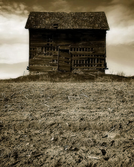
Do I smell a ribbon? Excellent. 10 edited: I cannot tell a lie, I actually scored this a 9. I must have gone back and changed it for some reason I no longer remember. But it is a wonderful image of decrepitude. The house seems to rise up organically from the dirt below it. The straight-on angle of the house makes it seem flat, robs the whole picture of depth, which actually serves to emphasize your subject more, and also create a mood of morbidity.
Message edited by author 2006-07-25 16:09:46. |
|
|
|
04/23/2006 10:05:52 PM |
| Wonderful image with great texture. Your centered composition works well. Good luck in the challenge. |
|
|
|
04/22/2006 02:08:41 PM |
| very nice shot i like it ! |
|
|
|
04/22/2006 07:32:17 AM |
| The decision to include all the bland and muddy foreground was inspired; I'd have probably unthinkingly cropped it out and lost all the drama that you have achieved. Presumably there's a lot of dodge & burn here, as well as some creative use of USM ... in which case this is a very fine (and rare) example of when heavy post-processing is justifiable. Nice work! 8. |
|
|
|
04/21/2006 06:31:26 AM |
| would like to see this composed off center. This way it just looks too square to my eye. Nice textures and details though and I think the sepia works well here. |
|
|
|
04/20/2006 07:39:23 PM |
| There is something in the symmetry that makes this photo work. The perspective you chose makes the crib look like it is teetering on a mountain top. It took a second look to give it the score it deserved. |
|
|
|
04/20/2006 06:28:42 PM |
| Very nice textures and tone |
|
|
|
04/20/2006 01:59:41 PM |
| beautifully run-down. I love this photo... a 9! |
|
|
|
04/20/2006 12:55:33 PM |
| Love the tones, the focus, the crop. A 10. |
|
|
|
04/20/2006 08:58:15 AM |
| Nice contrasts, the clouds make for an effective background. |
|
|
|
04/20/2006 06:54:01 AM |
| 8 - Nice shot and perspective. Processing and toning work well here. Like the composition. |
|
|
|
04/20/2006 12:25:14 AM |
| I like it, kinda gives me a children of the corn feeling of not wanting to look inside... |
|
|
|
04/19/2006 10:28:09 PM |
|
|
|
04/19/2006 01:57:59 PM |
|
|
|
04/19/2006 08:06:15 AM |
| Would like to see more sky on this one. |
|
Home -
Challenges -
Community -
League -
Photos -
Cameras -
Lenses -
Learn -
Help -
Terms of Use -
Privacy -
Top ^
DPChallenge, and website content and design, Copyright © 2001-2025 Challenging Technologies, LLC.
All digital photo copyrights belong to the photographers and may not be used without permission.
Current Server Time: 03/12/2025 02:30:08 PM EDT.