| Author | Thread |
|
|
05/07/2006 12:43:32 AM |
*Critique Club*
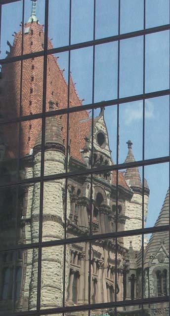
"Trinity Reflected" is a very interesting addition in the Window Framed challenge. I really do like the shot, and I guess you had a different interpretation of the challenge which is always good in my opinion.
The overall image is a great idea and I really like the frame being as full as you could fill it with the building. I think you might have placed higher if you increased the colors either by the levels of the contrast. This was a very natural looking shot, I read your comments and for not really meaning to take the shot it looks pretty good. Also I understand that you were able to make it bigger because of that, but because you are pretty close I don't think it hurt your score as much as it could of if the image were much smaller.
I am very glad you took the time to enter this challenge and I look forward to your future challenges. |
|
 Photographer found comment helpful. Photographer found comment helpful. |
Comments Made During the Challenge  |
|
|
04/30/2006 06:12:57 PM |
| great shot. I think a little more contrast and shadows would make it even better. |
|
| Photographer found comment helpful. |
|
|
04/30/2006 05:49:46 PM |
| ok, this would do awesome in a reflection challenge, but not in the window framed challenge |
|
| Photographer found comment helpful. |
|
|
04/30/2006 05:30:17 PM |
| neat image... could be enhanced to make it even better! neat theme... old vs. new |
|
| Photographer found comment helpful. |
|
|
04/30/2006 12:32:10 PM |
| Nice reflection, the colors look a bit muddy, had you run this shot through 'levels' or the equivalent and played with the 'hue/saturation' this could have been vastly improved |
|
| Photographer found comment helpful. |
|
|
04/30/2006 10:53:04 AM |
| This image would improve HEAPS if you dramatically increased the contrast in it, just try it, trust me. |
|
| Photographer found comment helpful. |
|
|
04/29/2006 08:50:22 PM |
|
| Photographer found comment helpful. |
|
|
04/29/2006 04:13:42 PM |
| This is a nice contrast of new and old. |
|
| Photographer found comment helpful. |
|
|
04/29/2006 01:22:53 PM |
| I think a quick levels adjustment would help this shot by getting rid of the hazy look, otherwise a nice shot. |
|
| Photographer found comment helpful. |
|
|
04/29/2006 11:04:46 AM |
| The colours seem a little flat here - I think you need to increase the contrast slighting in post processing. |
|
| Photographer found comment helpful. |
|
|
04/29/2006 10:25:45 AM |
| Nice shot, I could be wrong but it looks like it needs some Layers balancing done? Still a very strong composition and photo. |
|
| Photographer found comment helpful. |
|
|
04/29/2006 07:35:49 AM |
| beautiful building. some added contrast would improve it greatly |
|
| Photographer found comment helpful. |
|
|
04/29/2006 07:00:23 AM |
| This could have been a lot bet image, level, curves or anything to improve it. Its a flat side. Also need to keep your file size up to around 150k. |
|
| Photographer found comment helpful. |
|
|
04/29/2006 05:45:59 AM |
| Nice juxtoposition of the old and new. |
|
| Photographer found comment helpful. |
|
|
04/28/2006 11:15:21 PM |
|
| Photographer found comment helpful. |
|
|
04/28/2006 06:13:45 PM |
Think this one needs to be a bit darker to make it a bit sharper.
Nice capturing the old from the new! |
|
| Photographer found comment helpful. |
|
|
04/28/2006 07:58:35 AM |
| Pictorial reminder of the goal of any Believer! |
|
| Photographer found comment helpful. |
|
|
04/26/2006 11:51:29 AM |
| nice but would look better (to me) if the window lines were level |
|
| Photographer found comment helpful. |
|
|
04/25/2006 09:08:20 PM |
| picture could use a bump in contrast. |
|
| Photographer found comment helpful. |
|
|
04/24/2006 11:33:23 AM |
| Nice 'old and new' thing going on here. Could use a little boosting to the levels to give it more 'punch'. |
|
| Photographer found comment helpful. |
|
|
04/24/2006 07:35:15 AM |
| Love the IDEA I wish you had knocked the saturation level up a bit and given this a wipe-over with a USM filter to bring up the detail and the colour. I like the diaganal window frames against the gothiq building it works for me but please put more colour into it and get the BLACKS and WHITES cut in and this might of been top 10... good luck -8- |
|
| Photographer found comment helpful. |
Home -
Challenges -
Community -
League -
Photos -
Cameras -
Lenses -
Learn -
Help -
Terms of Use -
Privacy -
Top ^
DPChallenge, and website content and design, Copyright © 2001-2025 Challenging Technologies, LLC.
All digital photo copyrights belong to the photographers and may not be used without permission.
Current Server Time: 03/12/2025 09:31:39 AM EDT.