| Author | Thread |
|
|
07/22/2002 08:52:00 PM |
| I liked this shot and believe it should have been higher. I gave it a 7 |
|
|
|
07/22/2002 02:13:00 PM |
| I'd just like to second chariots comment. this photo should have done alot better IMHO. |
|
|
|
07/22/2002 07:15:00 AM |
| Wow. I can't believe you are this far down. This was a great photo and one of my 10's this week. |
|
Comments Made During the Challenge  |
|
|
07/21/2002 11:06:00 PM |
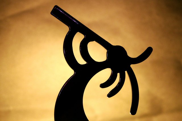
| nice photo, very evocative. since the strengths of this photo are also its weaknesses (soft backlighting and silhouette) i dont see any way to change these and make it better. composition is the only thing left to play with, and imho you have nailed it for all its worth! |
|
|
|
07/21/2002 10:58:00 PM |
| Yay for Kokopelli! I have this little guy on a keychain attached to my camera bag. I think this might have been better as a vertical and not a horizontal and I also would have gone ahead and added even more wrinkles/creases to the bacground -- but some people don't seem to like that. I think it would have made the lighting that much more interesting in the background to sue a crumpled paper effect. |
|
|
|
07/21/2002 02:37:00 AM |
| Good shot! This would have been even better to not see any shine on this side of him. |
|
|
|
07/20/2002 04:15:00 PM |
|
|
|
07/20/2002 12:11:00 AM |
|
|
|
07/19/2002 12:08:00 AM |
| I like the coloring you used for the background. |
|
|
|
07/18/2002 10:38:00 PM |
|
|
|
07/18/2002 01:37:00 PM |
| i love this design... the lighting on the background is excellent :) = 9 - jmsetzler |
|
|
|
07/18/2002 08:35:00 AM |
Its not a Silhouette, as there are points of light on it. It also seems a bit chopped off at the bottom, perhaps you could have cut some foiliage from black card to create a barrier at the bottom.
|
|
|
|
07/18/2002 08:34:00 AM |
| nice contrast but no depth |
|
|
|
07/17/2002 07:05:00 PM |
|
|
|
07/17/2002 02:35:00 PM |
GREAT photography!!! I love this - especially the soft background - really enhances the entire photo. Excellent work.
Ruthann |
|
|
|
07/17/2002 01:51:00 PM |
| Great contrast and lighting! |
|
|
|
07/17/2002 12:57:00 PM |
| i would've liked there to be a shadow on the wall. |
|
|
|
07/17/2002 12:28:00 PM |
|
|
|
07/16/2002 03:55:00 PM |
| Interesting. I like the lighting and focus. |
|
|
|
07/16/2002 03:18:00 PM |
|
|
|
07/16/2002 09:41:00 AM |
Hey that's a Cocopelli - have the Tatoo on my foot..:o)
Like the warm colour of the background and the contrast of the black figure. Nice done. 8 - Danie |
|
|
|
07/16/2002 12:25:00 AM |
| simple but beautiful... peaceful composition |
|
|
|
07/15/2002 08:29:00 PM |
| Great shot. The lighting is super. |
|
|
|
07/15/2002 04:00:00 PM |
| When I saw the thumbnail I knew I would love this one ! Finally after a few hours of voting here it is...I love it !!! I just love it ! Shiiizzzam =10 |
|
|
|
07/15/2002 02:43:00 PM |
| Very well set up shot. I'm interested to know what you used to create the background. |
|
|
|
07/15/2002 02:42:00 PM |
| Great shot, reminds me of some Hopi designs. I can't see anything to change/critique/comment. GREAT SHOT. (first 10 this week) 10 Swash |
|
|
|
07/15/2002 01:05:00 PM |
|
|
|
07/15/2002 11:16:00 AM |
| Nice shot. Your backdrop needs less wrinkles though. I like how the light is a brighter in the center, but it could be a little more even than it is. |
|
|
|
07/15/2002 06:06:00 AM |
| And yet, Koko is actually a black near-plane object and not a true silohuette. |
|
|
|
07/15/2002 04:43:00 AM |
| Over all a nice photo. Kee |
|
Home -
Challenges -
Community -
League -
Photos -
Cameras -
Lenses -
Learn -
Help -
Terms of Use -
Privacy -
Top ^
DPChallenge, and website content and design, Copyright © 2001-2025 Challenging Technologies, LLC.
All digital photo copyrights belong to the photographers and may not be used without permission.
Current Server Time: 03/12/2025 06:53:26 PM EDT.