| Author | Thread |
Comments Made During the Challenge  |
|
|
05/02/2006 09:27:23 PM |
| I like this shot, but the colors do not seem complementary. |
|
 Photographer found comment helpful. Photographer found comment helpful. |
|
|
05/02/2006 08:01:30 PM |
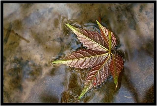
| Great clarity of the leaf. Like the water ripples around the leaf. |
|
| Photographer found comment helpful. |
|
|
05/02/2006 04:09:50 PM |
| Lovely image. I love the bronzy tones on this one. Great detail on the leaf. |
|
| Photographer found comment helpful. |
|
|
04/30/2006 09:58:23 PM |
|
| Photographer found comment helpful. |
|
|
04/30/2006 07:04:28 PM |
| what is that plant? *cough cough* |
|
| Photographer found comment helpful. |
|
|
04/30/2006 04:25:26 PM |
|
| Photographer found comment helpful. |
|
|
04/30/2006 11:07:22 AM |
| good composition. I think that the background is a little busy and takes away from your main subject a bit. |
|
| Photographer found comment helpful. |
|
|
04/30/2006 09:54:21 AM |
| doesnt fit the challenge enough |
|
| Photographer found comment helpful. |
|
|
04/29/2006 11:16:26 PM |
| Wow. I can't stop looking at this photo. I love how crisp the leaf looks against the smooth, yet murky water. Keep wanting to rotate the photo so the left edge is the top. |
|
| Photographer found comment helpful. |
|
|
04/29/2006 02:22:21 PM |
| i can almost see the sompliments here but could have been better IMHO |
|
| Photographer found comment helpful. |
|
|
04/29/2006 01:52:17 PM |
| barely enough color to qualify, 5 |
|
| Photographer found comment helpful. |
|
|
04/29/2006 08:53:27 AM |
| Sorry, I don't see the complementary colors here... |
|
| Photographer found comment helpful. |
|
|
04/29/2006 03:44:47 AM |
| Not really much color in this one to speak of; at least not the vibrant, highly saturated colors one would normally see in a complementary colors challenge. |
|
| Photographer found comment helpful. |
|
|
04/28/2006 09:33:43 PM |
| Have to say this is a favorite. The colors in the leaf, love that it is upside down, and the contrast of the reflections from the water pull this together nicely. Great job. |
|
| Photographer found comment helpful. |
|
|
04/28/2006 06:24:00 PM |
| How is this complemetary colors? |
|
| Photographer found comment helpful. |
|
|
04/26/2006 11:29:26 PM |
good shot
not much colors |
|
| Photographer found comment helpful. |
|
|
04/26/2006 09:09:03 PM |
| 3 - Like the concept, but struggling with the color scheme(s). Tweaking of the colors - red/green and/or blue/orange, plus sharper focus, make this better in my opinion. Not sure on the frame. |
|
| Photographer found comment helpful. |
|
|
04/26/2006 07:00:56 PM |
| I would enjoy this more if the colors were more vibrant |
|
| Photographer found comment helpful. |
|
|
04/26/2006 03:27:59 PM |
| Not sure which Complementary combo you're portraying (red/green?), but this is a beautifyl image. 8 |
|
| Photographer found comment helpful. |
|
|
04/26/2006 06:26:21 AM |
| quite soft in the focus...perhaps a bit of camera movement or leaf movement is blurring this |
|
| Photographer found comment helpful. |
Home -
Challenges -
Community -
League -
Photos -
Cameras -
Lenses -
Learn -
Help -
Terms of Use -
Privacy -
Top ^
DPChallenge, and website content and design, Copyright © 2001-2025 Challenging Technologies, LLC.
All digital photo copyrights belong to the photographers and may not be used without permission.
Current Server Time: 04/26/2025 11:18:02 PM EDT.