| Author | Thread |
Comments Made During the Challenge  |
|
|
05/02/2006 10:04:36 PM |
| Very cool, but not very complementary-dun wrry, i still luurve it, lol :) |
|
|
|
05/02/2006 07:22:04 PM |
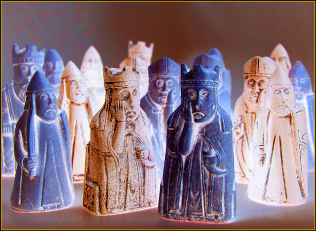
| These kings do indeed look worried. Nice title and good photo. |
|
|
|
05/01/2006 08:37:00 PM |
| haha. loved the looks on the faces... 9 |
|
|
|
05/01/2006 04:59:31 PM |
| Haha! The tones aren't a strong enough contrast.. but si funny! |
|
|
|
04/30/2006 06:19:06 PM |
| I agreee with your title. |
|
|
|
04/30/2006 05:33:40 PM |
| LMAO!! 10 for humor-- this made me laugh.. |
|
|
|
04/30/2006 05:00:41 PM |
|
|
|
04/30/2006 03:28:52 PM |
| Hahaha, you get a 5 just for having a sense of humor. If it makes you feel any better, I DO see the yellow and purple. |
|
|
|
04/30/2006 06:51:45 AM |
|
|
|
04/29/2006 11:14:08 PM |
| LOL excellent composition and color. |
|
|
|
04/29/2006 09:53:12 PM |
| I like the objects but there isn't much orange for this challenge (to go with the blue) |
|
|
|
04/29/2006 09:46:22 PM |
| lolol, too funny! I'm laughing at the expression on the faces of the chess pieces. Would have made a great negative image but I think it makes a good complementary colours image too. |
|
|
|
04/29/2006 06:21:41 PM |
| Nice lighting and interesting hues. |
|
|
|
04/29/2006 02:58:24 PM |
| uh oh! where are the compliments? |
|
|
|
04/29/2006 01:53:16 AM |
| This looks a little too overprocessed... |
|
|
|
04/28/2006 04:39:52 PM |
| I agree with the comment ;-) |
|
|
|
04/28/2006 02:11:43 PM |
| Comic, I like the composition and the expresion of the two figures. I think the colors need a bit of power. |
|
|
|
04/28/2006 02:46:45 AM |
| LOL @ the title. Actually, you have pulled this off nicely. I understand the negativity, but I just don't like the whiteness in the photo. 8 |
|
|
|
04/27/2006 09:30:31 PM |
| lol. probably should have. |
|
|
|
04/27/2006 08:45:16 PM |
| Humorus - adding point for that :-) |
|
|
|
04/27/2006 05:43:17 AM |
| He is right. Its a very clever idea, but colors could be saturated some more and frame doesn't add. in negative challenge i had given 7, here it is only 5 |
|
|
|
04/27/2006 04:35:38 AM |
:-)
Love the title and these statues are cool too |
|
|
|
04/27/2006 01:25:21 AM |
| Whoops - still, they fit here as well : ). |
|
|
|
04/26/2006 11:31:54 PM |
|
|
|
04/26/2006 10:21:10 PM |
|
|
|
04/26/2006 07:07:30 PM |
| 3 - A little unusual, still needs some tweaking of the colors to make it more unusual in my opinion, and especially for this Challenge. More balance, a more refined crop and the background 'blotches' fixed, make this better in my opinion. |
|
|
|
04/26/2006 06:56:25 PM |
| nice facial expressions. . . |
|
|
|
04/26/2006 03:07:15 PM |
| complimentary negatives - I like it. :-) |
|
|
|
04/26/2006 01:53:00 PM |
| ha ha - bolder colours would have met the challenge...but you raised a smile |
|
|
|
04/26/2006 12:24:20 PM |
|
|
|
04/26/2006 11:56:56 AM |
HA!
I have that chess set. |
|
|
|
04/26/2006 06:32:03 AM |
| yes you certainly should have...;-) |
|
Home -
Challenges -
Community -
League -
Photos -
Cameras -
Lenses -
Learn -
Help -
Terms of Use -
Privacy -
Top ^
DPChallenge, and website content and design, Copyright © 2001-2025 Challenging Technologies, LLC.
All digital photo copyrights belong to the photographers and may not be used without permission.
Current Server Time: 04/27/2025 07:55:22 AM EDT.