| Author | Thread |
|
|
05/04/2006 01:33:20 PM |
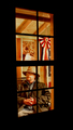
Critique Club Critique:
ladyhawk22
First Impression: An interesting old window with intriguing reflections, but it seems cropped too tight.
Composition: Because the close crop of this shot was something I immediately noticed, I think this is the area of the photo that might be most improved. You have framed the window with a row of bricks on the top, bottom, and left--but not the right. Seems like a strange thing to notice, but it can make a big difference! It looks like we're working with a pretty wide window here, but we want to keep the reflections, cause that's what makes it interesting, right? A tough choice, certainly. At the very least, if you are going to frame the window with brick, I would make sure that frame is on all sides. But I think what I would like to see even more is just more of this building. It's good to fill the camera frame with your subject, but I think we've come a little too close and it's starting to feel cramped. Give those nice reflections a little space to breathe! :-)
Subject: This was a difficult challenge--finding something interesting in a window isn't always as easy as it seems! I think that you chose some reflections which definitely have some interest. There's a variety of colors and shapes, accentuated by the individual window panes. It also appears to be an interesting building, which is likely why I want to see more of it!
Technical (Color, Focus, Light): The colors in this photo came out very well and true to life. The reds of the brick are particularly lovely and offset the colors in the reflections nicely. Focus seems to be pretty good as well. Lighting is good, especially on the lower bricks, but the top bricks are encased in a pretty dark shadow--not a HUGE deal, except that because of the close framing it leaves a large dark area that draws my eye away from your subject.
To Grow It's Vote: I would again suggest a slightly different cropping...I think that would help a lot. Pull back away from the building a bit more and include some more "negative space" to the left or the right. The rule of thirds is almost always a good one to follow. Also, in general, it seems that the photos which scored higher in this challenge were not necessarily based only on reflections...many utilized reflection as well, but generally included part of what was being reflected.
Summary: You have some great colors here which help to capture the eye! Just a couple little things to tweak and we're off and running! The technical aspects of your photography seem to be right on, so just keep up the good work!! |
|
 Photographer found comment helpful. Photographer found comment helpful. |
Comments Made During the Challenge  |
|
|
04/30/2006 07:24:40 PM |
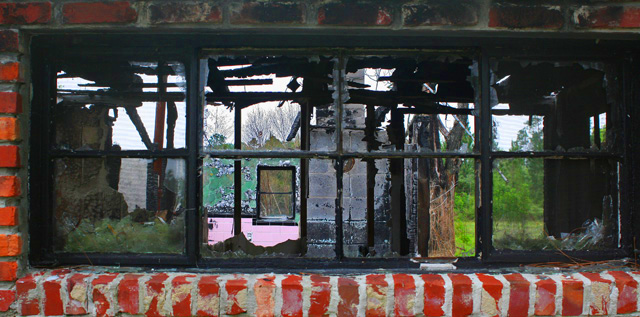
| Some great textures here, but the overal effect is too cluttered. |
|
| Photographer found comment helpful. |
|
|
04/30/2006 05:42:52 PM |
| This image as such is not really good: it is very busy and overwhelms the viewer with too many distracting details. An easy way to improve this photograph tremendously would be to include a person in it - somebody looking at the viewer through the window panes and drawing the attention on him- or herself. |
|
| Photographer found comment helpful. |
|
|
04/30/2006 02:52:52 PM |
| Great story telling image. Nice DOF. WOW 9! |
|
| Photographer found comment helpful. |
|
|
04/30/2006 11:42:42 AM |
| Very gritty, looks like a great location for a fashion shoot. |
|
| Photographer found comment helpful. |
|
|
04/30/2006 01:48:50 AM |
| Seems to be cut off just a little soon on the right.... |
|
| Photographer found comment helpful. |
|
|
04/29/2006 08:46:55 PM |
| Very busy pictture but so interesting to look at. I like it |
|
| Photographer found comment helpful. |
|
|
04/29/2006 04:29:37 PM |
| There's really too much going on in this window...reflections, broken stuff, there's just nowhere for the eye to really stop and come to a rest. |
|
| Photographer found comment helpful. |
|
|
04/29/2006 03:30:19 PM |
| It's not very inspiring. The strong colors of the brick dominate what is supposed to be framed. |
|
| Photographer found comment helpful. |
|
|
04/29/2006 01:18:13 PM |
| A bit too busy for me. Theres seems to be too many shapes and colors that it's hard to find a focal point. |
|
| Photographer found comment helpful. |
|
|
04/29/2006 10:53:17 AM |
| Great title and very emotive image! I like it alot, the colours and crop works very well. |
|
| Photographer found comment helpful. |
|
|
04/28/2006 06:18:56 PM |
| Nice colours but a horrible house. |
|
|
|
04/25/2006 09:04:47 PM |
| There seems to be some interest here but the detail is just too far away to view. A closer shot might have been better. |
|
| Photographer found comment helpful. |
|
|
04/25/2006 09:03:22 PM |
| Reds are pretty crazy! it would hav been nice to see a little of the RH side |
|
| Photographer found comment helpful. |
|
|
04/25/2006 12:58:56 PM |
| squares within squares within squares, windows within windows. love it. |
|
| Photographer found comment helpful. |
|
|
04/24/2006 11:40:58 PM |
| Sad image, but true to life as well..... |
|
| Photographer found comment helpful. |
|
|
04/24/2006 06:55:15 PM |
| excellent usage of frame and negative space. |
|
| Photographer found comment helpful. |
Home -
Challenges -
Community -
League -
Photos -
Cameras -
Lenses -
Learn -
Help -
Terms of Use -
Privacy -
Top ^
DPChallenge, and website content and design, Copyright © 2001-2025 Challenging Technologies, LLC.
All digital photo copyrights belong to the photographers and may not be used without permission.
Current Server Time: 04/26/2025 12:47:47 PM EDT.