| Author | Thread |
Comments Made During the Challenge  |
|
|
04/30/2006 11:24:36 PM |
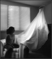
| a bit overexposed on myh monitor but otherwise a very nice shot |
|
 Photographer found comment helpful. Photographer found comment helpful. |
|
|
04/30/2006 11:00:51 PM |
| Nice, I have a picture very similar to this one! 8 |
|
| Photographer found comment helpful. |
|
|
04/30/2006 08:48:34 PM |
|
| Photographer found comment helpful. |
|
|
04/30/2006 07:30:43 PM |
| A little too close to just copying existing artwork for my liking. The windows have been over-exposed, losing detail. |
|
| Photographer found comment helpful. |
|
|
04/30/2006 03:13:25 PM |
| This is very pretty, good luck. |
|
| Photographer found comment helpful. |
|
|
04/30/2006 12:55:20 PM |
|
| Photographer found comment helpful. |
|
|
04/30/2006 12:08:26 PM |
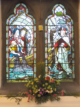
| very nice! i think it could use a little contrast boost and a little saturation on the flowers. |
|
| Photographer found comment helpful. |
|
|
04/30/2006 11:53:57 AM |
| Your photo is quite flat, since most of the shot is in the shadows, a small bit of curves made it pop out a bit more. Thus improving the colors. |
|
| Photographer found comment helpful. |
|
|
04/30/2006 11:25:44 AM |
| Try to make the most of the allowed 640 pixles next time, it will definately help your score. |
|
| Photographer found comment helpful. |
|
|
04/30/2006 01:47:29 AM |
| I'm sure this won't be your only size comment, but make sure you use the full 640 pixels when saving for the web. |
|
| Photographer found comment helpful. |
|
|
04/29/2006 11:17:58 PM |
| This is ok. Colors could be a bit more striking. It's a bit of a stretch for this competition - the subject is supposed to be framed by the window, not to be the window itself. |
|
| Photographer found comment helpful. |
|
|
04/29/2006 08:36:30 PM |
| Maybe a little more contrast needed. |
|
| Photographer found comment helpful. |
|
|
04/29/2006 04:31:05 PM |
| good idea, your composition is lacking and it's a bit small for my taste. |
|
| Photographer found comment helpful. |
|
|
04/29/2006 02:25:02 PM |
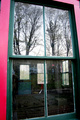
| hmm seems like it's not level |
|
| Photographer found comment helpful. |
|
|
04/29/2006 08:19:02 AM |
| you should have used more photoshop to contrast the photo more and make it more hars on the colors. |
|
| Photographer found comment helpful. |
|
|
04/28/2006 05:28:54 PM |
a bit overexposed, I think the colours would be stronger if the whole image was a bit darker. the flowers don't add anything to the photo. is this a coffin in the foreground?
Good luck |
|
| Photographer found comment helpful. |
|
|
04/25/2006 03:55:09 PM |
| your photo is a bit small. the subject doesn't really appeal to me. You may try to use another point of view or get towards the windows to get another composition. |
|
| Photographer found comment helpful. |
|
|
04/24/2006 11:40:17 PM |
| This is such a wonderful and very "inspiritual" moving image, that you have done. I like it, and I hope it gets the votes it deserves, and is on the front page..... |
|
| Photographer found comment helpful. |
|
|
04/24/2006 12:27:27 PM |
First, you should probably use the full 640 pixels allowed.
Second, to my eyes, this doesn't really have a well defined point of focus. Am I supposed to look at the stained glass, or am I supposed to look at the flowers? |
|
| Photographer found comment helpful. |
Home -
Challenges -
Community -
League -
Photos -
Cameras -
Lenses -
Learn -
Help -
Terms of Use -
Privacy -
Top ^
DPChallenge, and website content and design, Copyright © 2001-2025 Challenging Technologies, LLC.
All digital photo copyrights belong to the photographers and may not be used without permission.
Current Server Time: 03/12/2025 09:34:13 AM EDT.