| Author | Thread |
|
|
05/07/2006 01:59:31 PM |
Comment:
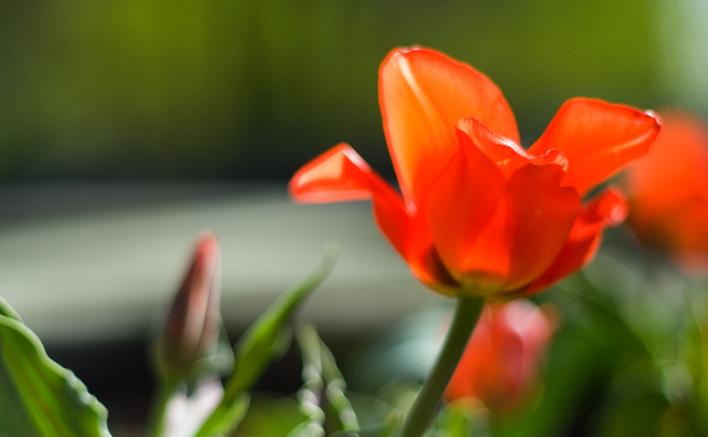
Hello from the Critique Club!!!
Composition:
This is a very nicely composed shot. The subject if off center and that is usually a good thing
Background/ Foreground
The shallow DOF has the background blurred but the foreground is also blurry. It is hard to see exactly where your focal point is.
Camera Work:
The focus is off which makes the whole shot seem blurry. I like colors they are crisp and bright.
Post-Processing:
I might have tried a tighter crop to get rid of the green on the left.
My Opinion:
I think the members comments are right on for the most part. A better focus and better DOF would have made this a much better shot.
I hope you find these comments to be helpful, thank you for allowing me to critique your picture. If you have any questions or concerns feel free to contact me via PM.
Best of luck in your future photographic endeavors,
Regards,
Karen Doss
|
|
Comments Made During the Challenge  |
|
|
05/02/2006 08:11:58 PM |
| I like the tome of the colours here. Unfortunately, there doesn't seem to be a focal point here for me. If I look hard, it appears the the very center of the flower is in focus with a high degree of dof for the rest. Unfortunately, most voters will not see it and will vote according to the belief that the entire picture is out of focus. On a another point, parts of the pic appear to be overexposed. |
|
 Photographer found comment helpful. Photographer found comment helpful. |
|
|
05/01/2006 07:53:25 PM |
| Exposure is too bright. Focus could be better as well to show more detail in the separate petals. |
|
| Photographer found comment helpful. |
|
|
04/30/2006 10:11:54 PM |
|
| Photographer found comment helpful. |
|
|
04/30/2006 07:35:32 PM |
| It's not in focus exactly...or it's not very sharp. |
|
| Photographer found comment helpful. |
|
|
04/30/2006 05:17:36 AM |
| The colours are great, and they are certainly complementry, however I think the subject matter lets you down in this one. |
|
| Photographer found comment helpful. |
|
|
04/30/2006 01:39:58 AM |
| This looks like orange and green rather than red and green. |
|
| Photographer found comment helpful. |
|
|
04/29/2006 09:29:50 AM |
|
| Photographer found comment helpful. |
|
|
04/28/2006 04:43:14 PM |
| Lacks proper focus or at the very least the focus is too tight. |
|
| Photographer found comment helpful. |
|
|
04/26/2006 11:27:03 PM |
|
| Photographer found comment helpful. |
|
|
04/26/2006 07:50:06 PM |
| 5 - Nice. Softness works here in my opinion. Having said that, still like to see a little more definition, even in the lines/shapes. Perhaps a little more height too, not sure. Difficult, but the colors tweaked more, especially for the Challenge. A sharper angle/perspective to reduce that 'gray' also. |
|
| Photographer found comment helpful. |
|
|
04/26/2006 07:27:35 PM |
|
| Photographer found comment helpful. |
|
|
04/26/2006 07:35:54 AM |
| the shot is really quite blurry |
|
| Photographer found comment helpful. |
Home -
Challenges -
Community -
League -
Photos -
Cameras -
Lenses -
Learn -
Help -
Terms of Use -
Privacy -
Top ^
DPChallenge, and website content and design, Copyright © 2001-2025 Challenging Technologies, LLC.
All digital photo copyrights belong to the photographers and may not be used without permission.
Current Server Time: 03/11/2025 02:57:47 PM EDT.