| Author | Thread |
|
|
05/07/2006 12:03:28 AM |
::: Critique Club :::
Hi, my name is Kari and from the critique club.
First Impression - the most important one:
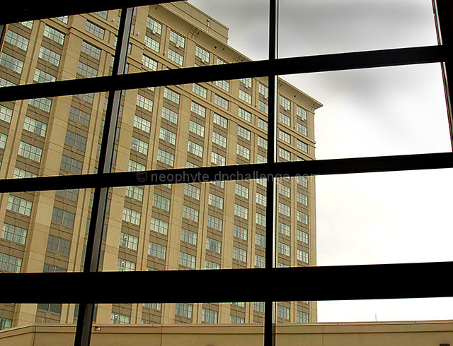
Yup. Have to concur with the other commentors .. it lacks a little on on the interest side.
Composition:
The composition is fine .. and it works for what it is.
Subject:
Meets the challenge.
Technical (Colour and light):
Sharp .. nice colours ... good contrast .. the sky being gray just detracts from the interest .. it is hard that we can't just dictate the weather.
To grow its vote?:
Find a point of interesting which captures the viewer.
Summary:
Solid portfolio shot .. well done ..
If you've got any questions about this critique, please feel free to contact me via the PM system.
Cheers
Kari |
|
 Photographer found comment helpful. Photographer found comment helpful. |
Comments Made During the Challenge  |
|
|
04/30/2006 10:14:39 PM |
| Very average except for the color contrast ratio and exposure dead on so I gave this a 6 for technical merits. |
|
| Photographer found comment helpful. |
|
|
04/30/2006 03:06:58 PM |
| interesting use of lines. |
|
| Photographer found comment helpful. |
|
|
04/30/2006 09:06:27 AM |
| It meets the challenge, but isn't a very interesting subject. |
|
| Photographer found comment helpful. |
|
|
04/29/2006 11:02:09 PM |
| Too much monotony in this composition for my taste. |
|
| Photographer found comment helpful. |
|
|
04/29/2006 06:21:53 PM |
| this seems like more of a snapshot if anything, and it just seems like the window frame "got in the way" instead of being part of the photograph. |
|
| Photographer found comment helpful. |
|
|
04/29/2006 10:55:47 AM |
| something more interesting outside would improve this a lot |
|
| Photographer found comment helpful. |
|
|
04/29/2006 09:56:56 AM |
| Nice angle although the subject isn't that interesting. Good luck. |
|
| Photographer found comment helpful. |
|
|
04/29/2006 02:56:54 AM |
| Great minimal palette and composition. 10 |
|
| Photographer found comment helpful. |
|
|
04/27/2006 04:18:02 PM |
| I think, as far as this place is concerned, images such as this which depend for their effect on the purely graphic are more liked if they have big bright colours. There is something to the relationship of glass and glass here, but perhaps it needs something to emphasise that first layer of glass? Reflections maybe? Just thoughts ... |
|
| Photographer found comment helpful. |
|
|
04/26/2006 11:53:04 PM |
| This really isn't that interesting of a shot. Sorry. |
|
| Photographer found comment helpful. |
|
|
04/25/2006 07:19:33 PM |
| Subject is a bit ordinary but I like the idea |
|
| Photographer found comment helpful. |
Home -
Challenges -
Community -
League -
Photos -
Cameras -
Lenses -
Learn -
Help -
Terms of Use -
Privacy -
Top ^
DPChallenge, and website content and design, Copyright © 2001-2025 Challenging Technologies, LLC.
All digital photo copyrights belong to the photographers and may not be used without permission.
Current Server Time: 03/10/2025 11:08:47 PM EDT.