| Author | Thread |
|
|
05/06/2006 04:33:35 PM |
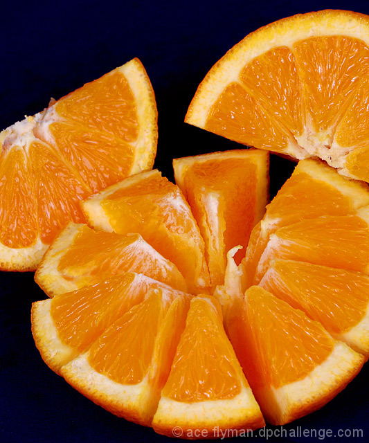
It's an excellent picture - I caned it in the challenge voting because complementary colours need to be similarly weighted in order to be truly complementary. (By 'weighted' I mean they should have the same dark/light tone). Were it not in the challenge, or even better, if it were in an 'appetising food' challenge - bingo. The picture pushes my thirst-for-fruit buttons.
So don't despair :)
 |
|
 Photographer found comment helpful. Photographer found comment helpful. |
Comments Made During the Challenge  |
|
|
05/02/2006 09:24:21 PM |
| At first I didn't notice the background was a very dark shade of blue. I take it not everyone will see that. Shame because this is a very good photo. 9! |
|
| Photographer found comment helpful. |
|
|
05/02/2006 08:07:07 PM |
| I can taste the orange. great photo! |
|
| Photographer found comment helpful. |
|
|
05/02/2006 05:26:07 PM |
| where is the complementary color?? |
|
| Photographer found comment helpful. |
|
|
05/02/2006 04:31:46 PM |
| Really great photo. Looks good enough to eat. |
|
| Photographer found comment helpful. |
|
|
05/02/2006 03:36:32 AM |
| Great, great image of an orange - it looks good enough to eat. But where is the complimentary colour? Such a shame, the sharpness and composition of this are very good. |
|
| Photographer found comment helpful. |
|
|
05/01/2006 04:57:33 PM |
| Cool orange, but I don't see the contrast. The background is not blue enough! |
|
| Photographer found comment helpful. |
|
|
04/30/2006 07:24:06 PM |
| Looks delicious. Nice lighting. |
|
| Photographer found comment helpful. |
|
|
04/30/2006 07:14:49 PM |
|
| Photographer found comment helpful. |
|
|
04/30/2006 04:47:27 PM |
|
| Photographer found comment helpful. |
|
|
04/30/2006 11:35:57 AM |
| doesnt meet the challenge |
|
| Photographer found comment helpful. |
|
|
04/29/2006 10:06:01 PM |
| great picture but no complementary color for the orange (at least on my screen) |
|
| Photographer found comment helpful. |
|
|
04/29/2006 09:37:06 PM |
| You have captured the flesh of the orange very well! The surrounding colour looks black but I can see shades of blue at the bottom. Good luck. |
|
| Photographer found comment helpful. |
|
|
04/29/2006 09:32:53 PM |
| you forgot the purple unless the background was supposed to look purple but great detail |
|
| Photographer found comment helpful. |
|
|
04/29/2006 04:31:21 AM |
| wheres the compliment? Blue? |
|
| Photographer found comment helpful. |
|
|
04/29/2006 03:47:33 AM |
| On my monitor the background is practically black. Really had to look to find the blue. |
|
| Photographer found comment helpful. |
|
|
04/29/2006 03:16:42 AM |
| Good composition and lighting. |
|
| Photographer found comment helpful. |
|
|
04/28/2006 04:41:50 PM |
| I see a lot of orange but no complementary color (blue), so sorry DNMC. |
|
| Photographer found comment helpful. |
|
|
04/28/2006 10:42:14 AM |
| Great set-up/composition but I'm not sure how this fits the challenge unless my screen is too dark and needs recalibrated again. |
|
| Photographer found comment helpful. |
|
|
04/27/2006 10:59:37 PM |
| I like the composition and lighting, but the background is too dark. |
|
| Photographer found comment helpful. |
|
|
04/27/2006 09:55:04 PM |
|
| Photographer found comment helpful. |
|
|
04/27/2006 08:50:35 PM |
| The blue is too dark - I'm viewing on a laptop tonight (a very good laptop, but still!) and I had to adjust my viewing angle to catch the navy. |
|
| Photographer found comment helpful. |
|
|
04/27/2006 03:50:05 PM |
| Where's the complimentary color? |
|
| Photographer found comment helpful. |
|
|
04/27/2006 01:23:54 PM |
| One of the best pictures of oranges that I have seen in a while, but where is the complimentary color? |
|
| Photographer found comment helpful. |
|
|
04/27/2006 01:10:36 PM |
|
| Photographer found comment helpful. |
|
|
04/27/2006 10:42:28 AM |
| Erm... What is the other colour? |
|
| Photographer found comment helpful. |
|
|
04/27/2006 09:39:41 AM |
| Where is the complementary color? blue/yellow; red/green; purple/gold??? |
|
| Photographer found comment helpful. |
|
|
04/27/2006 12:04:40 AM |
| cool composition but doesn't meet the challenge requirements |
|
| Photographer found comment helpful. |
|
|
04/26/2006 11:25:03 PM |
|
| Photographer found comment helpful. |
|
|
04/26/2006 08:09:24 PM |
| 5 - Good detail and color in the orange. More blue and not so blotchy in the parts of the blue that are visible, make this better in my opinion. |
|
| Photographer found comment helpful. |
|
|
04/26/2006 05:53:03 PM |
| The complementary blue isn't very evident. In my monitor it looks almost black. Other than that, I think this is very nice. I specially like the way the half orange is cut, it creates interest for the eye. Very clear and well-balanced. |
|
| Photographer found comment helpful. |
|
|
04/26/2006 05:15:25 PM |
| At least on my monitor, the background would be better if lighter to emphasize the complimentary colors. |
|
| Photographer found comment helpful. |
|
|
04/26/2006 11:45:56 AM |
|
| Photographer found comment helpful. |
|
|
04/26/2006 08:46:01 AM |
| if you had made the blue more blue so i could have seen it was blue right away you would have gotin a 8 from me. but you didn't so i will have to say 6 sorry |
|
| Photographer found comment helpful. |
|
|
04/26/2006 07:38:10 AM |
| I see orange, and it looks amazing, but what is the complementary colour? would it be the black? |
|
| Photographer found comment helpful. |
|
|
04/26/2006 06:53:30 AM |
Great image of the fruit, but where is the complimentry colors.....
blue & orange, or red & green, or purple & yellow..... |
|
| Photographer found comment helpful. |
|
|
04/26/2006 03:56:12 AM |
| not much to see of a complimentary color, but technically goo shot |
|
| Photographer found comment helpful. |
|
|
04/26/2006 03:03:54 AM |
|
| Photographer found comment helpful. |
Home -
Challenges -
Community -
League -
Photos -
Cameras -
Lenses -
Learn -
Help -
Terms of Use -
Privacy -
Top ^
DPChallenge, and website content and design, Copyright © 2001-2025 Challenging Technologies, LLC.
All digital photo copyrights belong to the photographers and may not be used without permission.
Current Server Time: 03/12/2025 04:37:23 PM EDT.