| Author | Thread |
|
|
05/08/2006 08:54:41 PM |
Hello from the critique club,
You have already received many very helpful commments. I considered this for awhile before going on to read what others had to say, so I hope that I can add something to the discussion.
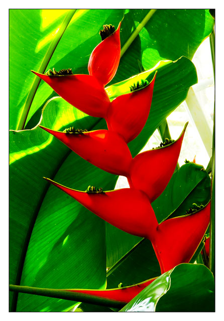
My favorite part about this image is the composition. I love all of the diagonal lines and the shape of the red leaves. I like how the red flower cuts into the frame from one direction and the green leaves form lines in the opposite direction. I like how the longest red flower/leaf comes all the way across the very bottom of the image. It keeps my eye from trailing out the bottom of the frame and sends me looking back upwards. The weakest part of the composition, as you know, is the blank space of the window.
It feels like there is a bit of an upward camera angle, which I like here. Kind of like the greenery is towering above the viewer. Maybe this could have been exagerrated with an even steeper angle? Could you have gotten even closer to the base and really shot up at it?
As you mention in your comments there is some significant loss of detail in both the reds and the greens. THis may be from your exposure or your processing, I am not sure. More detail and contrast in the leaves and flowers would give the image more texture and depth. I like the highly saturated colors, though. I think it works for this image (although it probably contributed a bit to the detiail loss).
For the challenge, the mix of red and green is bang on. I didn't vote in the challenge, but I would have given this a 6. I think it can be very hard at a place like a botanical gardens to separate all of the intense visuals of flowers and plants and find the photograph lurking within. This is a very well seen shot that meets the challenge well, but with some technical limitations.
Please feel free to pm me if you have any questions about any of my commets.
Cheers,
Liza
|
|
 Photographer found comment helpful. Photographer found comment helpful. |
|
|
05/07/2006 12:52:46 PM |
~trading post~
Very vibrant, stands out among all the other plant entries.
The different shapes really complement each other.
I wonder if you could have cropped out the bottom two red triangle leaves/petals, so that there was more emphasis on the repetitiveness of the shapes. This could be combined with a slight tilt, so the reds lie at a diagonal, or extending the field of view so they lay on a third.
I didn't really notice it until reading photogs comments, but I think you're right that it's over NIed. I dont really mind the windows - sure, t'would have been a cleaner composition without, but they don't really distract me personally.
Definite pop factor when you first see it, but obviously you've already identified ways to improve little bits n pieces. |
|
| Photographer found comment helpful. |
|
|
05/05/2006 03:33:04 AM |
| Good strong colors here...although the yellowish area of the leaves is a bit washed out on my monitor, I suspect from saturation. The composition is really helpful, too. I like how the flower and the leaves interact...at first glance they almost seem to be spiraling upwards together. The lines formed by the leaves and flowers give this photo a lot of abstract punch. |
|
| Photographer found comment helpful. |
|
|
05/03/2006 09:25:36 PM |
Trading Post comment
Good score on this one. My favorite thing about the picture is the composition - I really like the diagonal formed and the shape of the flowers. The colors are good - rich and bright - but maybe a bit too saturated. The blown bits take away from the overall impression, though. I also like the perspective you chose, looking up a bit, but wish the "open" space on the right was smaller or not as bright. |
|
| Photographer found comment helpful. |
|
|
05/03/2006 07:55:36 PM |
[[Trading Post]]
this is a nice image, but everything can be improoved.. I think this is oversaturated, and probably neatimaged too much as there is too much loss of details, and that blown out area on the right is bad for the photo.
but it's not all bad, there are more good things about the image, composition is good, the subject is interesting and the angle makes it very apealing, the way the pollen looks like little fingers crawling out of the flower, and the colors are complementary even though they come out as cyan and magenta when inverted.
I think this image would benefit from a tighter crop to lose the blown out area, and skip the neatimage, and lower saturation to get natural color, that way you'll get the fine details of the flower that most people find crucial to a flower macro.
still a good finish in top 50. |
|
| Photographer found comment helpful. |
|
|
05/03/2006 05:36:16 PM |
hello,
it obviously did well. i think it would have done better ifn your colors were so harsh. the lighting seems to be pretty good overal but making the red colors lacking in any detail. like the red channel is blown out.
but that seems to be the only issue i have.
the composition is good, the subject is nice. the light shining through the plants kind of lighting them up is great. |
|
| Photographer found comment helpful. |
|
|
05/03/2006 03:13:03 PM |
| Awesome "wow" on first view, the colours really doing a lot to enhance the unusually shaped leaves. Very nice image. The white element at top right is unfortunate, and detracts for me. Had that not been there, the effect would have been really superior. Compositionally well done, the red leaves leading our eye up through the centre perfectly. |
|
| Photographer found comment helpful. |
|
|
05/03/2006 12:41:05 PM |
Trading Post...
That's a really cool flower! The colors are great. As I also seem to be told though, that break (background) is distracting. Maybe a different angle could have eliminated that. Congrats on the high placement.
Message edited by author 2006-05-03 12:41:47. |
|
| Photographer found comment helpful. |
|
|
05/03/2006 12:35:06 PM |
[[Trading Post]]
My first impression is "Great Color!" My second is "Neat Image? Maybe a hair too much, maybe none at all???" A sheet of white paper stuck down on the right side to blank out that background area would have probably given you a full point in the score (my opinion). Excellent composition; the yellows are a BIT oppressive, but not terribly so. |
|
| Photographer found comment helpful. |
|
|
05/03/2006 06:49:12 AM |
| Cool looking flower. The colors overall are a bit too saturated for my tastes and maybe a bit oversharpened (although I think over saturation sometimes has the same effect). I didnt dislike this shot (I gave a 6) but it also didnt stand out. 46th place is great placing though. |
|
| Photographer found comment helpful. |
Comments Made During the Challenge  |
|
|
05/02/2006 09:42:15 PM |
This is VERY cool, looks natural but almost sci-fi or something. The color is great too!
Awesome job. |
|
| Photographer found comment helpful. |
|
|
04/30/2006 05:12:16 PM |
|
| Photographer found comment helpful. |
|
|
04/30/2006 08:49:45 AM |
| very cool fits the challenge title need swork but since the photo is so interesting i will overlook it. no need for that border. 9. |
|
| Photographer found comment helpful. |
|
|
04/30/2006 06:34:11 AM |
| Love the organic lines! Large border suits it as well 9 |
|
| Photographer found comment helpful. |
|
|
04/29/2006 02:50:06 PM |
| nice and beautifully saturated image ;) |
|
| Photographer found comment helpful. |
|
|
04/29/2006 02:21:41 PM |
| strong color... maybe a bit too strong ... try bringing down the red channel a touch |
|
| Photographer found comment helpful. |
|
|
04/29/2006 08:27:05 AM |
|
| Photographer found comment helpful. |
|
|
04/27/2006 04:37:58 PM |
| Wish the lighing was better, but the composition is excellent. Darn that sun ;o) |
|
| Photographer found comment helpful. |
|
|
04/27/2006 11:27:46 AM |
|
| Photographer found comment helpful. |
|
|
04/27/2006 08:19:32 AM |
| very nicely done. i have never seen this type of plant before. |
|
| Photographer found comment helpful. |
|
|
04/26/2006 11:22:20 PM |
|
| Photographer found comment helpful. |
|
|
04/26/2006 07:59:19 PM |
| 4 - Nice angle. The reds, and some other areas, seem blown or 'something', loss of detail and perhaps loss of control/contrast/too saturated, who knows. |
|
| Photographer found comment helpful. |
|
|
04/26/2006 02:52:59 PM |
|
| Photographer found comment helpful. |
|
|
04/26/2006 12:18:04 PM |
| Naturallly? Done it before myself. Nice picture seems to lack a bit of sharpness. 7 |
|
| Photographer found comment helpful. |
|
|
04/26/2006 06:12:17 AM |
| that's an amazing plant and a great shot...hope you do well with this |
|
| Photographer found comment helpful. |
Home -
Challenges -
Community -
League -
Photos -
Cameras -
Lenses -
Learn -
Help -
Terms of Use -
Privacy -
Top ^
DPChallenge, and website content and design, Copyright © 2001-2025 Challenging Technologies, LLC.
All digital photo copyrights belong to the photographers and may not be used without permission.
Current Server Time: 03/12/2025 08:09:20 AM EDT.