| Author | Thread |
|
|
05/02/2003 01:20:50 AM |
|
Comments Made During the Challenge  |
|
|
07/21/2002 09:17:00 PM |
|
|
|
07/21/2002 08:18:00 PM |
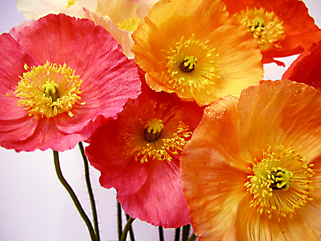
| I'm not sure if I think the shallower depth of field worked with this one or not. Partially, I think that may be because I'm not sure, visually, which is actually the dominant flower int he grouping and since some of the portions I'm drawn to are out of focus.... Love the color combination and the touch of white space in LL corner. I think the OOF stems also bug me a little bit. All in all though, one of my fav images this go round. |
|
|
|
07/21/2002 06:48:00 PM |
| Beautiful colors. I also like the thaw on the blossoms. Still I don't understand why you left the lower left corner empty. I think it would have looked better when there would be flowers , too. |
|
|
|
07/21/2002 05:59:00 PM |
|
|
|
07/21/2002 08:53:00 AM |
| I like the mix of colors. Could be a little clearer and I don't like the white background in the lower left. Composed a little diff would help. |
|
|
|
07/21/2002 02:43:00 AM |
| GREAT SHOT! Vibrant colors and nicely arranged. Most importantly, in FOCUS!! Wonderful picture. |
|
|
|
07/20/2002 09:58:00 PM |
|
|
|
07/20/2002 12:18:00 AM |
|
|
|
07/19/2002 10:24:00 PM |
|
|
|
07/19/2002 04:58:00 AM |
| Lovely lively colors. Maybe those staples are not necessary... |
|
|
|
07/18/2002 05:40:00 PM |
| very nice colour combo :) |
|
|
|
07/18/2002 05:33:00 PM |
|
|
|
07/18/2002 04:29:00 PM |
| love the colors alot, wish they were a tad sharper, sorry but I hate the background - seems to dull to me for such vibrant flowers. good job. 7 cthenk |
|
|
|
07/18/2002 02:39:00 PM |
I think a background that is an orange-yellow color would have worked better. It easy to think that it should contrast with the flowers but in this case, with flowers, I think it is just the opposite. nice cropping.
8 -Tim |
|
|
|
07/18/2002 04:11:00 AM |
| I feel like there should be another poppy in the bottom left hand corner.... |
|
|
|
07/17/2002 06:52:00 PM |
| excellent color :) i love nice macro flower shots, no matter what anyone says... :) = 7 - jmsetzler |
|
|
|
07/17/2002 05:36:00 PM |
| where have i seen this before.. nice colours |
|
|
|
07/17/2002 04:21:00 PM |
| now this is a good flower pic 6 |
|
|
|
07/17/2002 02:01:00 PM |
|
|
|
07/17/2002 01:32:00 PM |
| I like the way you have cropped this one. |
|
|
|
07/17/2002 01:02:00 PM |
|
|
|
07/17/2002 12:13:00 PM |
|
|
|
07/17/2002 10:17:00 AM |
| i never knew poppies were this color... |
|
|
|
07/17/2002 08:22:00 AM |
| Brilliant colors. Makes me happy. |
|
|
|
07/16/2002 10:31:00 PM |
| Gorgeous. You are getting a 10 from me. (I have only given 3 others) |
|
|
|
07/16/2002 09:14:00 PM |
| fairly good detail. composition with stems on lower left is distracting |
|
|
|
07/16/2002 02:17:00 PM |
| beautiful study of poppies--you ave the thin weedy stalks contrasting with the bright blowsy petals--lovely. |
|
|
|
07/16/2002 02:11:00 PM |
| Very nice job on composition, color, and arrangement. The DOF works well and the foreground is in focus. I suggest that it could use a touch more sharpening (personal preference), which should only be done after resizing (or so the experts say and my experience confirms). Overall a VERY nice job on this photo :-) |
|
|
|
07/16/2002 11:20:00 AM |
| The empty bottom left corner is distracting,needs a flower there. |
|
|
|
07/16/2002 02:45:00 AM |
| very nice use of pull-focus. great color contrast with the sky, and a nice composition. |
|
|
|
07/15/2002 08:33:00 PM |
|
|
|
07/15/2002 08:20:00 PM |
| I'm not a "flower" person, but hey, this is nice! |
|
|
|
07/15/2002 06:56:00 PM |
|
|
|
07/15/2002 05:28:00 PM |
| Lovely photo. Would have liked an extra poppy in the bottom left. There seems to be dead space without it."7" Dogman :-) |
|
|
|
07/15/2002 05:06:00 PM |
| Nice, nice composition. You could of left off the stems and placed yet a few more flowers to fill that space. Still I like this, good colors. Nice job. Kee |
|
|
|
07/15/2002 03:43:00 PM |
| Lovely shot, really like the "dew", nice touch. Not thrilled with large negative areas with colors this bold. Excellent focus. 9 Swash |
|
|
|
07/15/2002 03:18:00 PM |
|
|
|
07/15/2002 02:58:00 PM |
Copy the comments from the last postcard photo and past here >>
Copy the comments from the last flower photo and past here >>
Copy the comments from the last one of my top picks this week photo and past here >> |
|
|
|
07/15/2002 02:15:00 PM |
|
|
|
07/15/2002 01:34:00 PM |
| Beautiful! Nothing more to add, sorry. :-) 8 |
|
|
|
07/15/2002 11:46:00 AM |
| this is great , love that you show the stems. It cuts the frame nicely |
|
|
|
07/15/2002 08:41:00 AM |
| Very pretty. Really nice colors. I don't like the white space in the lower left. |
|
|
|
07/15/2002 07:55:00 AM |
| Really nice. Sharp with great color and a non-distracting background. |
|
|
|
07/15/2002 03:01:00 AM |
| Nice colors and good focus. I might have tried filling the frame with the flowers, and not left the blank white space. |
|
Home -
Challenges -
Community -
League -
Photos -
Cameras -
Lenses -
Learn -
Help -
Terms of Use -
Privacy -
Top ^
DPChallenge, and website content and design, Copyright © 2001-2025 Challenging Technologies, LLC.
All digital photo copyrights belong to the photographers and may not be used without permission.
Current Server Time: 03/12/2025 10:30:27 PM EDT.