| Author | Thread |
Comments Made During the Challenge  |
|
|
05/01/2006 04:47:35 PM |
|
 Photographer found comment helpful. Photographer found comment helpful. |
|
|
04/30/2006 11:03:01 PM |
| Clean and simple. Good job! |
|
| Photographer found comment helpful. |
|
|
04/30/2006 02:39:23 PM |
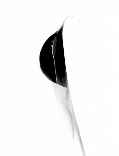
| I like the heavy center area of the flower and the light soft outer edges. I just noticed how the flower leads off the bottom of the page through the framing line. I like this. |
|
| Photographer found comment helpful. |
|
|
04/30/2006 07:51:36 AM |
| Even thoug I can't see what it is I like it, maybe because it is simple. the inner border is distracting maybee it is too sharp (gray in some tone had been better). |
|
| Photographer found comment helpful. |
|
|
04/29/2006 03:27:13 PM |
| great shot .. works well as a negative ... though I find the line border doesn't work well on the bottom when it itersects the flower |
|
| Photographer found comment helpful. |
|
|
04/27/2006 10:08:27 AM |
| Very elegant; I might have tried to have the backround have a little more contrast with the stem. |
|
| Photographer found comment helpful. |
|
|
04/26/2006 03:41:02 PM |
| very nice... just wish the bottom of the stem would be inside of the border... |
|
| Photographer found comment helpful. |
|
|
04/26/2006 06:50:49 AM |
| I think would have like to have seen the dark area a little less defined, with a few more subtle tone. |
|
| Photographer found comment helpful. |
|
|
04/26/2006 05:32:42 AM |
| Love the simplicity of this fine image..... |
|
| Photographer found comment helpful. |
Home -
Challenges -
Community -
League -
Photos -
Cameras -
Lenses -
Learn -
Help -
Terms of Use -
Privacy -
Top ^
DPChallenge, and website content and design, Copyright © 2001-2025 Challenging Technologies, LLC.
All digital photo copyrights belong to the photographers and may not be used without permission.
Current Server Time: 03/12/2025 06:14:10 PM EDT.