| Author | Thread |
|
|
05/05/2006 03:36:04 AM |
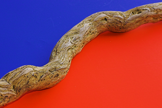
| Good job. Love the idea and the colors. The vine/wood piece seems slightly out of focus (unless it's my tired eyes that are not focusing). Other than that, I really like this photo and would have scored it a 6 or 7. |
|
 Photographer found comment helpful. Photographer found comment helpful. |
|
|
05/03/2006 09:50:33 PM |
Trading Post comment
Nice score, and an addition to your top row on your profile page, no less! It's bold, bright, simple and has a nice strong diagonal. I don't really notice the blurriness you mention all that much; the texture of the wood is nice against the smoothness of the color and I suppose a bit more sharpening might have helped. I suspect it would have done better had the orange been more "orange" - it looks a little reddish on my monitor. |
|
| Photographer found comment helpful. |
|
|
05/03/2006 08:14:45 PM |
[[Trading Post]]
this is a very nice abstract, but there's something that makes it uncomfortable to look at.
the proportion of red and blue are too even, there should be about 65% blue and 35% red, as red is the dominant color and takes all the attention away from the blue, using different amount of color gives more balance to the image.
and while using those proportions it gives you the chance of spliting the image to fulfil the rule of thirds.
that twig gives the image a nice feeling, makes it more alive than using something without texture to split the colors.
keep playing with colors, it really helps you being a better photographer. |
|
| Photographer found comment helpful. |
|
|
05/03/2006 07:09:23 PM |
| I love this composition so very much.....I too got so many comments that my image looked red not orange so feel for you. I do believe this should have got a much higher position..... I love it so it is now in my favorites as well..... |
|
| Photographer found comment helpful. |
|
|
05/03/2006 05:44:17 PM |
hello,
my whole problem with this one is that on my screen it almost looks red instead of orange. i almost wrote a not with this one that said dnmc.
i looked a bit more becuase i simply could not believe that this composition would not be right and thinking the "red" was a bit off, realized it was off because it wasnt red. lol.
i think ifn that orange were more orange, and it was a bit sharper you would have been much much higher. |
|
| Photographer found comment helpful. |
|
|
05/03/2006 04:20:51 PM |
ITs a nice simple idea, and I didnt even notice the red/blue thing for ages*, but the stick used as the division is a bit..well, ..boring imho. I would like to see the same idea but with something more dynamic - I'm sure I'm seen a similar design (albeit achieved in PS) with a lizard, that was used for some logo or something.
The scratches on the blue b/g detract, guess they could easily be removed outside of basic editing. The idea is simple and cool but needs something extra for that 'wow'
Hope you're feeling better anyway :)
*Yes, its very much red to me, but then again, my monitor isn't greatly calibrated itself |
|
| Photographer found comment helpful. |
|
|
05/03/2006 02:59:27 PM |
| I know you've heard it already, but it really looks like red and blue. I would have gone for a pristine look on the blue portion (I think I see scratches on that surface, maybe from where you were positioning the wood). Focus is a little soft, even with USM. At lower left, I think I see a hard line of shadow beneath the wood, which kind of detracts for me. It's an interesting composition nonetheless. |
|
| Photographer found comment helpful. |
|
|
05/03/2006 12:47:25 PM |
Trading post...
This is a nice image, very simple yet elegant. The wood seems to be off a little and it could be my monitor, but the colors look like red and blue to me. |
|
| Photographer found comment helpful. |
|
|
05/03/2006 07:48:35 AM |
| It's supposed to be blue and orange; apparently the monitor issue really got me. Karma and I both thought that it wasn't orange enough so I hue shifted a bit, and several people thought it too red. I really appreciate all the feedback on that, because I have a nearly "impossible to calibrate" cheap flatscreen, and I need to know all I can about what others see. Thanks. |
|
|
|
05/03/2006 06:44:49 AM |
I gave a 6 on this one. I liked the minimalist approach but would have preffered a bit more clarity on the wood. I figure the letters on the blue side were not intentional and if in advanced editing they would be gone. Overall it was a good shot. Good colors and the angle works well. Lack of "Wow" factor hurt it. Now if you had a chameleon walking on that log...
(quick read of lower comments - I do see cc with blue and orange) |
|
| Photographer found comment helpful. |
|
|
05/03/2006 01:48:21 AM |
--Trading Post Comment--
I really can't see the blur, but I think that you suffered from not choosing complementary colors. Red's complement is green and blue's is orange. Either way, I like this iamge. The composition is nicely balanced and the wodd in the middle really works well to draw the eye up and through the image. My only ding in voting was the colors. Still, very nice work. |
|
| Photographer found comment helpful. |
Comments Made During the Challenge  |
|
|
05/02/2006 04:12:21 PM |
| like it love it nice work |
|
| Photographer found comment helpful. |
|
|
05/02/2006 02:04:21 PM |
| Excellent idea and nice composition. The minor blips in the blue are but minor. |
|
| Photographer found comment helpful. |
|
|
05/01/2006 06:33:39 PM |
| Looks like blue and red on my screen, not complementaries. Nice idea. |
|
| Photographer found comment helpful. |
|
|
05/01/2006 12:28:26 AM |
i know this picture. . .
I think it is cool, but I'm not voting on it . :) |
|
| Photographer found comment helpful. |
|
|
04/30/2006 04:31:10 PM |
| Too easy. Yeah, nice work. |
|
| Photographer found comment helpful. |
|
|
04/30/2006 04:13:04 PM |
| Is this drift wood? Interesting shot. |
|
| Photographer found comment helpful. |
|
|
04/30/2006 09:27:47 AM |
| Nice abstract, I like the flow though the image. |
|
| Photographer found comment helpful. |
|
|
04/30/2006 09:21:45 AM |
doesnt fit the challenge unless youre trying to pull off this as being orange or perhaps it jsut looks very red on my screen.
ill give you the benefit of the doubt so ... it fits the challenge.
the title isnt interesting and i think that devalues the photo in my eyes. it doenst add anything to the photo and the photo has alot of potential. 7 |
|
| Photographer found comment helpful. |
|
|
04/30/2006 06:12:59 AM |
| So coo: 8 I'm so glad you havent really got any shadows, that would have ruined the impact. |
|
| Photographer found comment helpful. |
|
|
04/29/2006 03:06:11 PM |
| nice symmetry and execuition |
|
| Photographer found comment helpful. |
|
|
04/29/2006 01:47:57 PM |
|
| Photographer found comment helpful. |
|
|
04/29/2006 09:29:00 AM |
|
| Photographer found comment helpful. |
|
|
04/28/2006 02:15:43 PM |
| The orange looks a little to red to be complimentary to blue. I like it anyway. 9 |
|
| Photographer found comment helpful. |
|
|
04/27/2006 10:40:34 PM |
| I'm not really sure what this is... at first site it looked like the poop from my dog... lol Great job at seperating the two colors with a natural one. |
|
| Photographer found comment helpful. |
|
|
04/27/2006 09:43:35 PM |
| Great Concept that made for a great photo. |
|
| Photographer found comment helpful. |
|
|
04/27/2006 08:36:42 PM |
| 5 - Simple. Like to have seen a little more 'feel' here, whether it be texture of the wood, variation in lighting or just a little more 'depth', not sure. |
|
| Photographer found comment helpful. |
|
|
04/27/2006 11:42:12 AM |
|
| Photographer found comment helpful. |
|
|
04/27/2006 08:19:25 AM |
|
| Photographer found comment helpful. |
|
|
04/26/2006 11:24:56 PM |
| I love this, but it should be blue & orange. I have the same problem with my image, as it is supposed to be "orange" but looks more red on the screen here..... |
|
| Photographer found comment helpful. |
|
|
04/26/2006 11:17:24 PM |
|
| Photographer found comment helpful. |
|
|
04/26/2006 09:43:23 AM |
| the orange is too red for me, but I like the idea. |
|
| Photographer found comment helpful. |
|
|
04/26/2006 04:44:36 AM |
| very nice...would have liked the whole branch sharp, but that's minor...great colours |
|
| Photographer found comment helpful. |
Home -
Challenges -
Community -
League -
Photos -
Cameras -
Lenses -
Learn -
Help -
Terms of Use -
Privacy -
Top ^
DPChallenge, and website content and design, Copyright © 2001-2025 Challenging Technologies, LLC.
All digital photo copyrights belong to the photographers and may not be used without permission.
Current Server Time: 03/12/2025 08:55:58 AM EDT.