| Author | Thread |
|
|
05/12/2006 09:00:09 AM |
Greetings from the Critique Club -
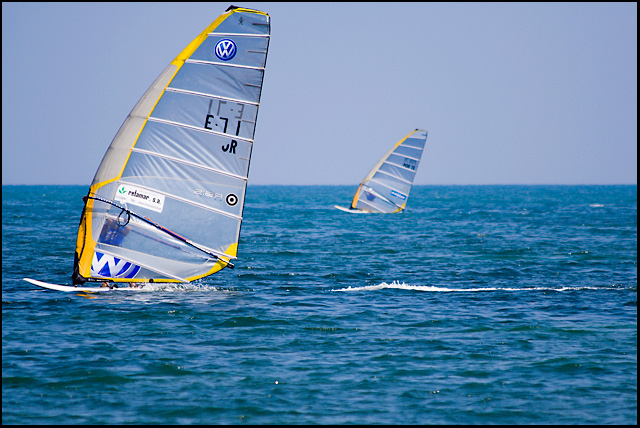
I like many aspects of this shot. The front board is in great focus along with the water trail behind him. The details on the sail are sharp. I like the soft focus on the back board - it is a good compliment. The colors work well also.
I think the only thing that needs adjustment is the crop. I would have liked to have seen a little bit more to the left and top of the front boat and/or a little less on the bottom. It just feels a bit tight on the top and left. The extra space may have given an even better sense of the vast ocean expanse (if that makes any sense).
Beyond that I think this shot works very well. I could see this shot in the sports section of a paper or magazine. Great capture.
Tim |
|
 Photographer found comment helpful. Photographer found comment helpful. |
|
|
05/09/2006 03:16:54 PM |
| I like this pic. Maybe if you didn't crop it so close to the yacht and if the second yacht was still in focus? Thats my problem- focus. The yellow looks good against hte blue... |
|
| Photographer found comment helpful. |
|
|
05/08/2006 10:39:43 PM |
From the CTP MkII
Disclaimer: The following crits are personal opinions, not photographic dogmas. Please see them as suggestions, not claims of mastery nor a show of hauteur.;p
First Impression: 6 or 7, for visual appeal. Also, I can imagine it appearing alongside a windsurf article.
Composition: 4 or 5, because there's too much space behind the sails and too little in front of and above them.
Subject: 6, 'cuz windsurfing rocks. Not a fan of half-naked men images so I'm fine with having them behind the sails(j/k). It would've been another issue had they been doing acrobatics and shit.;p
Technical: 6. I'd say it's a spot-on exposure, if not very very slightly underexposed. The vibrant colors add a lot to the visual appeal. I, however, find the water a tad too green, the sky a tad too flat, and the yellow in the sails a tad too saturated. But that's just me.;)
Improvement: Re-compose to the right and below, tweak the colors, and have explosions in the background(j/k).
Summary: You're the first on the list so you're my first critiquee. I'm a number too short on screws in the head so please do not be offended.;p
Message edited by author 2006-05-08 22:44:03. |
|
| Photographer found comment helpful. |
|
|
05/08/2006 08:56:53 PM |
Ok, I already left a brief comment on this during voting, but I want to touch base for CTP2 and maybe expound a little bit.
The color and clarity on this are gorgeous, and I do like the minimalist feel of the photo, with the sails looking a bit like sharkfins skimming through the water. However, I do still think that for a Photojournalism challenge I would have liked to see something a little more personal. We can't see the surfer behind the sail, and front page photos tend to really focus on the people involved in whatever is going on.
My one complaint with the photo as just a photo is that it feels to me like the sail in the foreground is way too close to the upper border. I think extending the sky up by about 30 pixels would do the trick to make it look more balanced. |
|
| Photographer found comment helpful. |
|
|
05/08/2006 05:12:08 PM |
Greetings from your own critique club.
First Impression:
Looks professional and very photojournalish
Composition:
Don't really have any issues with it except maybe the lack of space at the top where the sail nearly touches the frame, however I get what you were trying to do (i.e. avoid a perfectly centered horizon).
Subject:
This is my main problem I have. It looks like those things are just floating out there by themselves since the surfers are on the other side of it. That's a shame because I think this would have scored a lot higher if that wasn't the case.
Technical (Colour and light):
No problems here for me. The main subject stands out and is quite vibrant in color so you did everything well to capture that.
Improvement:
Just make the athletes more prominent in shots like this.
Summary:
Excellent photo with just that one flaw. Great accomplishment since this appears to be your first effort shooting with that long a lens. |
|
| Photographer found comment helpful. |
|
|
05/08/2006 03:10:40 PM |
Comment from a member of your own commenting club :-)
This is a lovely windsurf picture.
Plus:
1. Lovely colours
2. Good frame choise
3. Superb focus on the front boat.
Minus:
1. I would have preferred to balance the picture a bit by cropping differentely. Add more of the sky and cut a bit from the ocean.
For the rules of thirds, have a bit more ocean in the left side.
2. The horizon is horzontal but looks like it isn't because of different sizes of boats. Maybe in this case it would have been better to tilt it a tiny little bit. But then again maybe not :-)
Congratulations on your deserved "over 6"
Message edited by author 2006-05-10 20:25:10. |
|
| Photographer found comment helpful. |
|
|
05/08/2006 02:06:29 AM |
Where was this taken? The water is gorgeous! And it looks like it's warm!
compostion: I would have liked this a bit better if was framed more to the left, so that the winning surfer is sailing into the frame, instead of out of it. Or else a tighter crop on the main windsurfer. All the empty space to the right doesn't really add anything.
subject: Nice enough. It fits the challenge well.
technical: The colors work really well, and the focus seems to be sharp(I need glasses, so I can't really swear that it is �)
summary: This is a nice shot, that would have been a great shot if the framing were slightly different.
|
|
| Photographer found comment helpful. |
Comments Made During the Challenge  |
|
|
05/07/2006 11:39:09 PM |
| Great colors and the movement is great! Too bad the crop is too tight at the top. |
|
| Photographer found comment helpful. |
|
|
05/07/2006 08:07:43 PM |
you're probably getting killed for the border. if not, you should be ;-)
nice shot, but really should be cropped as tightly as possible. one of the key elements of PJ is to fill the frame with as much relevant content as possible; here, all that sky and water is wasted space. |
|
| Photographer found comment helpful. |
|
|
05/07/2006 07:36:21 PM |
| Great shot for the challenge |
|
| Photographer found comment helpful. |
|
|
05/05/2006 06:02:02 PM |
|
| Photographer found comment helpful. |
|
|
05/04/2006 06:19:03 PM |
|
| Photographer found comment helpful. |
|
|
05/03/2006 05:14:02 PM |
| A fairly straightforward windusrfing shot - though the repetition of those shapes adds an element of interest. I would think a news shot would need more immediacy, basically to get closer, and this is a bit too available to everyone. |
|
| Photographer found comment helpful. |
|
|
05/03/2006 09:50:04 AM |
| This is good, very good in fact..... |
|
| Photographer found comment helpful. |
|
|
05/02/2006 09:24:42 AM |
nice nice nice ... great photo in my opinion, but i dont like the black frame it's really not needed here i think ...
peace |
|
| Photographer found comment helpful. |
|
|
05/01/2006 08:55:01 PM |
| The sport is somewhat obscure, not really a front page item. Ignoring that, while it's a nice picture, I think good front pagers tend to have more obvious human placement, putting a face on the activity at hand, especially with something like sports. |
|
| Photographer found comment helpful. |
|
|
05/01/2006 03:57:38 PM |
| Really? ;-) Good sports capture. Would work well in a sports section or a Windsurf mag. |
|
| Photographer found comment helpful. |
|
|
05/01/2006 09:24:57 AM |
| my ONLY complaint is that a paper would have a name, not a sail number. Great image |
|
| Photographer found comment helpful. |
|
|
05/01/2006 12:58:30 AM |
| Excellent composition and exposure. Nice job. |
|
| Photographer found comment helpful. |
Home -
Challenges -
Community -
League -
Photos -
Cameras -
Lenses -
Learn -
Help -
Terms of Use -
Privacy -
Top ^
DPChallenge, and website content and design, Copyright © 2001-2025 Challenging Technologies, LLC.
All digital photo copyrights belong to the photographers and may not be used without permission.
Current Server Time: 03/12/2025 03:04:13 PM EDT.