| Author | Thread |
|
|
05/11/2006 02:35:50 AM |
Greetings from the Critique Club
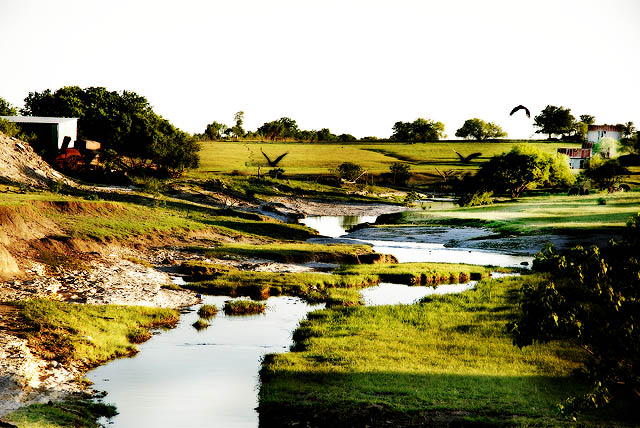
My first impression when I saw this image pulled from the queue is that the sky is blown out. A pity really because the rest of the composition lends to a dramatic image. The curves of the stream works really well adding fancy and interest throughout the composition. The grass seems a bit oversharpened as some of the details are lost in the mix. The right side of the image seems a tad dark and I am viewing this from my bright monitor so I can only suspect that this seems a bit dark for most.
Timing is everything in landscape images. I would suggest reshooting this image at dusk - the magic hour as we call it. the skies would have had beautiful coloration to them and the sun wouldn't be as harsh as it is now.
I hope that in the interest of improvement, you see this critique as being constructive and helpful in your pursuit for improvement. You have some beautiful images in your portfolio and this just seems to be slightly off from what you normally are comfortable with as far as editing styles go. Last minute entries most often don't do all that well since you won't have any chance to review them. Give it time like everything else and you will deifnitely reap the rewards later.
Feel free to PM me if you have any questions at all and I will definitely get back to you as soon as I can ;)
Cheers,
Rikki |
|
 Photographer found comment helpful. Photographer found comment helpful. |
|
|
05/08/2006 07:12:12 PM |
| I like this pic a lot. I don't agree with the majority of the comments posted. |
|
| Photographer found comment helpful. |
Comments Made During the Challenge  |
|
|
05/05/2006 10:58:43 PM |
| i like this photo, but the sky seems overexposed. |
|
| Photographer found comment helpful. |
|
|
05/05/2006 06:54:25 AM |
| The highlights are really overblown on the sky, the water, the sand,etc. Birds are a nice touch. That is probably my favorite part of the entire scene. |
|
| Photographer found comment helpful. |
|
|
05/03/2006 09:58:13 PM |
|
| Photographer found comment helpful. |
|
|
05/03/2006 02:02:57 PM |
| Great idea, but the lighting and multiple elements make it too busy and confusing. The exposure is nice and the focus is sharp, but I'd try to isolate the stream a bit more. |
|
| Photographer found comment helpful. |
|
|
05/03/2006 10:35:45 AM |
| Lighting is too harsh to really show off this nice scene |
|
| Photographer found comment helpful. |
|
|
05/02/2006 06:08:00 PM |
Nice rich colors, like the comp with the river. I may have cut out the utility shack and left side of the river bank IMHO.
Good luck -7- |
|
| Photographer found comment helpful. |
|
|
05/02/2006 11:54:04 AM |
| Interesting place ! I think that it would gain with a blue sky or an added gradient to bring more "life" to this photo. |
|
| Photographer found comment helpful. |
|
|
05/01/2006 06:19:43 PM |
| Composition is good with the lines on the stream leading the viewer through the shot and a nice straight horizon line well placed in the top third of the frame. With regard to exposure - the sky is completely blown out and devoid of any detail. PP could be stronger with regard to the color saturation, IMHO. Overall, a decent shot. |
|
| Photographer found comment helpful. |
|
|
05/01/2006 04:39:29 AM |
|
| Photographer found comment helpful. |
|
|
05/01/2006 01:31:07 AM |
| the water is far too overexposed |
|
| Photographer found comment helpful. |
|
|
05/01/2006 12:32:21 AM |
| too much going on here.....don't know where to focus....overexposed sky, stream, building, white rock bed all fighting for attention with the birds........as my photography mentor says....."reduce and simplify" |
|
| Photographer found comment helpful. |
Home -
Challenges -
Community -
League -
Photos -
Cameras -
Lenses -
Learn -
Help -
Terms of Use -
Privacy -
Top ^
DPChallenge, and website content and design, Copyright © 2001-2025 Challenging Technologies, LLC.
All digital photo copyrights belong to the photographers and may not be used without permission.
Current Server Time: 03/14/2025 01:33:27 AM EDT.