| Author | Thread |
|
|
07/02/2004 05:59:02 PM |
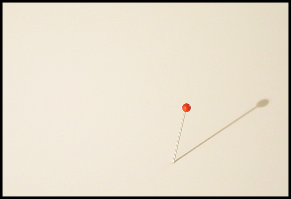
Simple and to the point! hehehe
The shadow definetely adds a lot of interest to the shot. Borders always rouse great debates on the site, but I think your border really makes this shot work. The shot is good, but I wonder if it could be better if pin was on left? |
|
 Photographer found comment helpful. Photographer found comment helpful. |
|
|
06/30/2004 10:20:51 PM |
Really cool idea for this challenge. I agree with some of the others that a whiter background would probably enhance the idea a bit, but I do like what you have here.
The shadow works to add interest without "overshadowing" the pin. I'm just not a big fan of the minimalistic sort of photos, but I think this one is well done. |
|
| Photographer found comment helpful. |
|
|
06/30/2004 10:06:44 PM |
|
| Photographer found comment helpful. |
|
|
06/30/2004 09:26:17 PM |
| I like this, but I can't help but wonder if the bg was supposed to be white...I can't get white foam core to look white in my camera, so maybe that's it? I don't know. Good use of negative space. :o) |
|
| Photographer found comment helpful. |
|
|
06/30/2004 09:24:08 PM |
Immediately when I saw this, I thought how much better it would be with a white background. My ps skills are not very good, but I decided to take a shot at it, to see if it would look better.
So I did, but I know some people don't like having their photos toyed with, but if you're interested in seeing it, I did it, and I think it makes the photo, which is already great, even better.
And I can't help but think, that if it had been white, you could have got a top ten placement. |
|
| Photographer found comment helpful. |
|
|
06/30/2004 09:16:04 PM |
| Simple. I like it. I'm wondering if I would like it even better if the bg was white...? I never see things like this. Good eye...or idea. :-) |
|
| Photographer found comment helpful. |
|
|
08/26/2003 11:40:44 AM |
Great shot Steve. One of my favorites for the week. I gave it a 9 by the way. Very simple and very effective composition. The shadow really adds oomph to the photo. Keep up the good work.
Cheers. |
|
| Photographer found comment helpful. |
|
|
08/25/2003 07:45:23 AM |
| easily one of my faves. i gave this a 9. you were robbed. |
|
| Photographer found comment helpful. |
|
|
08/25/2003 12:43:56 AM |
| This was one of my favorites. Think it should have been rated higher |
|
| Photographer found comment helpful. |
Comments Made During the Challenge  |
|
|
08/24/2003 10:23:51 PM |
| You should have framed on the left. In that case all the lignes aere going to the right and the half left part is not, to me negative space but lost space. Otherwise I like the idea |
|
| Photographer found comment helpful. |
|
|
08/23/2003 06:44:08 PM |
| Great...shows unique artistic talent and the importance of imagination in the competitions. |
|
| Photographer found comment helpful. |
|
|
08/23/2003 01:00:53 AM |
|
| Photographer found comment helpful. |
|
|
08/22/2003 01:08:39 AM |
| Beautiful and simple POINT. |
|
| Photographer found comment helpful. |
|
|
08/20/2003 01:25:22 PM |
| How could a simple pin say so much? Neg space, that's how! It helps us take our thoughts beyond the frame of the shot and to other things in this pin's world. Nicely done! 9 |
|
| Photographer found comment helpful. |
|
|
08/20/2003 12:07:04 AM |
|
| Photographer found comment helpful. |
|
|
08/19/2003 06:02:39 PM |
| very sparse and certainly meets the challenge - negative space indeed |
|
| Photographer found comment helpful. |
|
|
08/19/2003 05:06:01 PM |
I'm having problems defining this one. There is something that is either missing or not as defined as it should be. Possibly the pin to be just a bit more pronounced?
Wish I could be more specific. |
|
| Photographer found comment helpful. |
|
|
08/19/2003 03:41:37 PM |
| I like this image. I would have placed the pin in the left 1/3rd quadrant for ROT. |
|
| Photographer found comment helpful. |
|
|
08/19/2003 01:23:25 PM |
| I would have liked to seen a more vivid and defined pin. great idea. |
|
| Photographer found comment helpful. |
|
|
08/19/2003 01:33:08 AM |
| Great idea! did you think to try placing the pin on the left instead of the right? I may have tried that to give it a little balance. Nevertheless, a great shot. |
|
| Photographer found comment helpful. |
|
|
08/18/2003 10:27:38 PM |
| Negative space should have a purpose. This is negative space for the sake of the challenge. |
|
| Photographer found comment helpful. |
|
|
08/18/2003 09:49:57 PM |
| perhaps not the most exciting photo ever, but right on the mark...so to speak. :) |
|
| Photographer found comment helpful. |
|
|
08/18/2003 03:25:32 PM |
|
| Photographer found comment helpful. |
|
|
08/18/2003 12:50:43 AM |
| I like the idea here, but I think that a different cropping would have been more effective. |
|
| Photographer found comment helpful. |
Home -
Challenges -
Community -
League -
Photos -
Cameras -
Lenses -
Learn -
Help -
Terms of Use -
Privacy -
Top ^
DPChallenge, and website content and design, Copyright © 2001-2025 Challenging Technologies, LLC.
All digital photo copyrights belong to the photographers and may not be used without permission.
Current Server Time: 04/28/2025 10:36:55 AM EDT.