| Author | Thread |
|
|
05/16/2006 09:34:45 AM |
| You are just so creative and imaginative. I agree that this should have finished highter. I can easily see this on a movie poster! |
|
 Photographer found comment helpful. Photographer found comment helpful. |
|
|
05/15/2006 11:20:39 AM |
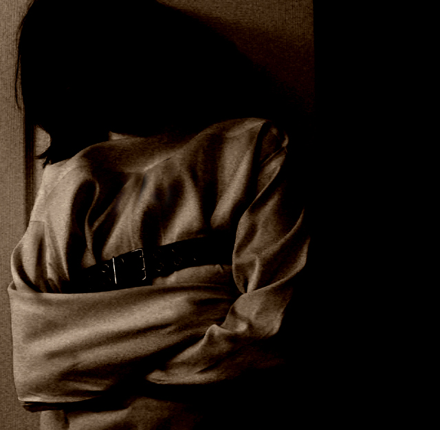
Another creative effort! It always amazes me how you manage to take everyday objects and make them so special. Like the darkness. Good job.
|
|
| Photographer found comment helpful. |
|
|
05/15/2006 10:29:40 AM |
| Should have finished much higher. Still a very cool shot that fit the challenge perfectly. |
|
| Photographer found comment helpful. |
|
|
05/15/2006 06:58:16 AM |
| I had this in my highest rated group. Hard to understand how this finished with just an average placing. |
|
| Photographer found comment helpful. |
Comments Made During the Challenge  |
|
|
05/14/2006 10:31:17 PM |
| Excellent use of light and grain...nice and tense...I particularly like how we cannot see the face, just a vague outline of the hair...nice work. |
|
| Photographer found comment helpful. |
|
|
05/14/2006 10:09:43 PM |
| This is wonderful! The darkness and the noise are perfect for this shot! |
|
| Photographer found comment helpful. |
|
|
05/14/2006 07:52:12 PM |
| creepy -- duotones makes this work so well -- one of my favorites |
|
| Photographer found comment helpful. |
|
|
05/13/2006 02:43:01 AM |
|
| Photographer found comment helpful. |
|
|
05/11/2006 10:31:09 PM |
Nicely done but a poster type orientation (crop) would make this a slightly better score...
TC |
|
| Photographer found comment helpful. |
|
|
05/10/2006 08:31:44 AM |
This is terrific. It has great lighting and composition, and the post processing is jagged-edged (i.e. just right). Maybe the most instructive thing is how much more convincing it is to not show the face, rather than to do the conventional thing and try to simulate a suitably manic and tortured facial expression. It's a fact well understood by exotic dancers; what you don't reveal can be much more stimulating and memorable than what you do expose.
I like this photo very much, and I'd no doubt like the movie, too. 9. |
|
| Photographer found comment helpful. |
|
|
05/09/2006 06:26:59 AM |
| I think I would loved it more if it wasn't too dark and out of focus. I like the idea though. |
|
| Photographer found comment helpful. |
|
|
05/09/2006 02:31:57 AM |
|
| Photographer found comment helpful. |
|
|
05/09/2006 01:26:56 AM |
| Great entry. I probably would have bumped up the highlights a bit to be more eye catching like what movie photos tend to be but otherwise perfect. |
|
| Photographer found comment helpful. |
|
|
05/08/2006 11:06:36 PM |
| Very disturbing. The angle of her head (or what seems like a tilt) adds to the drama. Well done. |
|
| Photographer found comment helpful. |
|
|
05/08/2006 12:57:54 PM |
| my first impulse is that I'd like at least a hint of a face, but what the hell, I'm game for a daring indie movie that might be more psychologicall than physically violent. Good job. This poster is more exciting and raises more questions than most indie films. |
|
| Photographer found comment helpful. |
|
|
05/08/2006 10:34:48 AM |
| I like it! It LOOKS like a movie poster, with an appropriate movie title. Love the mood. The sepia tones. GOOD LUCK!!! |
|
| Photographer found comment helpful. |
|
|
05/08/2006 03:32:39 AM |
| very good...what I am looking for in this challenge is for a creative 'wow' shot that would go on a movie poster. I think that's what the challenge is all about...this one does well |
|
| Photographer found comment helpful. |
Home -
Challenges -
Community -
League -
Photos -
Cameras -
Lenses -
Learn -
Help -
Terms of Use -
Privacy -
Top ^
DPChallenge, and website content and design, Copyright © 2001-2025 Challenging Technologies, LLC.
All digital photo copyrights belong to the photographers and may not be used without permission.
Current Server Time: 03/12/2025 02:14:33 AM EDT.