| Author | Thread |
|
|
05/14/2010 05:27:25 PM |
| Great lighting & compostion! |
|
 Photographer found comment helpful. Photographer found comment helpful. |
Comments Made During the Challenge  |
|
|
05/22/2006 08:37:10 PM |
|
| Photographer found comment helpful. |
|
|
05/21/2006 10:41:29 PM |
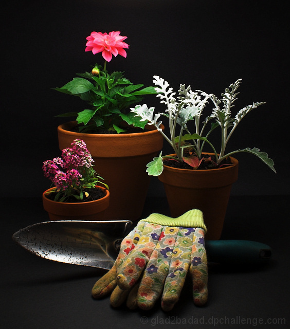
| For the classic style of still life themed entries, this one is most easily my favorite. |
|
| Photographer found comment helpful. |
|
|
05/20/2006 05:37:34 AM |
| I know some say that plants/flowers aren't still life but they definetly are in this composition. Great set up and perfect light & shadow. I'm glad the trowel is dirty too! :) |
|
| Photographer found comment helpful. |
|
|
05/19/2006 06:10:06 PM |
| nice composition, don't like the background could be lighter |
|
| Photographer found comment helpful. |
|
|
05/19/2006 04:29:56 PM |
| This is actually very good - technically and compositionally. The only weak thing I can find is the lack of fill light on the right hand side, very slight blow out at the top. The colors are forcing me to use the word marvelous. Depth of field is excellent. Okay, I just pulled the image into photoshop. I'm wondering if your monitor displays darker than mine as I can see the line separating the wall and the ground. If you darkened levels very slightly so that disappears and run a slight curves adjustment, the parts of the still life really pop. Only added that as an insight - some people with dark or light monitors see differently. Anyway, I think, for a boring subject (most all still lifes are boring), you creating an exceptional image that I could see in a garden magazine. I like the lighting but feel a slight amount of fill on the right would help. If I was voting on this challenge, I would probably give this at least a 7 if not more. |
|
| Photographer found comment helpful. |
|
|
05/19/2006 01:59:58 AM |
| Outstanding!!!!!!!!!!! I love the lighting, the colors, and the setup. clicking it to my faves |
|
| Photographer found comment helpful. |
|
|
05/19/2006 12:41:23 AM |
|
| Photographer found comment helpful. |
|
|
05/18/2006 08:34:56 AM |
| This meets the challenge � it�s inanimate and arranged. Neat, but lacks cohesion. 6 |
|
| Photographer found comment helpful. |
|
|
05/17/2006 11:28:46 PM |
| could be stronger with more crop |
|
| Photographer found comment helpful. |
|
|
05/17/2006 08:39:37 PM |
| I would like a wee bit more light from the front to bring out the shovel and to give more depth to the pots. |
|
| Photographer found comment helpful. |
|
|
05/17/2006 12:50:37 PM |
| I really like the lighting in this shot. The pink flower in the back has a nice glow to it, but is still in focus. I know it seems odd, but I think this would have been even better in my mind if the light was just a LITTLE brighter and if the ground was actually covered with a thin layer of soil. Yeah, I know. Like I said, I'm weird. ;) |
|
| Photographer found comment helpful. |
|
|
05/17/2006 11:44:30 AM |
|
| Photographer found comment helpful. |
|
|
05/17/2006 07:58:05 AM |
|
| Photographer found comment helpful. |
|
|
05/17/2006 02:59:08 AM |
|
| Photographer found comment helpful. |
Home -
Challenges -
Community -
League -
Photos -
Cameras -
Lenses -
Learn -
Help -
Terms of Use -
Privacy -
Top ^
DPChallenge, and website content and design, Copyright © 2001-2025 Challenging Technologies, LLC.
All digital photo copyrights belong to the photographers and may not be used without permission.
Current Server Time: 04/26/2025 08:50:34 AM EDT.