| Author | Thread |
Comments Made During the Challenge  |
|
|
05/21/2006 07:51:47 PM |
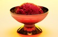
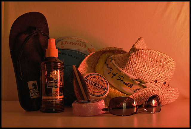
| The orange lighting is a little too orange for me. I feel like the picture needs some sand grains scattered on the table. Creative idea. :) |
|
 Photographer found comment helpful. Photographer found comment helpful. |
|
|
05/21/2006 12:42:55 AM |
| I'm not crazy about the color, or the wrinkles in your background fabric. I like the idea, though. |
|
| Photographer found comment helpful. |
|
|
05/20/2006 03:45:06 PM |
| Color seemed too orangy. Could be my monitor. Color adjustment could be in order, and a bit more brightness and contrast. |
|
| Photographer found comment helpful. |
|
|
05/18/2006 01:29:22 PM |
| This meets the challenge - inanimate and arranged. Assembled for thematic reasons rather than visual, I dare say. |
|
| Photographer found comment helpful. |
|
|
05/18/2006 12:48:30 PM |
| The color is the first thing that I noticed. It is to magenta for me. Also it feels like too much is packed in and that the space on the sides is waisted. |
|
| Photographer found comment helpful. |
|
|
05/17/2006 02:50:29 AM |
| Great coloring of the light (reminds me of neon lights in a bar more than a sunset)...however the fall off is rapid making the tanning oil and shoe (?) too dark. I'd suggest using a stronger light, 2nd light, move the light to the other side, or swap your still life around so that the dark objects are closer to the light. The wrinkles in the upper corners & reflection in the glasses are also a bit distracting. I love how the glasses are upside down...adds to the "relaxed" feeling. |
|
| Photographer found comment helpful. |
Home -
Challenges -
Community -
League -
Photos -
Cameras -
Lenses -
Learn -
Help -
Terms of Use -
Privacy -
Top ^
DPChallenge, and website content and design, Copyright © 2001-2025 Challenging Technologies, LLC.
All digital photo copyrights belong to the photographers and may not be used without permission.
Current Server Time: 03/12/2025 12:46:12 PM EDT.