| Author | Thread |
|
|
06/13/2006 02:11:08 PM |
Greetings from your own critique club.
First Impression
Not an ordinary "Still Life", but nice shot.
Composition:
Good Composition.
Subject:
Not usual but really nice
Technical (Colour and light):
Very good focus and color. Lighting needs bit improvement IMO. How about another light source to lit the BG and the table. Or may be step up the exposure a bit with the same light source.
Improvement:
Lighting.
Summary:
Out of the box for "Still Life", still meets the challenge. Bit enhanced in PP or different exposure or another light source would have helped scoere better.
Cheers!! Keep shooting. |
|
 Photographer found comment helpful. Photographer found comment helpful. |
|
|
05/28/2006 12:06:25 PM |
Hey there from the CTPII!
This is an interestng shot to try and figure out. I wished you had taken a bit of time to explain the shot as you had conceived it in your comments section.
Some things I would do to if this were my shot. I would bump up the levels as the eposure seems a bit on the dark side. More light prolly would make the shot abit sharper too. Not sure why you might have used iso 200 tho for a still life. Perhaps slow down the shutter speed and just use 100 iso or lower.
So what is the focus of this shot? Is it an old letter? It's hard to tell. What's with the coffee stains? Is it significant? If so how? These are questions I'm asking from looking at the pic and am not sure that I can figure stuff out from it.
Hope this helps.
peace
rooster |
|
| Photographer found comment helpful. |
|
|
05/27/2006 06:25:48 PM |
CTCP2 Gunnsi
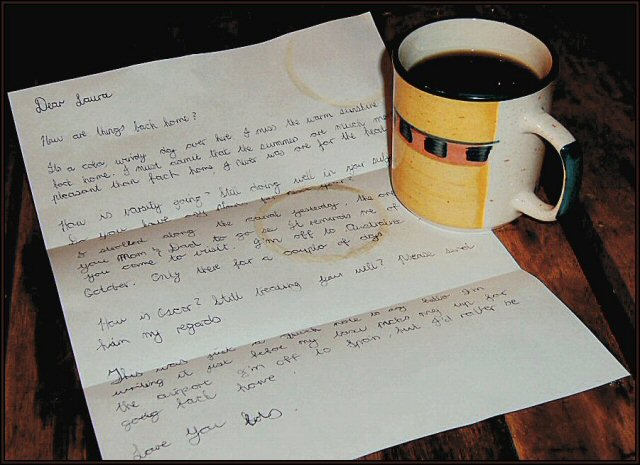
First impression: I want a coffe :-) and Why are there so many coffe stains? Dull colours. Nice idea, well executed. Good focus.
What can be better?
Brighter colours, fewer coffe stains on paper, use NeatImage to get rid of grains.
|
|
| Photographer found comment helpful. |
|
|
05/25/2006 08:54:59 PM |
Hi Laura -
The first thing that strikes me about this photo is that the lighting looks a little too snapshotty. I would like to see this lit from several directions, and with a warmer tone. The shadow behind the mug is rather harsh. Coffee is usually associated with waking up in the morning (at least in the USA), so some lighting that also implies morning would make this a much stronger image. I like the composition, the coffee rings on the letter. The arrangement and idea are nice. |
|
| Photographer found comment helpful. |
|
|
05/25/2006 07:11:27 PM |
From Ctp2:
This is an interesting shot, that causes me to stop and look at it. I'm not sure I'd really consider it a 'still life' in the traditional sense. It might have fit better under a different theme. I like the idea, though. The lighting and composition are OK, although, maybe just a tad dark. |
|
| Photographer found comment helpful. |
|
|
05/25/2006 10:18:47 AM |
Hello from �lex, CTP MkII
First Impression: Good idea for the challenge with a poor lighting
Composition: Composition works for me, it's a good cropping.
Subject: meets the challenge. The circles of coffe add interest to the shot.
Technical: here is the main flaw, the lighting. This is one of the harder things for us the beginners in order to score high, IMO. It's very clear in interior shots when your lighting is not good and that affects a lot to the score. Sorry. The colors are a bit dark.
Improvement: Obviously lighting.
Summary: Good composition. Keep working on improvement.
�lex
|
|
| Photographer found comment helpful. |
|
|
05/24/2006 04:52:13 AM |
Greetings from CTP2
Just as a side note, I like the coffee stains. That's just classic to me but I think I would have just went with one instead of the two rings.
Technicals:
The lighting and color is good. Maybe a tad underexposed but overall it has a nice moody feel to it. The image is also nice and sharp.
Subject/composition:
This might not have been what voters wanted to see as a still life and as such you got a much lower score than what this images normally would have gotten, IMO. As for the photograph itself the subject works well in the composition. I really like how the cup and paper contrast well with the background and the focal point is off-center.
Suggestions for Improvement:
Nothing really technically other than go with something more traditionally still life. What you shot would fit the description of still life but for the challenges it apparently didn't. |
|
| Photographer found comment helpful. |
Comments Made During the Challenge  |
|
|
05/21/2006 11:33:46 AM |
| So how IS Oscar? (smile) Nice photo |
|
| Photographer found comment helpful. |
|
|
05/17/2006 08:59:59 PM |
| I gave this photo a 1 because it didn't seem to me to fulfill my expectation of a "still life," a classic form of artfully arranged objects. Call me narrow minded but that's the way I see it. |
|
|
|
05/17/2006 01:19:59 AM |
| This would have been so much better if you didn't have the coffee or tea stains on the notepaper, as it makes it look dirty.....If there was to be a mark/stain, one should have it in the bottom right corner..... |
|
Home -
Challenges -
Community -
League -
Photos -
Cameras -
Lenses -
Learn -
Help -
Terms of Use -
Privacy -
Top ^
DPChallenge, and website content and design, Copyright © 2001-2025 Challenging Technologies, LLC.
All digital photo copyrights belong to the photographers and may not be used without permission.
Current Server Time: 03/12/2025 05:08:27 PM EDT.