*Critique Club*
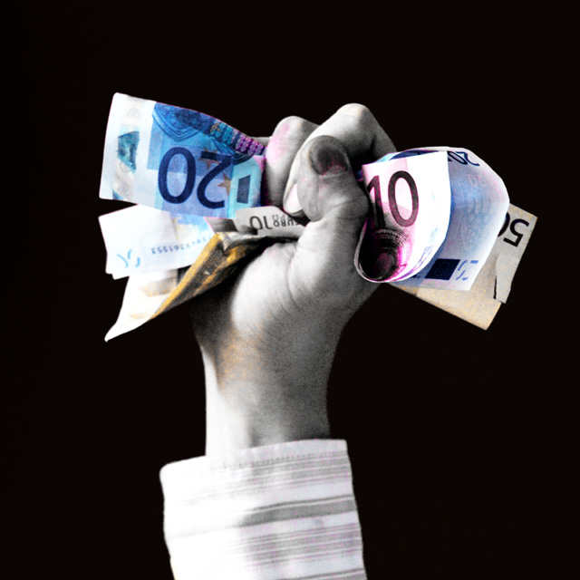
The very first thing that comes to mind when I see this is the thumbnail. It's a strange dark color and it looks like it's been smashed in the car door or something. Very odd look, and it draws my attention right away.
Next, is the selective color treatment. Very effective in drawing the attention to the color parts (money) and taking the attention mostly away from the hand/arm.
This does look like it meets the challenge. I don't know how much money that is, so I cannot determine how much success it represents, but i'll take your word for it that it's a good amount of money and the person was successful in something.
Focus is soft on the hand, and crisp on the money. I think I might have preferred the entire photo to be a crisp focus. Then again, it might just be the grainy look that causes it to look less crisp. I would prefer more uniform focus.
I like the angle and framing/cropping. The hand in the center of the photo does not bother me here. A lot of times it doesn't work, but I think with the money coming out of both sides of the hand, it works to have the arm coming from the center of the photo.
Lighting looks a tad bright in some areas, especially on the sleeve, but nothing serious. I might have preferred that toned down a bit, but really not something that HAS to be done.
Overall, I think the image is technically good, but lacking on the interest. It doesn't really draw me in and hold me for much longer than a minute. Interesting, but low visual appeal.
Good shot for success.
~Heather~ |