| Author | Thread |
|
|
06/06/2006 04:30:45 PM |
::: Greetings from Critique Club :::
Hi, as requested, here is an indepth critique of your submission.
First Impression - the most important one:
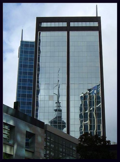
Decent shot, but it could be improved in post.
Composition:
This is where I have some issues. The vertical lines at the top of the building lean inward. A bit of perspective change in photoshop could have fixed this and made this shot a lot better compositionally.
Subject:
It's there and in your face. Can't miss it :-)
Technical (Color, focus, and light):
Focus looks sharp. Lighting is pretty good, but may be a very little under-exposed. Color could use a bit of saturation boost.
To grow its vote?:
Good starting shot, but needs a bit more processing to make it pop.
Summary:
Not bad overall, I do like the shot.
Hope to see more from you soon,
Leroy |
|
|
|
06/05/2006 01:55:26 AM |
| Good work mate. You getting better with every challenge! |
|
 Photographer found comment helpful. Photographer found comment helpful. |
Comments Made During the Challenge  |
|
|
06/03/2006 09:34:05 AM |
| I like the reflection..... |
|
| Photographer found comment helpful. |
|
|
06/01/2006 06:43:43 PM |
| It looks like a natural frame. I like it. |
|
| Photographer found comment helpful. |
|
|
05/30/2006 07:27:41 PM |
| If it was not aluminated glass what would we do....6 |
|
| Photographer found comment helpful. |
|
|
05/29/2006 04:50:09 PM |
| Fantastic shot! Well done. |
|
| Photographer found comment helpful. |
Home -
Challenges -
Community -
League -
Photos -
Cameras -
Lenses -
Learn -
Help -
Terms of Use -
Privacy -
Top ^
DPChallenge, and website content and design, Copyright © 2001-2025 Challenging Technologies, LLC.
All digital photo copyrights belong to the photographers and may not be used without permission.
Current Server Time: 03/12/2025 09:37:59 AM EDT.