*Critique Club*
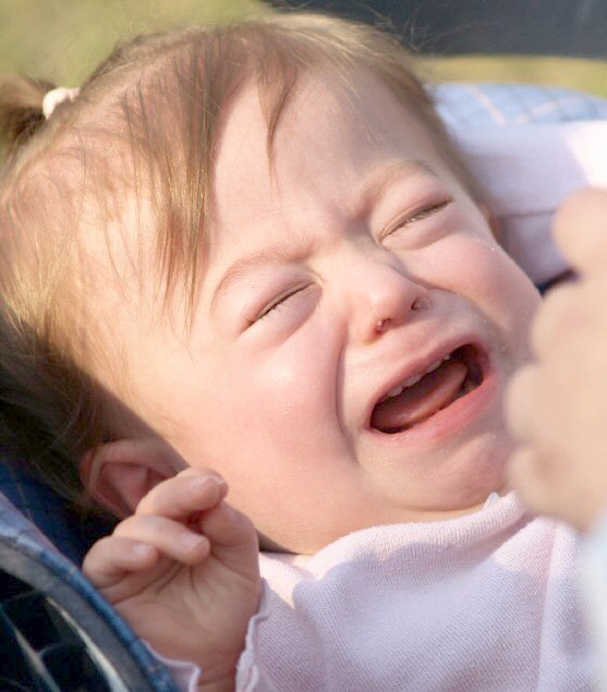
Well, it fits the challenge, but that's about it. The image doesn't appeal to me personally.
The majority of the photo is oof, which is ok, to some extent, but having SO much out of focus, kind of makes this hard to look at.
The hand to the right is out of control. It covers some of the baby's face which really is the visual focus of the photo and adds a serious distraction.
Focus is good on the baby's eyes.
Snot coming out of anyone's nose is simply repulsive to me. Yeah, it happens, but that doesn't make me want to see it.
The dark blue thing (edge of car seat?) in the bottom left is much darker than the rest of the photo, making it a distraction from the baby as well.
Lighting is very harsh. While it does't get to the point of washing away details, it creates some harsh bright spots on her face, which again, is suposed to be the main attraction here. The shadow also hurts the photo.
There are so many negative things working against this photo that it's hard really to suggest improvements.
First, I would have taken the photo NOT in the lighting conditions you chose here. Maybe indoors, or in a shaded area with some fill flash or something.
Next, I would have made sure other people's hands were out of the photo.
Clean off her nose. It's 'Cry Baby Cry', not 'Look at the nasty snot Ma'.
THEN try to take a shot. She's a baby, I find it hard to believe that this was the only time she cried all week.
Overall it seems snapshottish.
~Heather~ |